
Digital Epigraphy (Second Edition)
Chapter 5 – Digital Inking Method
Chapter 5, Section 4 - Inking Digitally
%20-%20Digital%20inking%20of%20heraldic%20vulture%20in%20progress.jpg)
MHB 91 (detail) - Digital inking of heraldic vulture in progress
Once our layers are set up, our drawing is ready for inking. First, we have to open the Brush tool and set up the Epigraphic Survey’s standard brush stroke sizes:
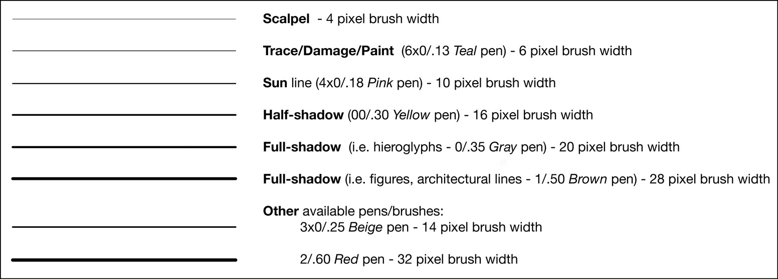
These brush line thicknesses are the digital equivalents of the line weights discussed in Chapter 2, Section 1. They were matched and created to represent the same line weights as the ones being used in previous Oriental Institute Epigraphic Survey publications. Because Photoshop uses pixel-based brush lines (unlike Illustrator’s vector-based lines), these thicknesses represent the actual line weights only in the 1200 dpi environment. If the artist needs to set up a less (or more) pixel-dense environment, he/she has to change the digital line weights accordingly.
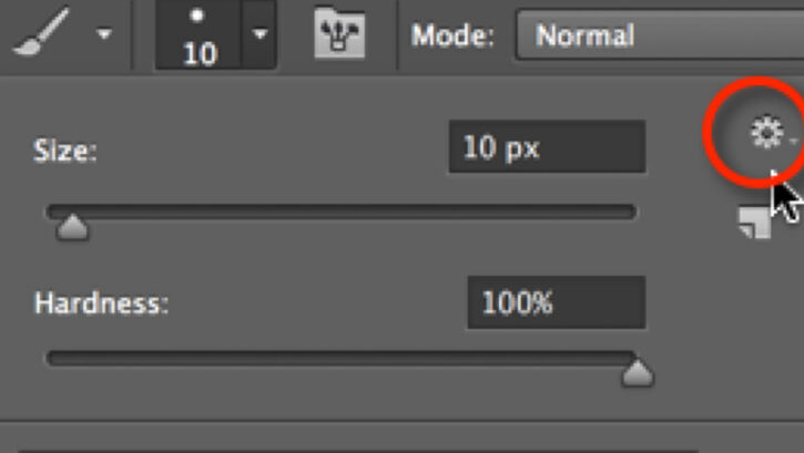
To do this we have to open the Brush Panel and set up each and every brush thickness we’ll use, name them, and save them to the brush palette. We also have to make sure that Smoothing is the only box checked, because - as we’ve already learned - all the other options cause a variety in line quality, a certain randomness in size, texture, and angle, and we don’t want that. We also have to make sure the brush Roundness and Hardness are set to 100%, and Spacing, which determines the distance in between the dots that build up our lines, is as little as possible (the smallest here is 1%). Clicking on the folded paper icon in the lower right corner, lets us give our new brush a name and save it.
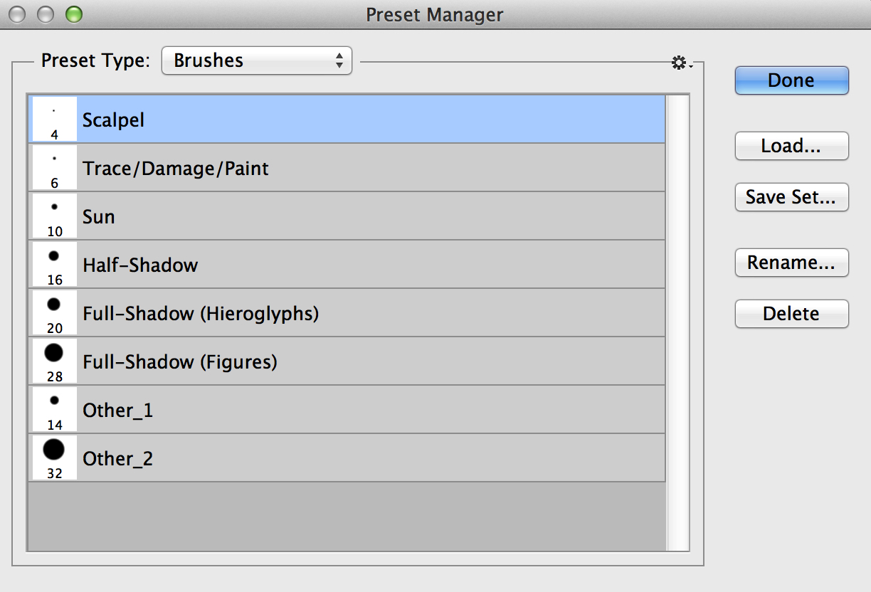
Standard brush sizes shown in the Preset Manager
All of the new brushes we save appear at the end of the custom brush list. To move them to the beginning of our list, we have to open the Preset Manager, highlight our new brushes (hold down Shift or use cmd to highlight more than one at the same time) and drag the set to the front of the list. Since we don’t need Photoshop’s preset brushes right now, we can delete them as well.
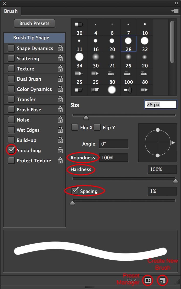
Brush panel with the important settings indicated
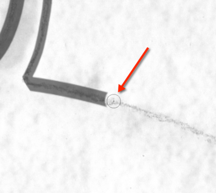
Once the preset window contains only our preferred brushes in the desired order, we should save the set and give it a name. Every time the artist needs to switch to a different brush set he/she should hit the little cog wheel in the upper right corner at the Preset Manager and choose from either Photoshop’s options or his/her own saved sets. One more important setting that can be adjusted at this point is changing the control for the brush cursor’s appearance. As a factory setting, the brush cursor reflects the size and shape of whatever brush is chosen. This is one of the most important brush attributes when the artist draws in an extremely zoomed-in environment. For example, it is necessary to see the edge of our brush tip when refining sun-shadow transitions to their desired shape. The artist has to be sure to set the cursor to Normal Brush Tip (Photoshop/Preferences/Cursors). A further useful setting is to make the center point of the brush cursor visible (Photoshop/ Preferences/Cursors/Show Crosshair in Brush Tip). Seeing the center point when working with transparent brush strokes helps the artist to determine and control the relationship between the original thin pencil lines and the - quite often - much thicker brush strokes.
Normal brush tip with center point indicated
Freehand Drawing
As is obvious from reading the previous sections, the tool we use for inking is the Brush tool. Theoretically we could use the Pencil tool as well, but there is one major difference between the two: The Pencil tool is limited to drawing with only hard brush tips of any size or shape. If we compare the two lines drawn with the same line weight, the difference is obvious:
%20and%20Pencil%20and%20cursor%20(right).jpg)
Brush and cursor (left) and Pencil and cursor (right)
While black brush strokes have much smoother (and therefore more realistic) edges, thanks to using grayscale pixels, black pencil strokes have serrated edges due to the absence of gray pixels. Even their cursors’ shapes indicate this differentiation.
As we start drawing we immediately realize two problems:
- Our black ink line covers up our initial penciled guidelines as we draw, and therefore we do not have much control over their relationship.
- No matter how hard we try; our brush strokes seem to be shaky and misplaced. Lifting up the Wacom pen and continuing a line where we left off seems especially problematic, not to mention adding sun-shadow transitions.
There are a few very useful tips to help the artist accomplish the inking process keeping the same quality he/she is used to when drawing on paper:
-
Always use semi-transparent brush strokes (by changing the layer’s transparency) when tracing over initially produced guidelines (penciling on enlargements, mylar, markers on plastic, etc.). Brush transparency and the above-mentioned center point help with determining and controlling brush stroke alignment while drawing. Layer transparency has to be adjusted back to 100% before finalizing the drawing.
%20and%20the%20same%20at%2050%25%20opacity%20(right).jpg)
Solid brush stroke (left) and the same at 50% opacity (right)
- Try different zoom settings for dealing with different features. Zooming in by 200% (do not confuse changing the viewing ratio with changing the actual image size!) helps when drawing delicate details, such as small hieroglyphs. By contrast, zooming out by 50% helps when dealing with non-decorative elements, such as damage and plaster, where faster paced, lighter brushwork yields a more realistic effect. The easiest way to zoom in/out is by using the Zoom tool. Switching between brush and zoom requires a whole sequence of commands, which can be very distracting. An easier way to change the viewing ratio is by clicking on the little pyramids at the bottom of the Navigator panel. These buttons change the drawing’s viewing ratio by a certain preset percentage without deactivating the actual tool that is being used. This even works in situations when we can’t apply the Zoom tool, such as scaling or rotating, etc.
Navigator’s zooming area
- As a general rule, the artist should draw faster when working in a zoomed-out view and slower when working in a zoomed-in view to accomplish the best quality-accuracy ratio.
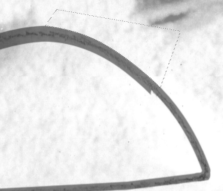
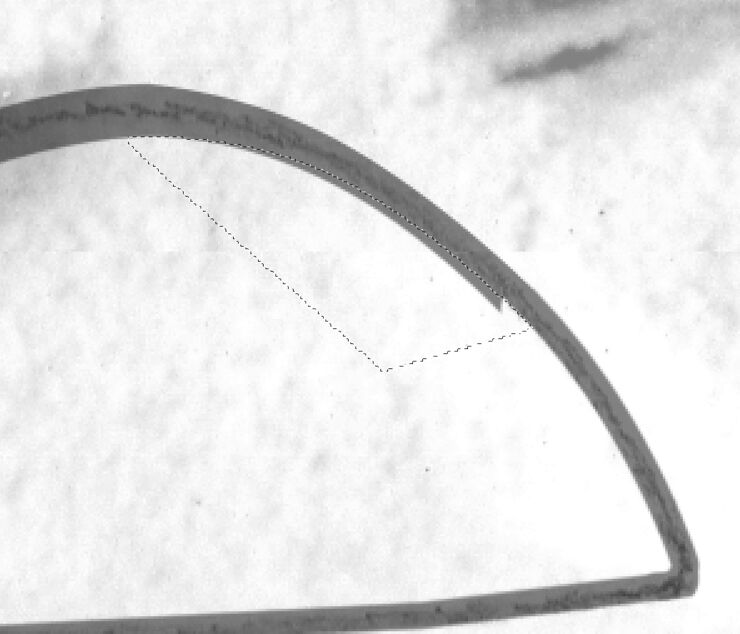
- Erasing from and adding to the brushstrokes are common when dealing with sun-shadow transitions. Adding to the inside and erasing from the outside of the brush line usually has the best result when drawing curves.
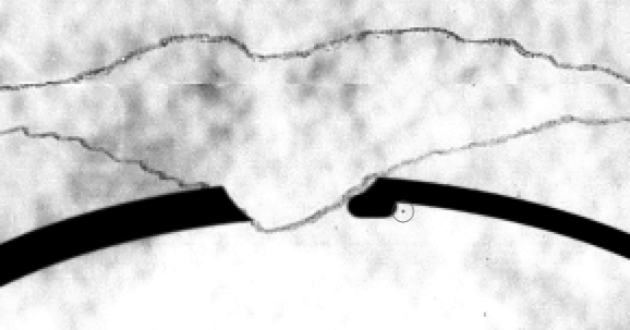
Inking sunk relief by adding to the brushstroke
- Try adding extra guides to the drawing. The most useful are Smart Guides (View/Show/Smart Guides), Grids (View/Show/Grids), and Rulers (View/Rulers). Smart Guides are a very handy tool for lining up different objects on a drawing. They enable the artist quickly and easily to see if the objects are lined up without having to use rulers, grids, or create ruler guides. The Grid is the perfect alignment tool if one has many repetitive elements on a drawing and they need to be positioned in a certain way. Combined with the Snap feature (View/Snap) the grid provides the same magnetic effect as the Smart Guides. Finally, having the Rulers visible at the horizontal and vertical edges of the drawing helps when rescaling any drawing elements. Rulers provide another helpful feature: they allow the artist to add any individual horizontal or vertical guideline to the drawing by clicking on the ruler and dragging the cursor away from it. These Guides can be moved, multiplied, etc. and can be deleted when they are not needed anymore (View/Clear Guides). All of the above features are fully customizable (including their colors) and can be adjusted in Photoshop/Preferences/Guides, Grid & Slices.
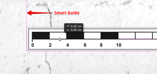
The Smart Guides are indicated in purple
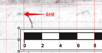
The Grid is indicated in red
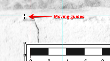
Grab and hold to move guides around
Learn the shortcuts necessary for your basic tasks! Although many keyboard combinations can be associated with our tablet’s hot keys (Chapter 3, Section 3), the artist should know about and learn the most common keyboard shortcuts for his/her day-to-day work. Only the ones related to using the Brush tool will be mentioned here, but one can find a more detailed list at the end of this manual (Supplements).
- [ (Decrease Brush Size) - Quickly decrease your brush size (based on your preset list).
- ] (Increase Brush Size) - Quickly increase your brush size (based on your preset list).
- Shift + [ (Decrease Brush Softness) - Decrease the softness of the brush by 25%.
- Shift + ] (Increase Brush Softness) - Increase the softness of the brush by 25%.
- 1->0 (Tool Opacity) - Press one of the numbers from 1 to 0 and your tool opacity (but not the layer, therefore it can’t be changed back later!) will change from 10% up to 100%. If you want finer control, press a second number quickly after the first, and you can get any percentage you want. Thus pressing 5 will get you 50% opacity, while pressing 5 then 3 will give you 53% opacity.
- Hold Shift (Straight Lines) - With the brush you want to use active, click once where you want your straight line to start, then hold down Shift while you move to the end of your straight line and click again. This will paint a straight line from the first point to where you just clicked.
Anchor Points and drawing with the Pen tool
The pen tool is one of the few tools available to the artist in Photoshop that works with Vector Graphics as opposed to Raster Graphics. With the Pen tool, one can create lines and smooth curves that can be modified to any desired shape. (Vectors are lines whose curvature, thickness, and length are determined by mathematical formulae.) Using the Pen tool and its siblings (Freeform Pen tool, Add/Delete Anchor Point tool) is the best way to draw smooth sun-shadow transitions and dynamic brush lines.
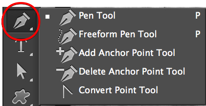
Pen tool and its siblings
It might seem strange to find vector drawing tools in a pixel-based program like Photoshop; vector drawing is usually associated with very different programs, like Illustrator. Photoshop can’t create entire vector documents. Instead it uses vector elements and stores them in layers and as paths. We use these paths to determine the exact track whereon our brush stroke is placed.
In Photoshop the mathematical name for the lines (paths) that determine vectors is Bezier (after a French creator, Pierre Bezier, who came up with a clever way to make computer-drawn lines bend to his will.) A Bezier curve’s direction and angle is determined by the position of little anchor points that lie along the path. A path is this series of curves joined together from anchor point to anchor point. As one clicks a point, it changes color and becomes black. This is called “filled or selected” meaning that that portion of the path can now be modified.
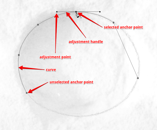
Drawing curves in Photoshop
Drawing with the Pen tool is - unfortunately - not a very natural process, especially to anyone who is used to drawing with a regular pen on paper. This is because, unlike the Brush tool, we are creating the shape with points and handles. The artist doesn’t just draw on the canvas, he/ she has to add points and manipulate them to create the desired shapes. The pen tool is the tool used to add these points, and the way one drags the tool when creating the points determines how they will look. One general rule: the fewer points we add, the smoother a path will be.
Freeform Pen Tool - The Freeform Pen tool is kind of a hybrid Lasso/Pen tool. The artist clicks and drags around the element he/she wants to trace, and the tool creates an outline that follows the cursor, exactly like the Lasso. After the Wacom Stylus has been released, Photoshop provides the anchor points, lines, and curves for that path. In this way, the Freeform Pen works exactly like the Pen. The downside of using the Freeform Pen is that the artist needs a steady hand in order to get an accurate selection, just like when working with freehand brush lines. The Freeform Pen tool is probably one notch better than the Brush tool because we get a path that can be refined before we turn it into a brush stroke.
To create straight segments by using the Freeform Pen, we can hold down Option (Alt on the PC) while drawing with the Wacom Stylus, and then click to create the anchor point. This command temporarily turns the Freeform Pen into the regular Pen. The artist can return to using the Freeform Pen by releasing Option, while keeping the Wacom Pen on the tablet screen. If one releases Option after releasing the Wacom Stylus, Photoshop immediately ends the path.
The Curve Fit option lets the artist adjust the amount of error (0.5-10 pixels) Photoshop allows when trying to fit the cursor movement to a path. Setting the value to 0.5 pixels makes the Freeform Pen very sensitive to any movement and forces the tool to follow the edge closely. The disadvantage of this option is that using it also causes unnecessary anchor points. Although a value of 10 pixels corrects this problem by making the tool less sensitive, now the path may not be as accurate as we desire.
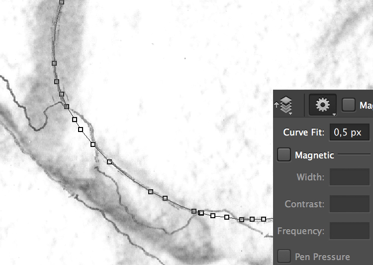
Adjusting Curve Fit
The Magnetic option makes the Freeform Pen act much like the Magnetic Lasso tool when the artist clicks anywhere on the edge of the element he/she wants to trace. By lifting up the Wacom Stylus and then moving the cursor along the lines to trace, the tool snaps to the edge of these elements, creating anchor points and segments. Unfortunately, the proper use of this magnetic effect needs a lot of contrast and definition for the elements to be traced. Therefore, it has very limited use for the digital artist when inking on photo enlargements. The magnetic effect gets exponentially more useful when tracing black marker lines on transparent plastic background. We will talk more about the Magnetic Pen tool when we discuss modifying inked lines in Chapter 5, Section 3.
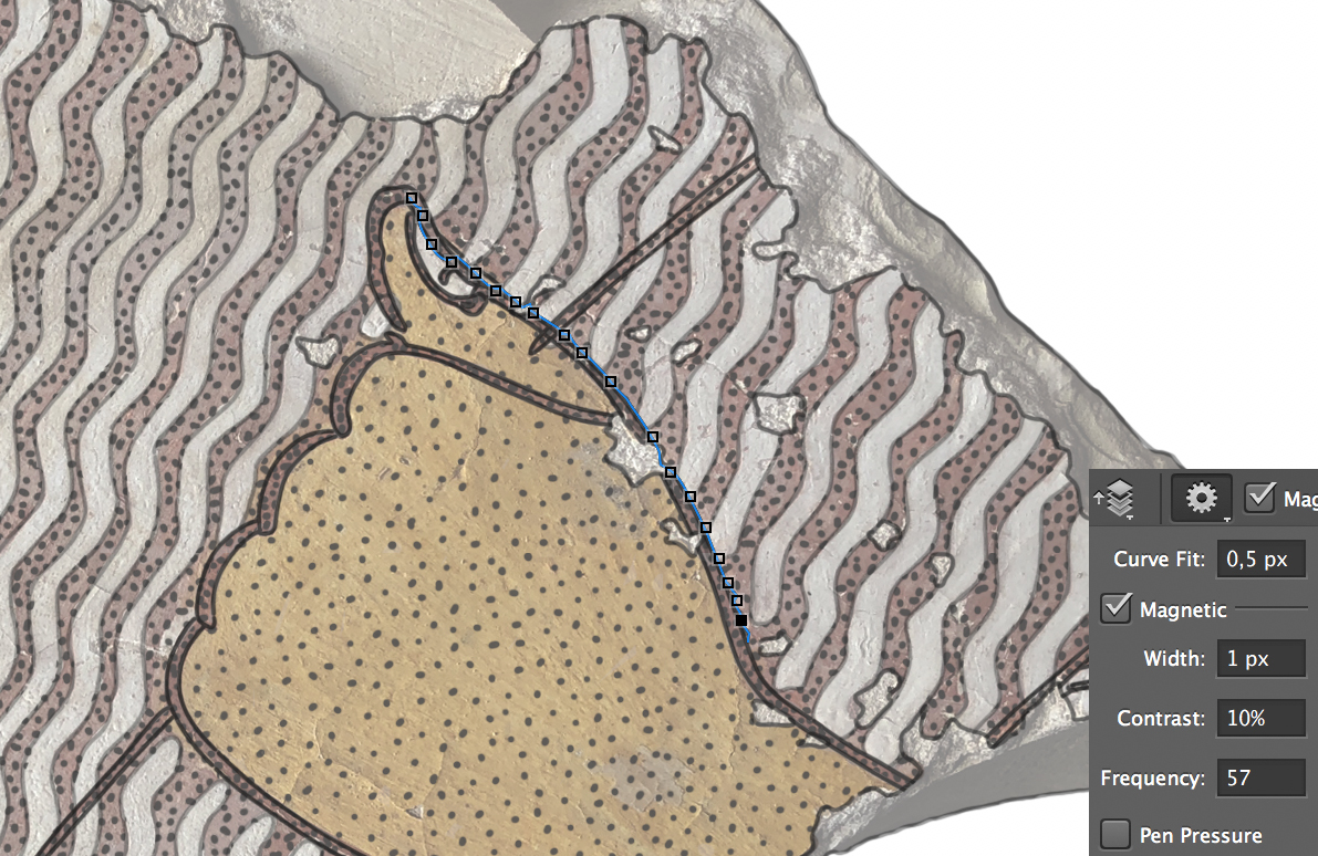
Turning on and adjusting the magnetic effect
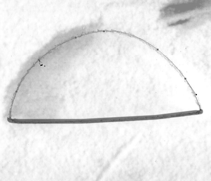
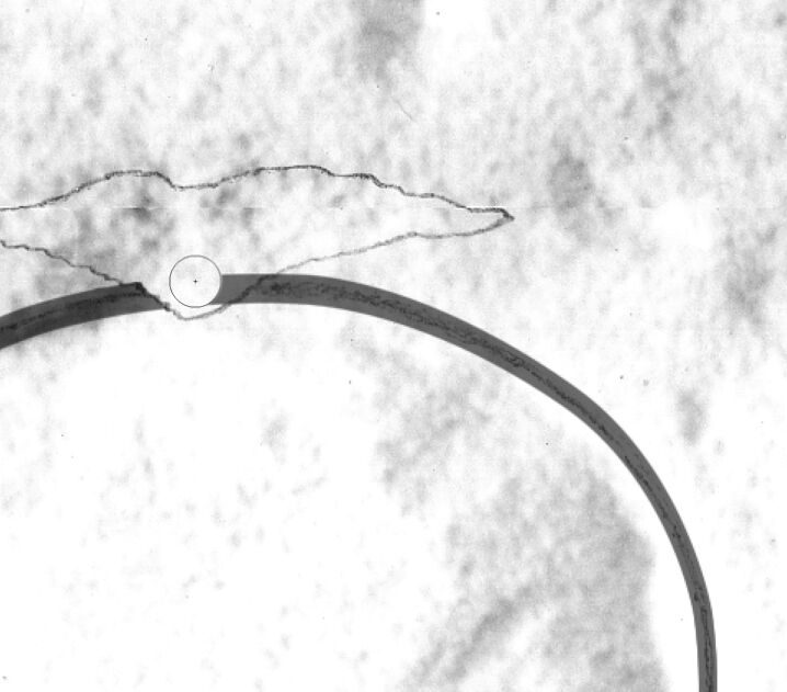
Pen Tool - using the Pen tool is the most precise and most controllable way of drawing curved paths for brush strokes. Its main advantage over the Freeform Pen tool is that the artist determines the number and position of the Anchor Points he/she wants to use along the path. The step-by-step guide below shows the process. Its advantages are even more obvious when dealing with fine transitions between different line thicknesses, such as sun-shadow adjustments. Adding sun-shadow transitions by freehand can be very difficult when the artist works with large curved elements (circles, loops, gures, etc.). When inking on paper we usually use templates (French curves) to help accomplish this task, and - in a way - the Pen tool is our digital French curve in Photoshop.
Drawing Curves by Using the Pen Tool
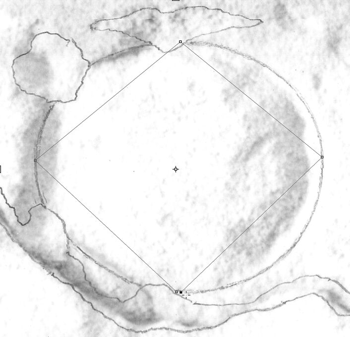
(1) Draw a rectangular area touching the lines you want to trace over. Don’t use too many anchor points and don’t close the path, to prevent it from becoming a Shape.

(2) Make sure Auto Add/Delete is active on the Tool Menu and add your first extra Anchor Point to the path.

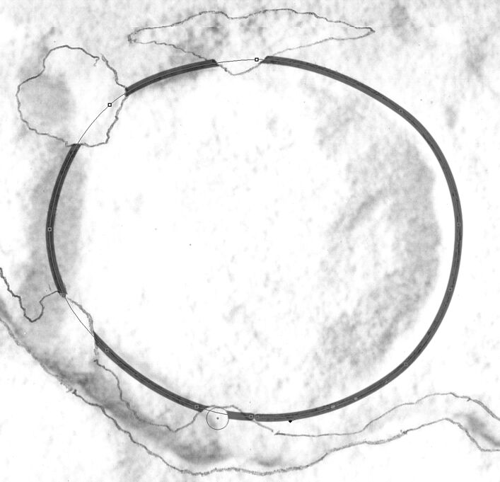
(3) Adjust the shape of your curve by holding down Command (Cmd + Drag) and moving your path section towards the line. Try to position it so it follows the line as closely as possible.
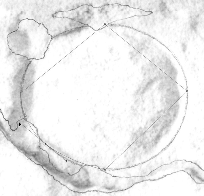
(4) Adjust your path section further by holding down Command and clicking and moving the Adjustment Points until you get the desired shape. Add more anchor points if necessary.

(5) Don’t forget that because Auto Add/Delete is checked, you can add any number Anchor Points by hovering over your path, but Command should be released while adding them.
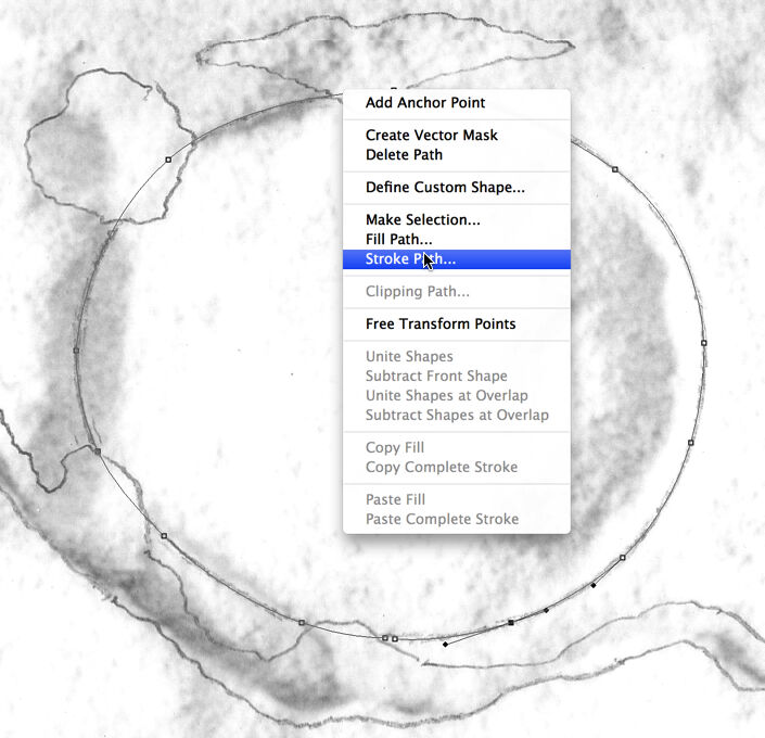
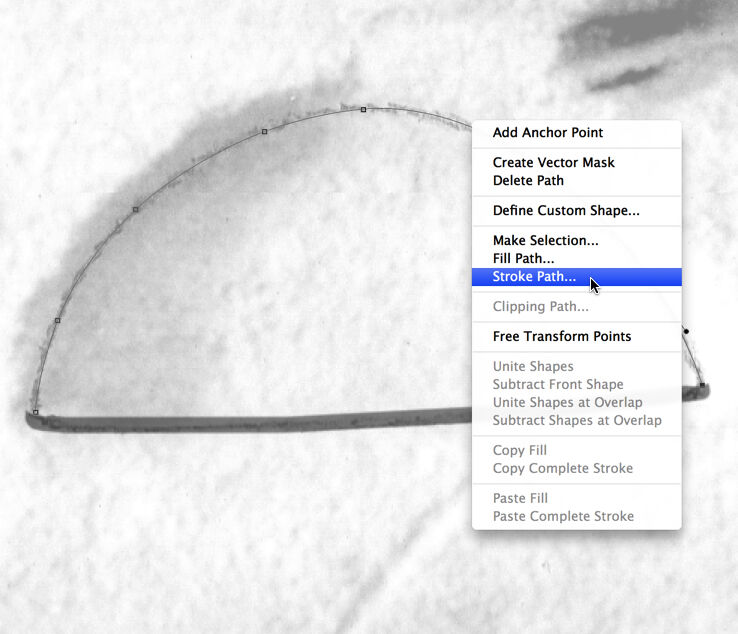
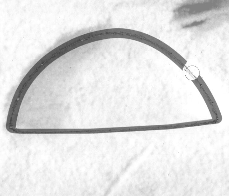
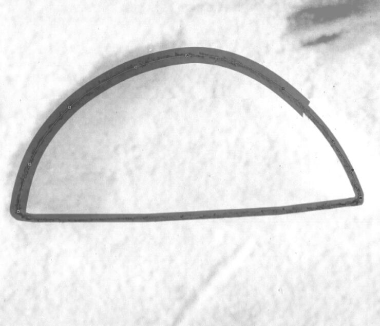
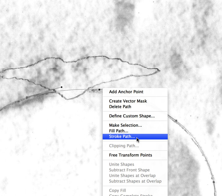
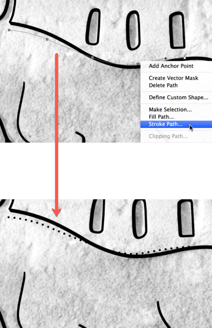
(6) Once you are satisfied with your path, right click (secondary click) anywhere along the path and choose Stroke Path from the menu.
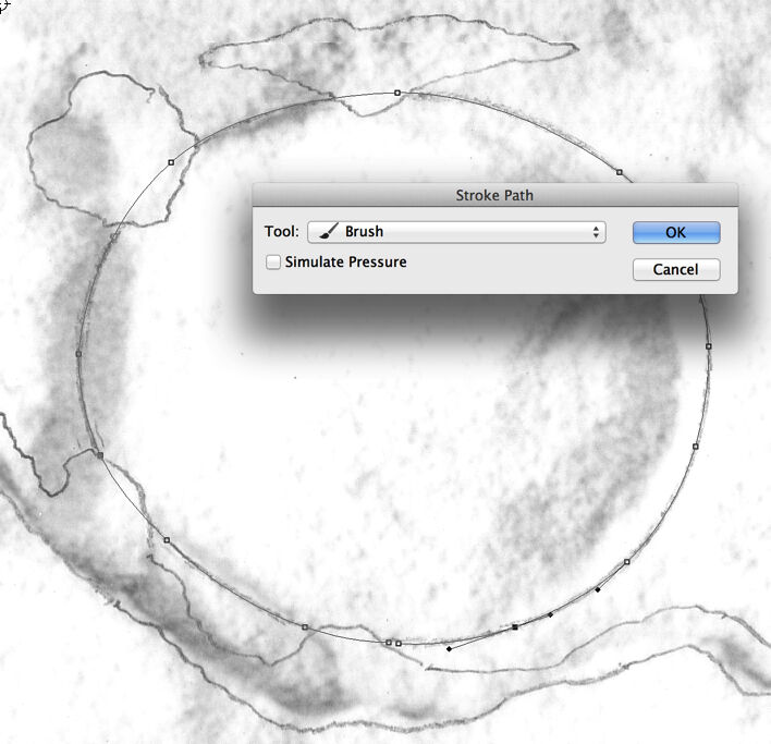
(7) This option opens up another panel, where you can choose the tool with which you’d like Photoshop to stroke your path. The width of the stroke is the same as what you used last time with that particular tool. Use the Brush tool for inking purposes.
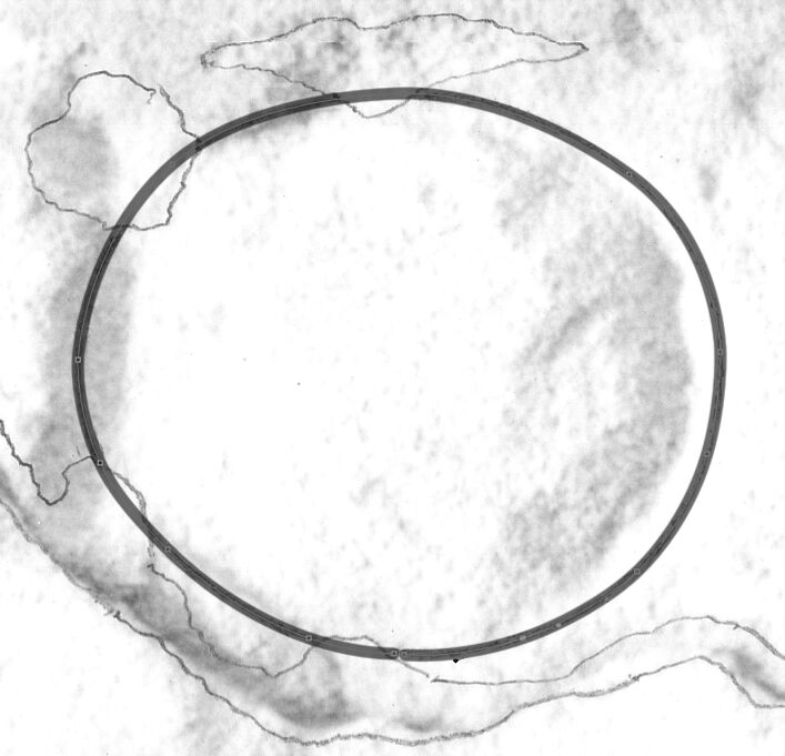
(8) The generated brush stroke uses your path as a center line, so half of its width is added to the outside of the path, the other half is added to the inside. You must take this into consideration when drawing paths.
(9) As a general rule, it is easier to draw one continuous path for the entire shape, even if it has some damaged areas, than to draw separate paths for each section. Unwanted brush strokes can always be deleted later.
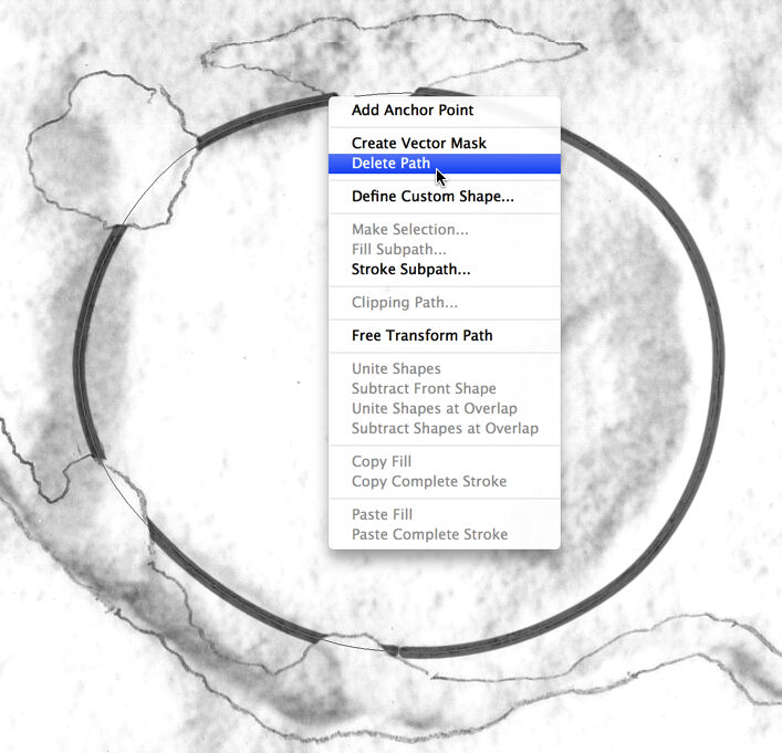
(10) When you have your desired lines stroked along the path, it can be deleted by using right click (secondary click) anywhere along the path and choosing Delete Path from the menu.
You can download the short tutorial to learn this skill.
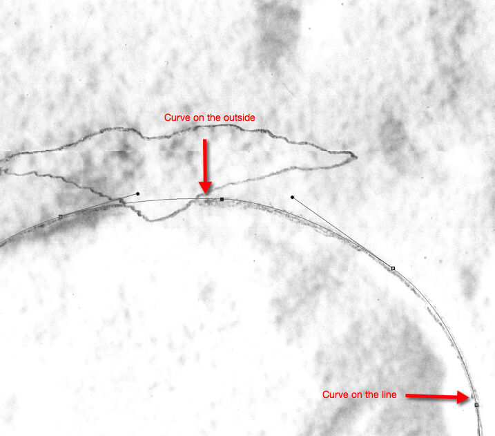
There are two slightly different methods that can be introduced here: the artist can either delete from or add to the initial curves. They are both very effective and, once mastered, they can be useful complements to hand-drawn brush strokes. The artist has to keep in mind that sometimes it’s easier to draw freehand than to force drawing with the Pen tool.
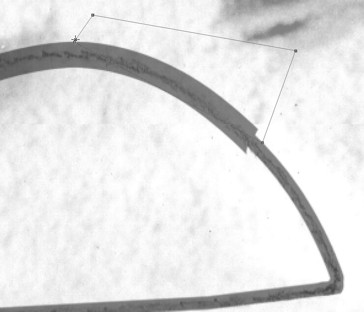
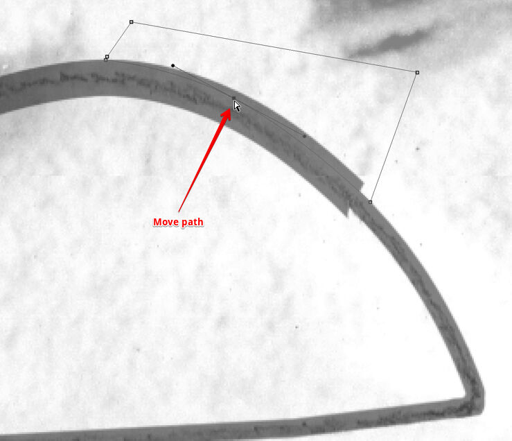
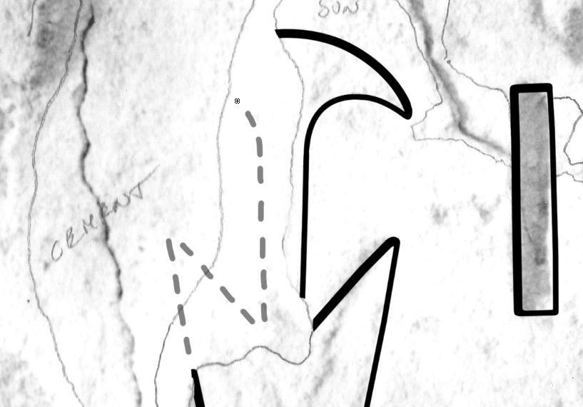
Delete Transitions with Path Selections
(1) Draw a path by carefully following the line you want to trace. This path will be the center for both shadow and sun lines.
(2) Stroke your path with the shadow line weight first (16 or 20 pixels accordingly).
(3) Keep your path and erase the section where the sun-shadow transition ends, and you will be drawing a sun line.
(4) Repeat Step 2, but this time use the sun line weight (10) instead of shadow. (Change brush size to sun!)
(5) Delete your path and draw another one over the transition area as shown on the image. Don’t close the path!
(6) Adjust your path to form the outer curve of your sun-shadow transition. Starting and ending points must touch the lines.
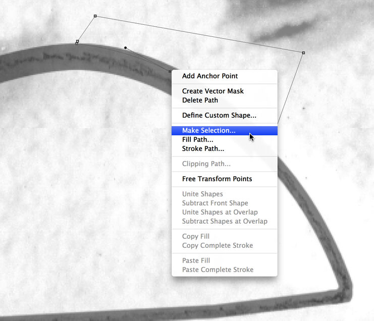
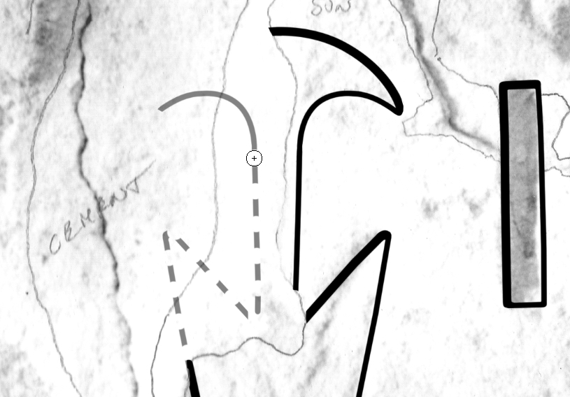
(7) Make your new path a selection by calling up the same panel as you’d use for Stroke Path.
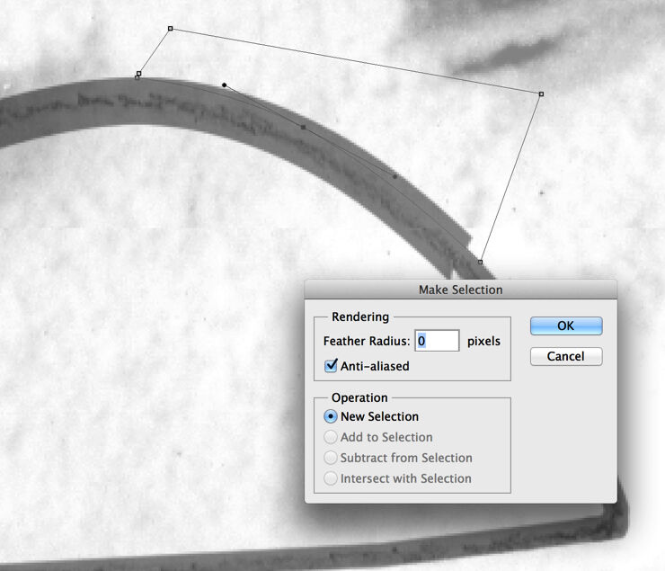
(8) You don’t have to change anything in the Make Selection pop-up window, unless it looks different from the one here.
(9) Once you hit OK, your path turns into the usual “marching ants”. Now you can hit delete and clear the selected area.
(10) You have to repeat Steps 5–9 again, but this time on the inside. Place your selection carefully!
(11) The final inked circle with the transparency changed back to 100%. Unevenness in transitions can be corrected manually.
You can download the short tutorial to learn this skill.
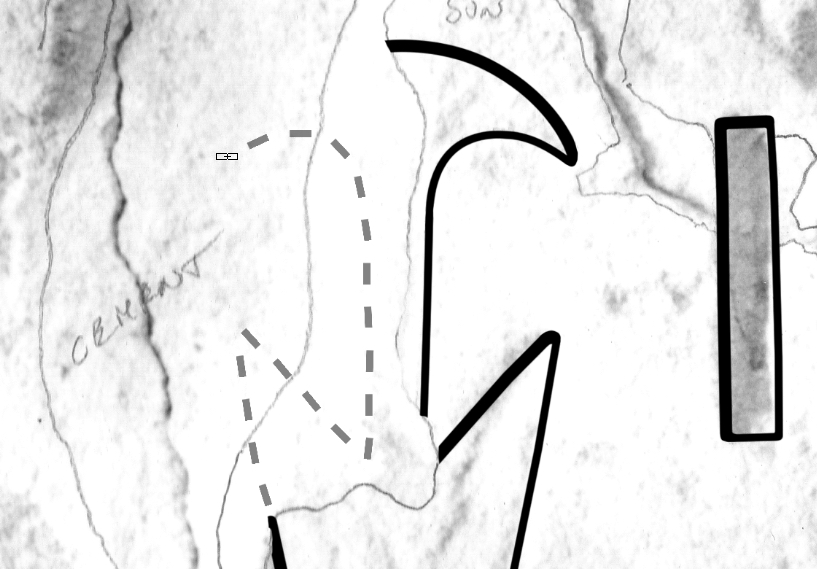
Adding Transitions by Moving the Path
(1) Add your path in a way that reflects where you want to place your final brush stroke. Note that adding shadow lines to sunk relief requires placing your path slightly on the outside of your guideline, so you can build inwards.
(2) Stroke your path with the sun line brush weight (10 pixels), and note that even the shadow line areas get the sun line width first. This brush stroke represents the outside of your inked line, so make sure its curvature is accurate.
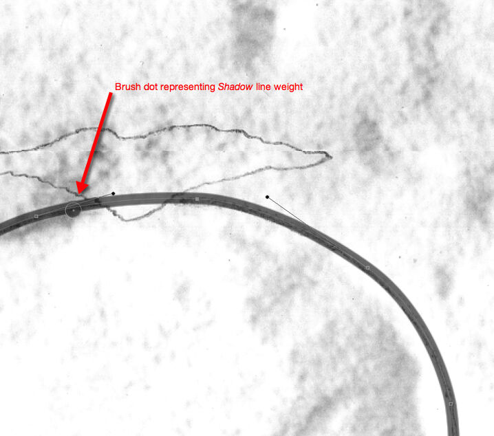
(3) Change your brush size to shadow line weight (16 or 20 accordingly) and add a dot which would represent the actual shadow thickness and shows you how much you have to move your path to get the desired thickness.
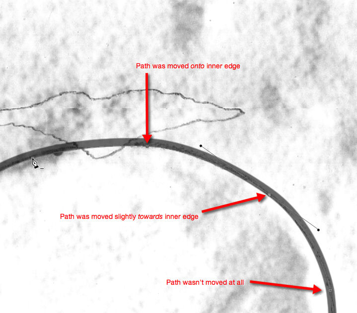
(4) Move your path according to the sun-shadow transition. Note that the path needs to be moved more wherever you want to have full shadow and less (or not at all) where you want to have your transition.
(5) Repeat the second step and add a sun line weight (10) brush stroke to your new path. Don’t forget to change the brush thickness back to sun line! Note that the width doesn’t change on the areas where the path wasn’t moved.
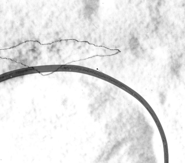
(6) Delete the damaged areas and, once everything looks as desired, delete your path as well. Adding entire features and deleting the missing parts later is a lot easier than dealing with sections, especially when drawing sun-shadow transitions.
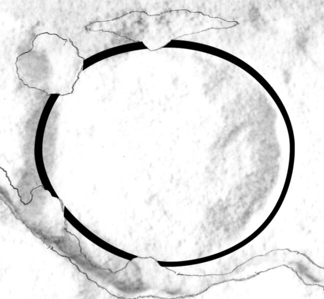
(7) The final inked circle with the transparency changed back to 100%. Unevenness in transitions can be corrected manually by using very thin brush strokes and the eraser.
Unfortunately, by default paths are very difficult to see, especially when they're on the edge of an object. Since it is impossible to change the color of the path, the only enhancement one can do for the visibility is to change the Anti-alias for Guides and Paths. To change this setting, one needs to go to Photoshop/Preferences/Performance (Edit on PC), click on the Advanced tab, and uncheck Anti-Alias Guides and Paths. This setting makes all the guidelines, including paths, a little sharper and thicker, and thus more visible.
Adjusting path visibility in Preferences
Inking Additional Details
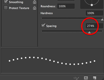
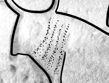
Adding Painted Details - According to the Epigraphic Survey’s drawing conventions (Chapter 2, Section 6), painted details are added by applying a series of dots along the painted outlines. Dotted lines can be configured in Photoshop in the Brush tool Menu by calling up the Brush Panel and changing Spacing for the brush we use for inking painted details (6 pixels). Our newly configured “painted line” brush stroke can be saved to the brush set (so the spacing stays consistent) and used any time for inking painted details. It can be combined with the Pen tool and stroked over paths just like any other preset brush type.
Adjusting distance between dots
Using dotted lines instead of individually applied dots is preferable when one has to draw very detailed areas in small scale, and placing a dot in the right place matters even more (e.g., for collars, costumes, etc.). Of course, not every artist will prefer to use artificially placed dots when dealing with painted details. Sometimes individual dots result in a more natural look, especially when we don’t have that much paint to add. The artist has to make these decisions (just like when drawing solid brush lines) based on what suits his/her work the best.
Using paths for even dot distance
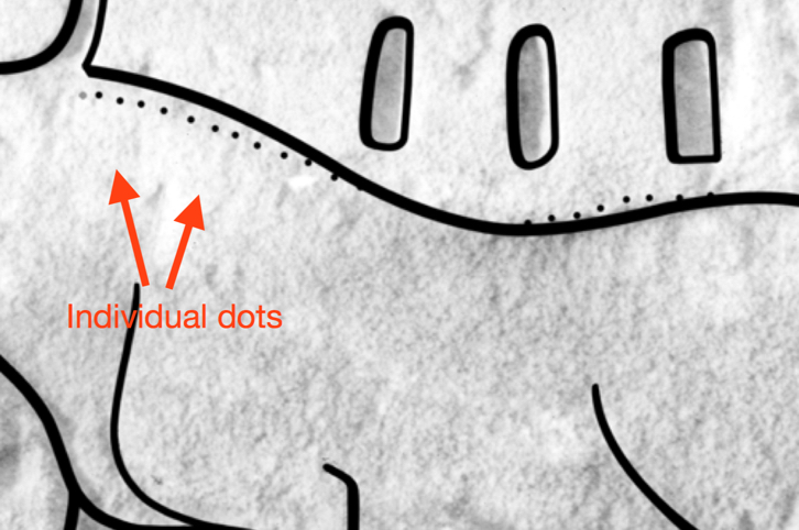
Using individual dots
Adding more than one layer of paint
Often there is more than one layer of painted decoration to be found on a decorated surface. In the past, the Epigraphic Survey has had to deal with the issue of representing and distinguishing between two sets of dotted lines by introducing a new convention. On paper the more recent painted layer is indicated by a double row of dotted lines, which makes its appearance stronger, indicating the actual situation. When added digitally, painted decorative elements applied in different historic periods can be represented on different layers, just like traces of carved decoration. These layers can be then modified and represented in many different ways including adding color, transparency, etc.
%20-%20Drawing%20by%20Osgood.jpg)
MHB 207 North/Left (detail) - Drawing by Osgood
%20with%20paint%20added%20digitally.jpg)
MHB 207 North/Left (detail) with paint added digitally
Restoration and Architecture – Restored decorative elements and architectural features, when part of an inked drawing, are represented by a series of dashed lines, as we’ve discussed in Chapter 2, Section 3. Again, just as with dotted lines, drawing dashed lines digitally can be accomplished in more than one way. The most obvious would be drawing dashed lines by freehand, but it raises a few issues:
- It is very hard to draw a sequence of straight line sections when tracing over complicated shapes.
- Holding down and releasing Shift repetitively while drawing (the easiest way to draw straight lines) would unnecessarily overcomplicate the process.
- The line segments become misaligned because of the difficulty caused by repeatedly releasing the pen from the screen.
- It is hard to preserve the uniform length of line segments as well as keep an even distance when drawing freehand.
A much better solution can be accomplished by drawing a continuous line along the shape that has to be shown as a dashed line. Once the line is drawn, the necessary gaps can be produced by simply erasing those sections.
There is, however, an even more elegant way of generating dashed lines in Photoshop. The artist can set up a Square Brush and tweak its behavior by changing some of its attributes to be able to produce dashed lines as a custom brush stroke.
Dashed Brush Line
(1) Square Brush Strokes are not part of the standard Photoshop Brush Set; therefore, they need to be added first.
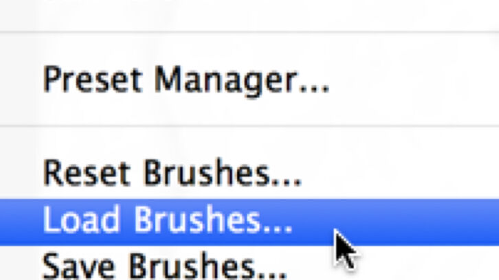
(2) In Brush Settings click on Load Brushes.
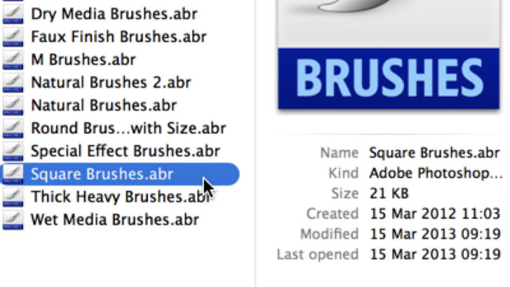
(3) Find the Square Brushes among the preset Photoshop Brush Sets (Applications/Adobe Photoshop CS6/Presets/Brushes on the Mac).
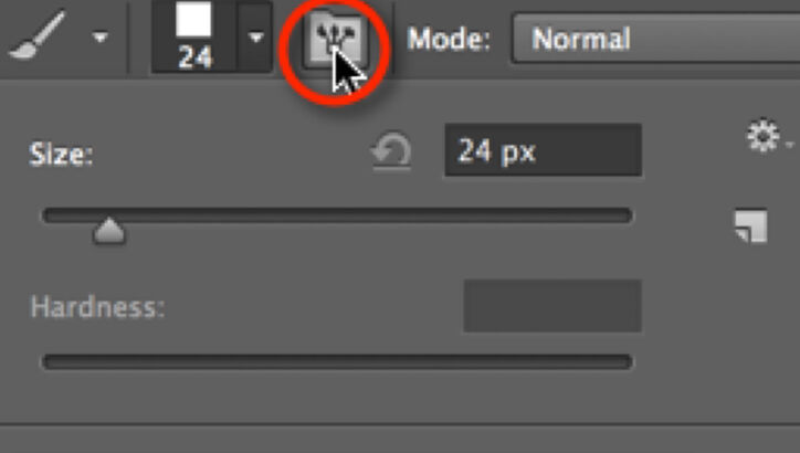
(4) Pick a random Square Brush and hit Toggle Brush Panel to call up the Brush Editing Window.
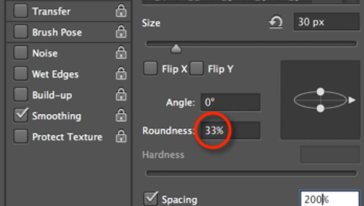
(5) Changing the Roundness of our brush by 33% (reducing it by 1/3) adds the necessary flatness to the dashed segments.
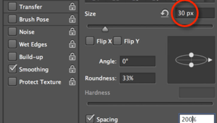
(6) Reducing Roundness reduces the brush thickness as well, so you have to multiply Size by 3 to get back the original line weight.
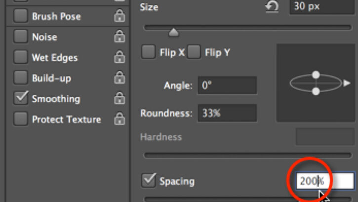
(7) Spacing determines how much space you’ll have in between the dashed segments. The higher the number the more space you’ll have.
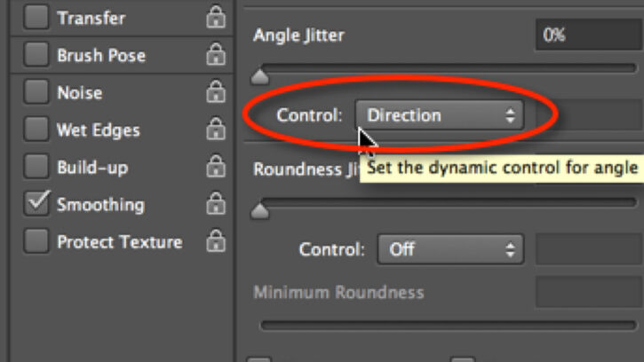
(8) Check Shape Dynamics on the right and make sure the Angle Jitter is controlled by Direction. Everything else should be off.
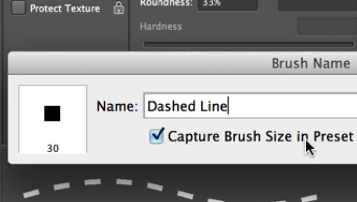
(9) Save your newly configured dashed line as a Brush Stroke, check Capture Brush Size in Preset, so it can be part of your Brush Set.
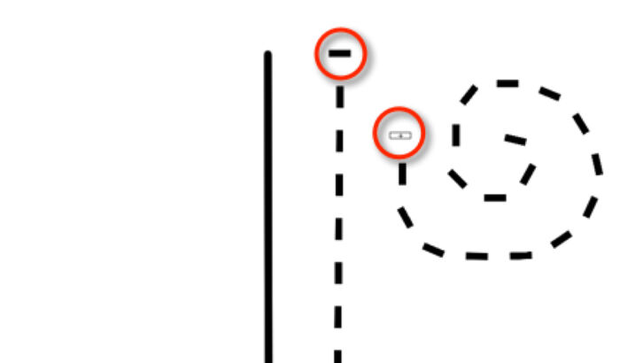
(10) Note that when you are drawing, hitting the screen once results in only a single horizontal segment, no matter what the direction is.
On the following screenshots we can make some observations about the three different ways of handling dashed lines. As always, before the artist starts a new project, it’s advised to make lots of observations and some careful planning about the features to be drawn. The artist shouldn’t be afraid to create custom brush types if it makes his/her work faster and/or more accurate.
Freehand dashed segments
Using eraser on continuous lines
Customized Square Brush
The following three epigraphic features (modeling, plaster, and damage) are by nature very different from the previously described elements. Lines, either carved or painted, can be treated with a single brush stroke (solid, dotted, or dashed), because they refer to a decorative element that we represent as an outline. However, there are some three-dimensional surface features that need to be represented by adding some texture as well. To be able to add texture to a drawing in Photoshop, the artist needs to learn how to use yet another tool.
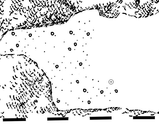
Modeling is indicated by a stippled area in which the variety in dot density adds a certain dimension to the texture. As with dotted paint lines and dashed architectural lines, the artist is free to add all the dots individually, and this is probably the easiest way to do so, especially when the area to be modeled is fairly small.
Modeling applied on bull's wrinkles
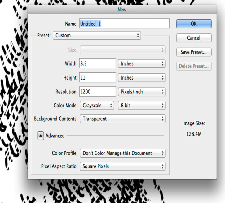
Nevertheless, there are cases when the artist has to add modeling to larger areas, such as large-scale figures, etc. Adding repetitive elements on the drawing can be made easy by defining patterns and using the Pattern Stamp tool to apply them. To set up a pattern one has to open a new canvas (File/New) and configure it to the same Resolution and Color Mode as the drawing he/she intends to use it on. Of course, the Size should be smaller; in our case 1x1cm is more than enough.
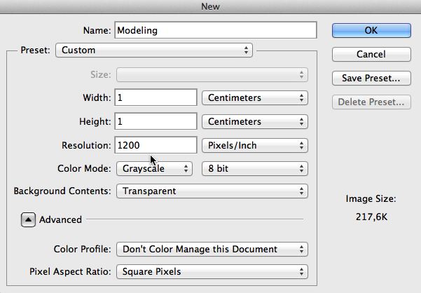
Setting up a new canvas for Modeling Pattern
When adding the modeling pattern digitally, first the artist has to cover the entire area with one light layer of dotted pattern (one should use a rather large Pattern Brush size).
---First%20(left)%20and%20second%20(right)%20layer-of-modeling-pattern-added-to-the-drawing.jpg)
KHF172 - (detail) - First (left) and second (right) layer of modeling pattern added to the drawing
Once the area to be modeled is covered with a layer of dots, the artist has to change his/her pattern brush to a smaller size and, by going over and over the darker areas, add some depth to the texture. Certainly, there is more than one way to provide satisfactory results when using patterns, and experimentation will be necessary.
Creating a Pattern for Modeling
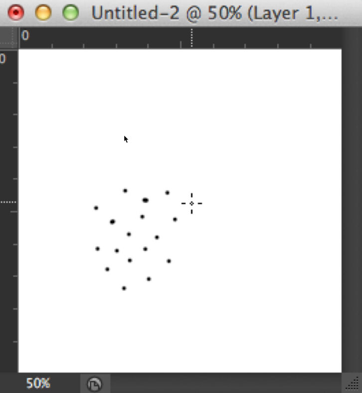
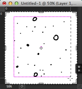
(1) Start painting dots on the canvas using the same brush size you would use for modeling. Keep a certain distance in between your dots, keeping in mind that your pattern needs to refer to the lightest parts of the modeled area. You don’t need to add too many dots.
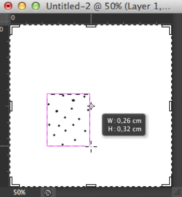
(2) Crop your canvas as small as possible around the dots. The easiest way to do so is by turning on Snap and Smart Guides.
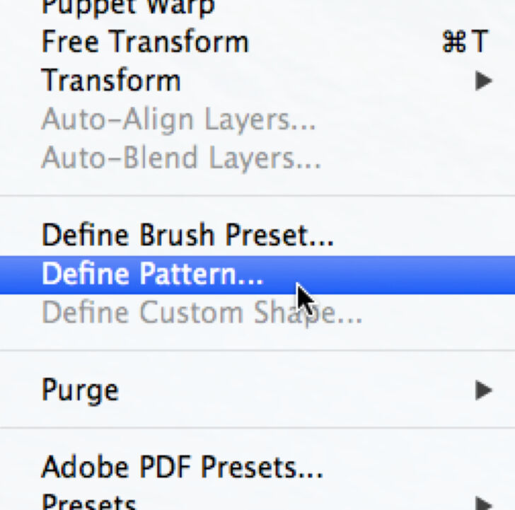
(3) Open Edit/Define Pattern and give your pattern a name. It can be called Modeling (or Modeling_1 if you have different variations).
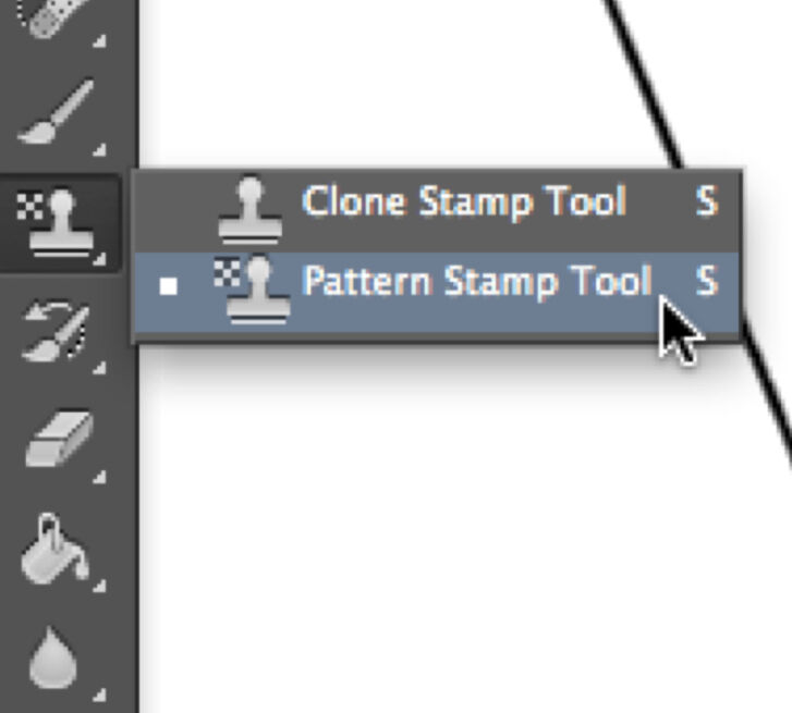
(4) Now your pattern is defined and, whenever you’d like to use it, all you have to do is hover over the Tools Bar and right click (secondary click) the Stamp tool. Choose Pattern Stamp tool.
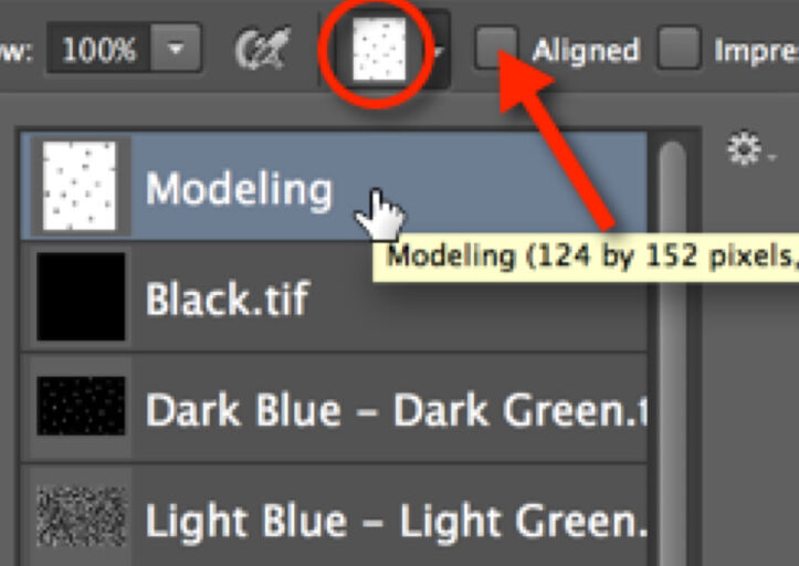
(5) Now find your pattern in the Pattern Tool Menu. Click on the Pattern drop-down window and pick the pattern for Modeling. (You’ll find your new pattern at the bottom of the list, but - as always - they can be rearranged, deleted, or modified by clicking on the cog sign.) Make sure Aligned is not checked, so instead of using your pattern in a grid, Photoshop generates a random arrangement of your pattern.
Drawing Plaster - Plaster, when it is inked, is indicated by a random pattern of dots and circles, where depth is emphasized by the density of these elements. Obviously, plaster can be added entirely by freehand and, again, it is advisable to do so when the artist is dealing with small areas. Setting up a Plaster Pattern might nevertheless prove useful when adding plaster to large parts of the drawing.
Plaster pattern including a variety of dots and circles
Creating a plaster pattern is fairly similar to setting up a modeling pattern, except that the artist has to be even more careful to not overdo the quantity of elements (i.e., dots and circles) when drawing the pattern sample. As a general rule, less is usually more; one has to think about the lightest possible occurrence of that particular texture when creating a certain pattern.
Adding a light layer of plaster pattern
When adding the plaster pattern digitally, the process starts with drawing a light layer of plaster over the entire area by using a fairly large pattern brush size. The artist has to keep in mind that drawing numerous separate strokes gives a more realistic result. One has to make sure that Aligned is unchecked in the Pattern Tool Menu.
Emphasizing darker areas by using Modeling Pattern
In the next step, the artist has to give some depth to the plastered area. It is advisable to use the already configured Modeling Pattern (to avoid the overwhelming presence of circles) for adding more dots over darker areas.
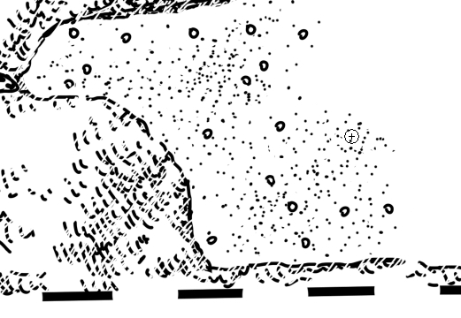
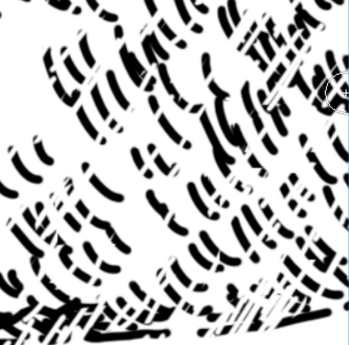
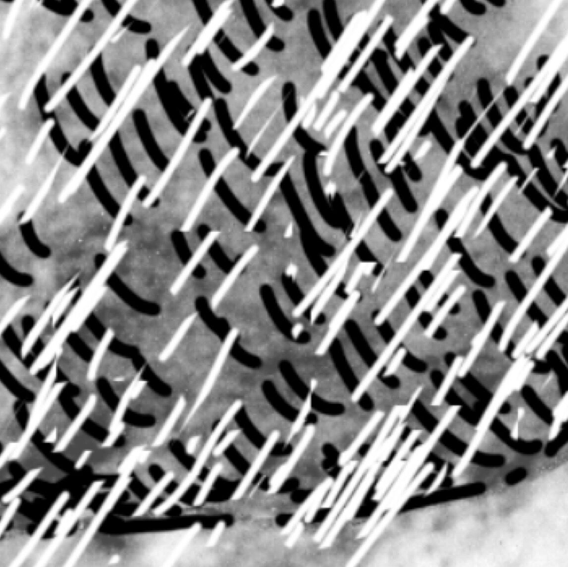
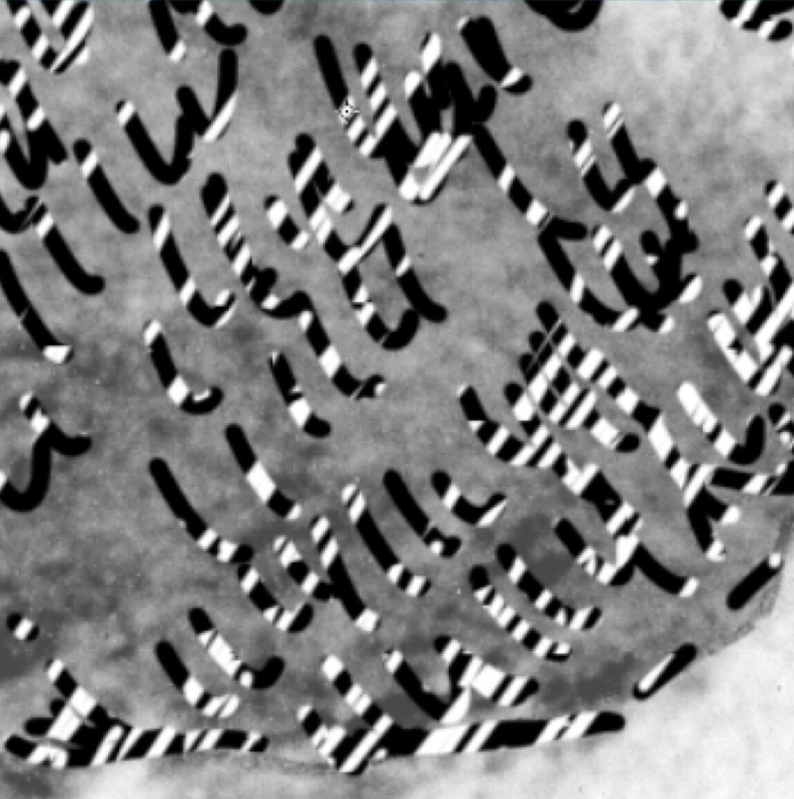
Inking Damage - Damage is the most complex surface texture the Epigraphic Survey artist has to indicate when inking an artwork. As discussed in Chapter 2, Section 4, it is traditionally shown with hatched inked lines. This inked pattern reflects the nature of the damaged surface captured on the photo enlargement. Because of the unique character of each damaged area to be inked, it is not possible to set up a unified pattern to represent it. The artist has to experiment with different zoom levels when inking different features. While an extremely zoomed-in view (200%) works much better for drawing decorative elements, zooming out (50%) proves to be more fruitful for adding textural elements, such as modeling, plaster, and damage. With a larger portion of the background image being visible at one time, one can have more control over texture consistency. Needless to say, scanned images tend to blur as we zoom in, making the individual features very difficult to see. The difference in zoom levels is shown here:
Damage Details at Different Zoom Levels
(1) Damage detail shown at 200%
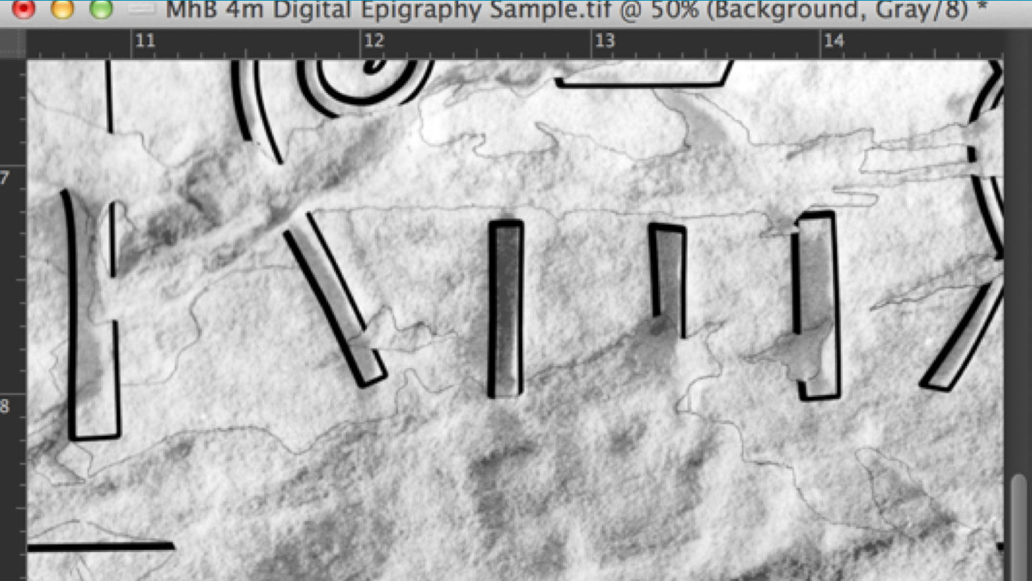
(2) Damage detail shown at 50%
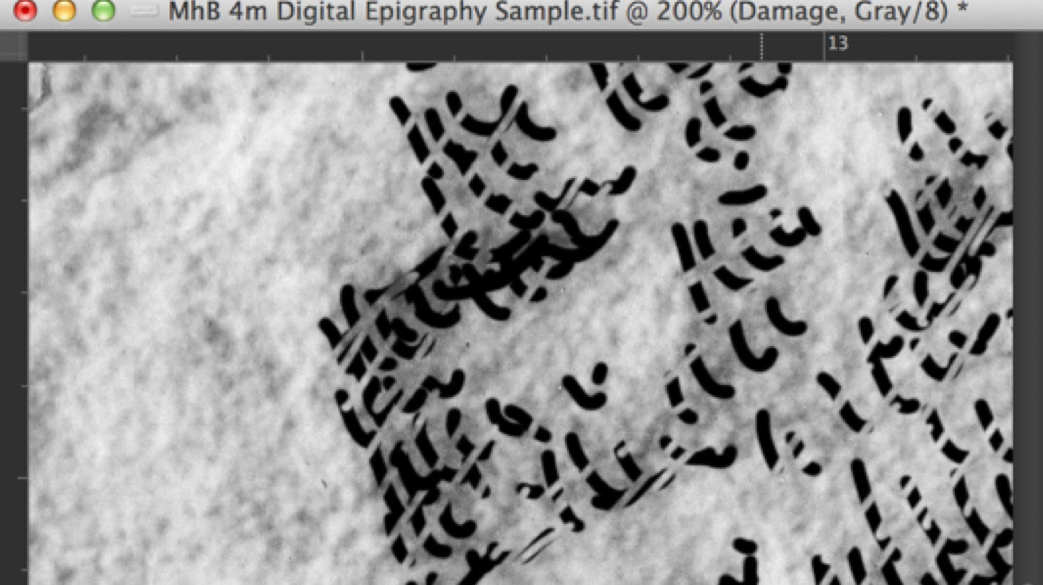
(3) Inked damage detail shown at 200%
(4) Inked damage detail shown at 50%
Although creating damage texture digitally cannot be automated, there is a certain part of the damage inking process wherein setting up a pattern proves useful. When inking on a photo enlargement, the scalpel is used as a final addition to “break” the damage lines. This treatment makes damage appear lighter in comparison to the solid lines used for carved details. In order to make our digitally inked drawings fit into the already existing corpus of Epigraphic Survey publications, we have to imitate the same effect digitally.
Once again there is the obvious method of applying a “digital scalpel” over painted lines, using the Eraser, except that using the Eraser tool to get this lighter effect takes a very long time. To speed up the process, one can set up a Scalpel Pattern and apply it over the inked lines the same way as he/she would do when modeling or drawing plaster. Although it acts like an eraser, we use a pattern based on white brush lines to accomplish our task:
Setting up a Digital Scalpel Pattern
(1) In a similar fashion to setting up all the previous patterns, open a new canvas, set the Resolution to 1200dpi, with Color Mode to grayscale.
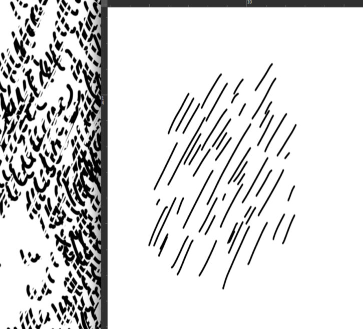
(2) Draw a few Brush Strokes with the same orientation as your scalpel would have. Add some variety in length.
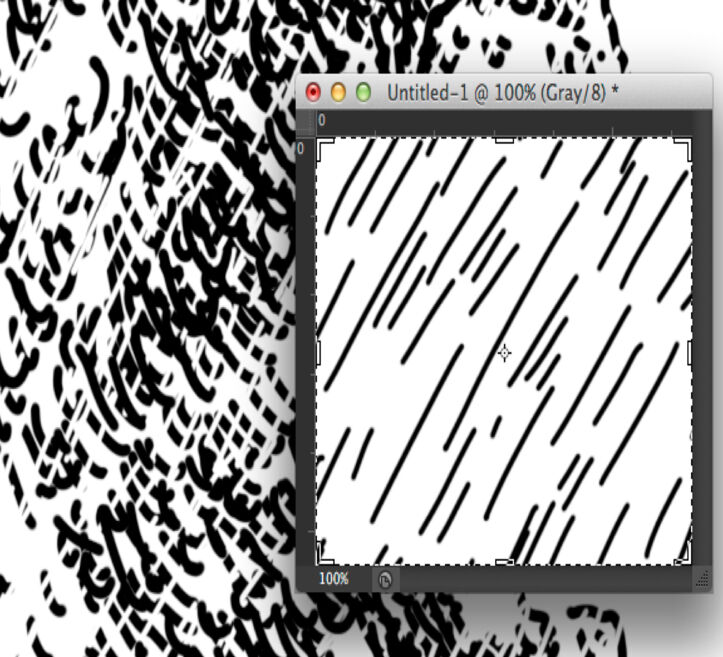
(3) Crop the area around your pattern in a way that no significant white space remains and the texture looks homogeneous.
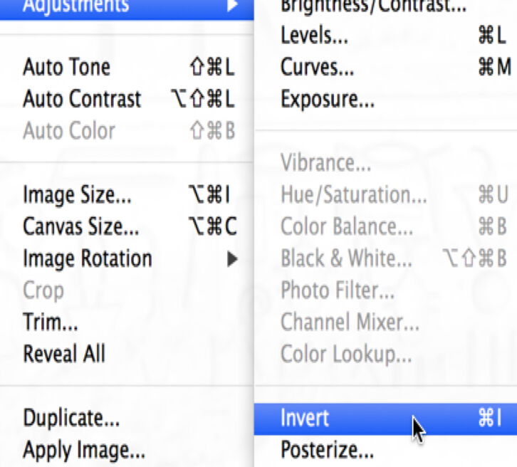
(4) Go to Image/Adjustments/Invert transform your black brush strokes to White. It turns your entire canvas white.
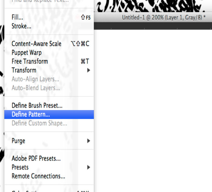
(5) Hit Edit/Define Pattern and set your new pattern up as Scalpel_1. (Try different patterns with slightly tweaked brush work.)
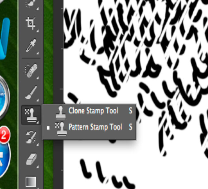
(6) Hover over the Tools Bar and hit right click (secondary click) at the Stamp tool. Choose Pattern Stamp tool.
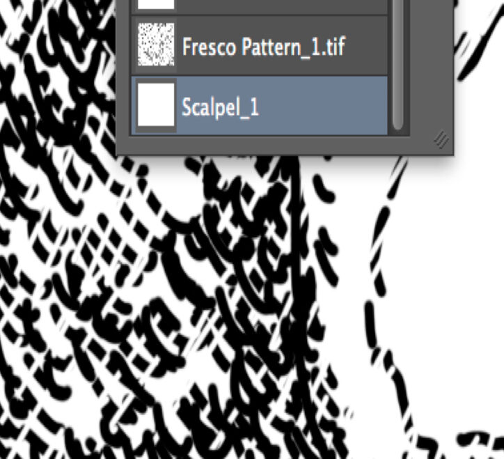
(7) Pick the Scalpel_1 pattern you want to use. Note that newly set patterns always end up at the bottom of the pattern list.
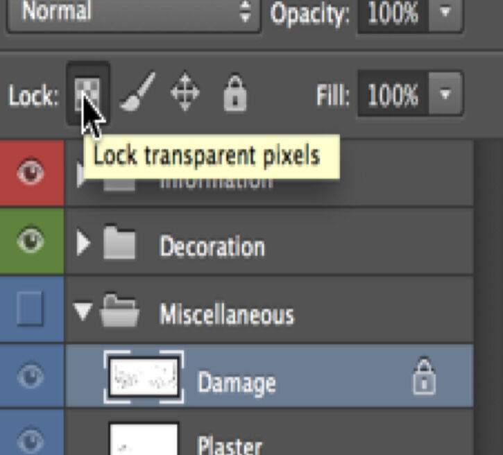
(8) Go to the Layers Panel, and with the Damage layer active, lock the transparent pixels by hitting the first tab on the Lock Menu.
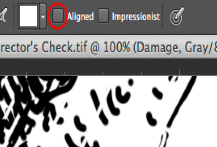
(9) Make sure Aligned is deactivated on the Tools Panel. Use the pattern by painting separate strokes over the damage.
As we can see on the tutorial panel, locking the transparent pixels on the damage layer is an important part of the process. This command prevents the brush from leaving brush strokes on the background. One would think it doesn’t matter, because we are using a white brush on a white background, but as soon as we make our background visible the difference becomes obvious:
Locking Transparent Pixels
(1) Final drawing
(2) Unlocked transparent pixels
(3) Locked transparent pixels
As demonstrated in this example, the artist has to be sure that he/she is in full control of every little modification applied on the surface, either visible or (in some cases) invisible. Changes in certain settings can cause a lot of trouble later on when further enhancements or modifications are added to the drawing. The artist has to experiment carefully with the features introduced in this chapter and be fully aware of the technical background behind each step.
Situations might occur when the artist, although seemingly following these guidelines, doesn’t get the desired result. In some cases, going back to an older version of one’s drawing and starting over seems to be the only solution. Saving the drawing before experimenting with new features is a good idea, especially for beginners. Once the scene is collated, adding modifications to the drawing is standard procedure; therefore, the artist should know how to change his/her drawing to apply these modifications.
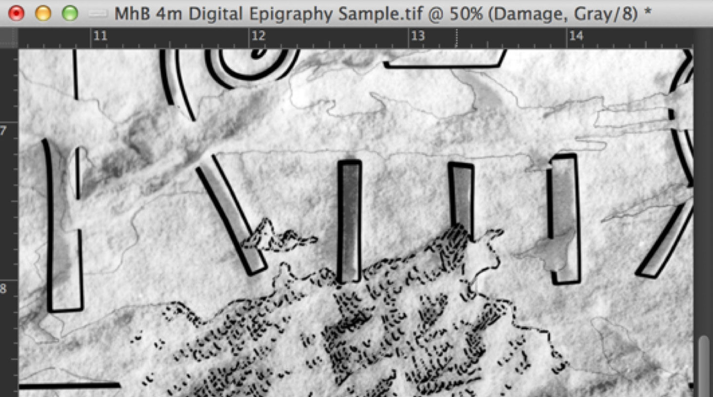
%20-%20Finished%20inked%20drawing%20with%20all%20the%20layers%20represented.jpg)
MHB 4m (detail) - Finished inked drawing with all the layers represented
In the next chapter we’ll have a look at how to make additional changes to our drawings, but first the artist has to know how to manage the huge amount of digital data that a single drawing project creates.
More Reading:
How to Make Your Own Custom Photoshop Brushes
Read More About Guides and Grids
A funny and very useful tutorial to master the Pen Tool in under 30 minutes
0 comment(s)
Leave a comment(We'll keep your email address private)