
Let's Talk About… …Sun and Shadow - A Fundamental Update on Drawing Drop Shadow Transitions in Photoshop
Written by Krisztián Vértes
How shadow affects the wall and the line drawing

(1) Background created for digital epigraphy using a large format camera with a CFV-50c digital back and strobe light (LD 177 detail, photo by Owen Murray)

(2) The same photograph in greyscale is used for digital penciling. The B&W environment enhances surface features, such as drop shadow

(3) Regular lighting conditions applied over RTI (Reflectance Transformation Imaging) produces a very similar output when no enhancements are applied (RTI model by Hilary McDonald)

(4) Sun and shadow areas become emphasized on raised relief in extreme raking light conditions (image generated from RTI model by Hilary McDonald)

(5) Line drawing superimposed over the color background photograph indicating how elements with various elevations are translated to the drawing

(6) The line drawing displays a range of different shadow line weights that are not necessarily reflecting the actual drop shadow appearing on the wall
In the next installment of the "Let's Talk About…" series, digitalEPIGRAPHY will put relief representation under the microscope. Relief (from the Latin relevo, to raise), by its definition, is a sculptural technique where the sculpted elements remain attached to a solid background of the same material. Typically, ancient Egyptian reliefs are either raised from (bas) or sunken into (en creux) the surface. Nonetheless, there is a whole range of variants to be found in between, with occasionally the two techniques combined within a single scene. In their physical existence, decorative elements carved in relief utilize the third dimension. Beginning with the first epigraphical efforts in Egypt, it has been a natural desire to capture this attribute on a sheet of paper with only two aspects: length and breadth.
To indicate the character of ancient Egyptian reliefs, the Epigraphic Survey has developed a set of scientific conventions supporting their two-dimensional representation. On paper, relief is characterized by an outline drawing of various line weights. In this artificial environment, the theoretical light source is placed at the upper left corner, raking the surface elements at a 45-degree angle. According to the Chicago House method, bas relief is drawn with thinner (sun) lines at the upper left and thicker (shadow) lines at the lower right side, with the conventions reversed for elements carved in sunk relief. The exact rulebook of representing carved features in a two-dimensional environment can be found (including numerous visual examples) in Chapter 2 of the Digital Epigraphy Manual.

Fundamental differences to be considered in representing raised and sunk relief in a two-dimensional environment (drawing by W. Raymond Johnson)
Raking light and its implementation to the line drawing
Traditionally, sun line is represented by a consistent line weight that is the equivalent of the 10 pixels solid black Hard Round Photoshop Brush, considering the Survey's predetermined 1200 dpi environment. While the same brush-width always indicates sun, the weight of shadow lines can be varied based on the presentation scale of the drawing or the relative importance and size of any given decorative element. Within a single scene, there can be a thin shadow brush applied on a hieroglyph's interior detail (16 pixels) and a regular shadow brush used on the same hieroglyph's contour (20 pixels). In comparison, the same 20-pixel shadow brush is applied to the central figure's interior details, with a much thicker shadow appearing over the figure's contour (28 pixels). Occasionally, even wider shadow brushes are determined to indicate certain architectural features (32 pixels), giving wall maps that are assembled from several individual drawings an even higher level of organization. The right application of these shadow line weights requires a lot of experience from the artist. However, even with the most outstanding care, finding the appropriate brush weights can be complex and prone to be adjusted several times during the epigraphic process.

Single-weight line drawing versus the sun-shadow system. Although time-consuming and hard to properly achieve, adding the illusion of shadow makes the drawing more "readable" (samples taken from the king's chamber at Luxor Temple)
It is also important to emphasize that the Survey's sun-shadow system is an artificially created classification. Although rooted in the physical appearance of the actual carved elements, it is by no means the exact derivative of the relief's realistic projection onto the wall. Due to the standard techniques applied to relief carving (either in sunk or raised form), a small hieroglyph often provides the same drop shadow thickness on the wall as a much more prominent central figure. When the central figure was the subject of atenist damnatio memoriae, it was often restored in ancient times. In some instances, its reestablished contour ends up being "scooped out" of the background providing mere incisions on the surface with no drop shadow at all. As long as we're on the subject of carving, we must also mention the deep Ramesside cuts applied in sunk relief, emphasizing certain hieroglyphs or parts of hieroglyphs. Occasionally, these "sculpted" areas can be so deep that the natural drop shadow fills the entire hieroglyph, creating an effect as if the whole sign was filled with black. This tradition was perfected to the extreme in Ptolemaic times, extending the impact to figures as well. Although favored by some publishers, the Survey has always avoided deeply sunk decorative elements (with one of the best examples being the sun disc) to be represented as solid black shapes.

Potentially problematic sun-shadow areas on a Ramesside inscription carved in sunk relief with various depth (the Small Amun Temple at Medinet Habu, Annex R, North Wall – detail photograph by Owen Murray)
It would be natural to think that adding the relevant shadow lines can be straightforward once the line weight issue is resolved. On the physical surface, raking light (a bright light, usually beamed obliquely) is used to reveal such features as texture and detail. Once captured on a crisp, high-resolution photograph that is ortho-rectified, it provides the perfect guide to where those thicker brush strokes should be employed. However, placing the relevant sun-shadow transitions on a line drawing is a little more complicated since – as we've seen above - the sun-shadow system developed by the Survey doesn't always mirror the drop shadow on the wall. One of the best examples in this regard is the water sign "n," which often loses all its projected shadow at the bottom due to the angle of the carving. When represented on a line drawing, this effect is overruled in favor of the better understanding of the actual shape, temporarily moving the light source off from the 45-degree angle (to a more horizontal-like raking position). One can find a whole set of similar corrections made to the drawing below:

Regular 45-degree drop shadow (always on the left) compared to the Survey's flexible "artificial" shadow lines (always on the right)
1.Automatically generated sun-shadow transitions
For obvious reasons, in the traditional sense of creating line drawings, the artist must use a set of different brushes, constantly applying the relevant line weights and adding to or trimming off the strokes to get the desired transitions. Drawing every single sun-shadow alteration freehand is hugely time-consuming and gets tedious at times, especially when crafting long gentle curves; just think of the deshret crown as an example.
However, when "inking" digitally, there are several aids that can be utilized to provide the ideal sun-shadow transitions that apply to a particular type of relief. For evaluation purposes and specific use cases, we'd like to quickly show you how to generate 45-degree drop shadows in Photoshop by casting an offset shadow behind an object to indicate that the object is hovering above the background in 3D space. This effect has two variables to be set: the position of the light source (the projection's relative orientation on the wall) and the elevation of the carving (shadow line width). Adding an automated shadow line to a line drawing can be achieved in these basic steps:

A step-by-step guide to generating artificial shadow lines to a line drawing
- Naturally, the first step is to create the actual line drawing using even strokes (sun) for the entire composition. It is essential to consider where the thicker shadow lines will be positioned. When dealing with auto-generated drop shadows, the effect always thickens the sun line by adding pixels to the right. To avoid creating overly thin sunk relief elements or – the opposite – excessively thick raised elements, one must place the future shadow segments off-centered to the pencil lines.
- When the drawing is ready, we must go to Layer/Layer Style/Drop Shadow to open the Layer Style panel's Drop Shadow segment.
- There are a few settings to be taken care of here, keeping in mind that what we set up for shadows will affect every brush stroke on the layer. One must make sure the Blend Mode is set to Multiply (to darken the layer behind it), the shadow's color is black, the Opacity is at 100%, and the angle is at 135 degrees (which produces the illusion of a 45-degree rake coming from the upper left corner). Distance depends on how many pixels must be added to get the correct shadow weight. Since the sun is 10 pixels wide and the general shadow weight is 20 pixels, the simple math would suggest adding 10 extra pixels to our line drawing. However, nothing is ever straightforward, as 10 extra pixels produce an overly thin shadow line due to how automated pixel shifting works. We recommend experimenting with adding 15 pixels to get the right outcome.
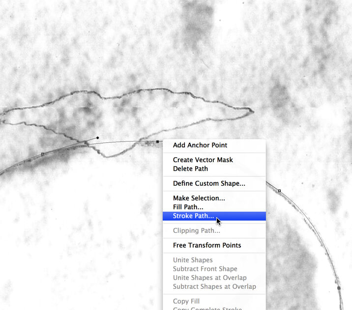
- Once the illusion of shadow is created, it needs to be masked over certain areas to create the 3D effect of the relief. To do so, one must turn the Drop Shadow Layer Effect into an actual layer by right-clicking (CTRL + click on the Mac) over the little fx sign on the Layers panel and choosing Create layer.
- Now is the time to delete unnecessary shadow line segments and initiate more prominent shadow shifts (creating thicker shadow lines for figures etc.) by selecting areas to be dealt with independently.
- By adding the "trimming" effect at the end, our automated shadow lines can look quite relevant, assuming the decorative scene is not too complex in its design. This method works best for simple shapes, such as hieroglyphs.
2.Drawing sun-shadow transitions freehand
On the other end of the spectrum stands freehand drawing, which is still the most obvious value of working with Photoshop in a raster environment (and has the most respect for the ancient craftsmen's efforts). Interestingly, digital freehand drawing has the exact opposite strengths and shortcomings compared to using Rapidograph pen on a reduced scale print photograph. Crafting long, curved sun-shadow transitions on paper is usually easy to accomplish, especially with the added benefit of using French curves. However, the same task becomes difficult in Photoshop, where one works with a magnified segment of the canvas, with the sun-shadow transition often exceeding the visible screen area. Additionally, freehand brush strokes are hard to "tame" on a digital canvas, with even our best efforts often resulting in wiggly, disjointed curvatures. Drawing a long, curved usekh-collar when trying to master a beautiful sun-shadow transition entirely freehand, is probably not the best way to proceed.

Inking small scale cartouches with lots of sun-shadow transitions in a relatively small space can benefit tremendously from working in a digital environment (freehand drawing with Rapidograph pen on the left and freehand digital drawing on the right)
On the other hand, drawing freehand in a digital environment has benefits for small, detailed decorative features. Everybody who has ever inked a kheper-beetle or ms-sign at 1:4 using India ink knows how hard it is to get the correct curvatures and sun-shadow alterations over such a tight space. What takes hours to craft on paper usually takes a few minutes in Photoshop, thanks to the ability to zoom in and make instant corrections. Nonetheless, we wouldn't have developed our version of digital epigraphy if it weren't for a whole range of other toolscoming to our aid when perfecting line drawings.
3.Freehand drawing with Brushstroke Smoothing
Over the past two years, digitalEPIGRAPHY has given plenty of praise to a particular Photoshop feature, always orienting people to try and experiment with Adobe's native brushstroke stabilization. Once PC and Mac users could only use 3rd party tools, such as Lazy Nezumi (PC) and Hej Stylus (Mac), to achieve the sense of "digital French curves" when creating line drawings. While these are fantastic solutions by any means, applying the same effect became tremendously easy in Adobe CC 2018, with the introduction of Brushstroke Smoothing. Fully customizable and controllable line stabilization gives the artist a rock-steady hand during the inking process, resulting in much smoother sun-shadow transitions when drawing freehand. Multiple versions of the same brush can be saved with and without this artificial line support, making switching between gently building up sun-shadow conversions (smoothing on) and adding minor corrections on the spot (smoothing off) a breeze.

The level of Brush Smoothing can be adjusted between 0-100 percent or completely turned off in Brush Settings
4.Perfecting sun and shadow with the aid of vector guides
The Pen Tool is one of the few available Photoshop tools that works with vector graphics as opposed to raster. Using the Pen Tool, one can create lines and smooth curves adaptable to any desired shape, with their direction and angle determined by an array of anchor points that lie along the path. The digital inking method developed by the Survey utilizes these paths to determine the exact track whereon the brush stroke is placed in its most basic use. A detailed description of how and when it is advised to use vector paths in Photoshop is provided in the Digital Epigraphy Manual. The Pen Tool is a versatile tool, however adjusting paths laid over complex curvatures – again – can be a cumbersome way to achieve sun-shadow transitions, which has, unfortunately, not much to do with the art of drawing.
Adding Transitions by Moving the Path
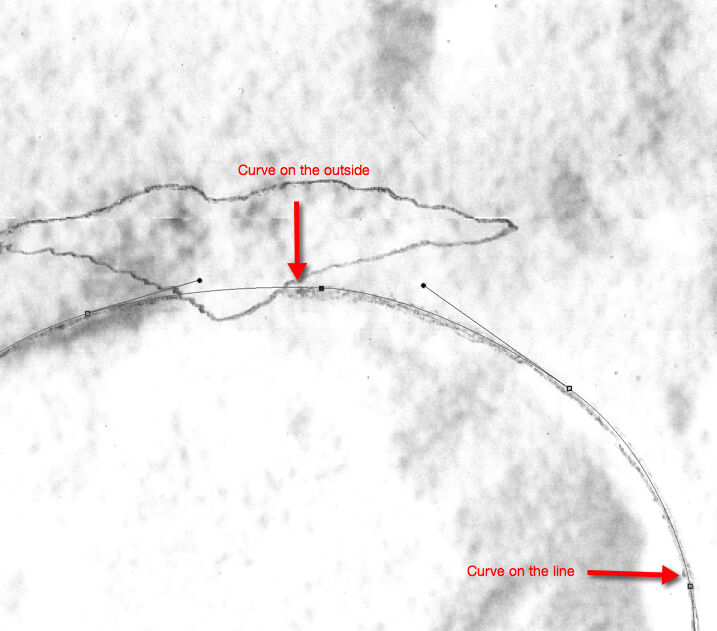
(1) Add your path in a way that reflects where you want to place your final brush stroke. Note that adding shadow lines to sunk relief requires placing your path slightly on the outside of your guideline, so you can build inwards.
(2) Stroke your path with the sun line brush weight (10 pixels), and note that even the shadow line areas get the sun line width first. This brush stroke represents the outside of your inked line, so make sure its curvature is accurate.
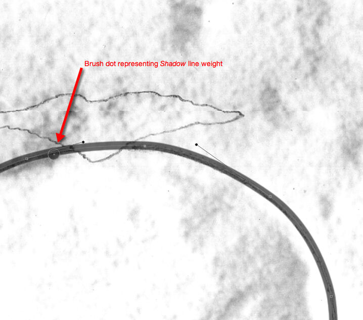
(3) Change your brush size to shadow line weight (16 or 20 accordingly) and add a dot which would represent the actual shadow thickness and shows you how much you have to move your path to get the desired thickness.
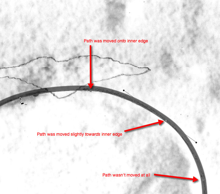
(4) Move your path according to the sun-shadow transition. Note that the path needs to be moved more wherever you want to have full shadow and less (or not at all) where you want to have your transition.
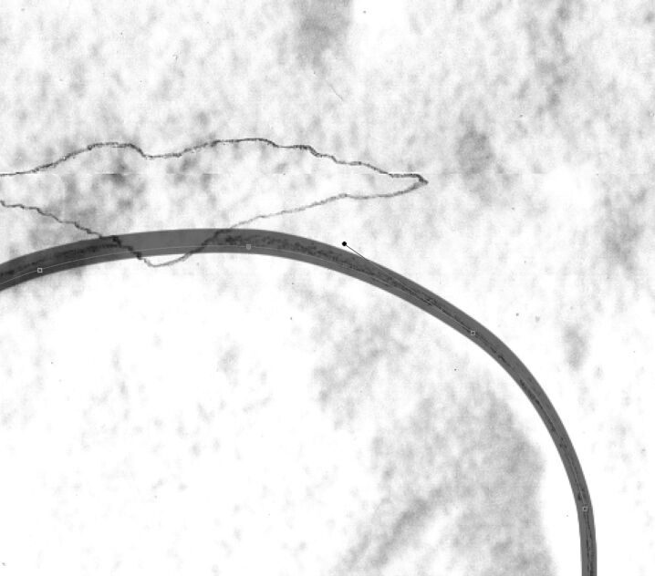
(5) Repeat the second step and add a sun line weight (10) brush stroke to your new path. Don’t forget to change the brush thickness back to sun line! Note that the width doesn’t change on the areas where the path wasn’t moved.
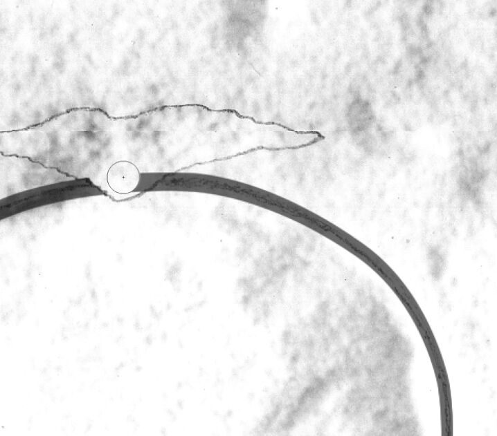
(6) Delete the damaged areas and, once everything looks as desired, delete your path as well. Adding entire features and deleting the missing parts later is a lot easier than dealing with sections, especially when drawing sun-shadow transitions.
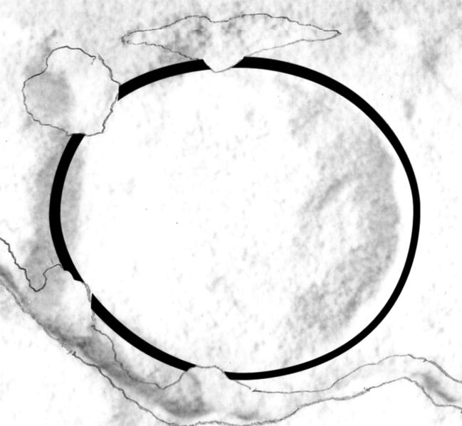
(7) The final inked circle with the transparency changed back to 100%. Unevenness in transitions can be corrected manually by using very thin brush strokes and the eraser.
Despite its time-consuming application, the Pen Tool remains one of the cornerstones of the digital inking method developed by the Epigraphic Survey. Luckily, when Photoshop 18 (part of the Adobe CC Photography Plan) was released in October 2017, one of its outstanding features was the addition of the Curvature Pen tool. Curvature Pen adds a great deal of automation to laying paths, deeply simplifying creating sun-shadow transitions. With the Curvature Pen tool, one can push and pull segments directly instead of modifying Bezier handles, not dissimilarly to the Curvature Tool in Adobe Illustrator CC. Although these streamlined paths don't always behave as one would want them to, adding extra anchor points within the course usually helps to stay on track with our curves. Nonetheless, as a rule, one must keep in mind that fewer anchor points mean less pain when shifting the path to the proper position to create the illusion of shadow. To fully master the tool, we recommend practicing how paths are navigated (moved, angled, locked, selected, saved, etc.) and how pixel brushes appear when stroked over vector lines.
5.Sun-shadow transitions drawn by offsetting sun/pencil lines
![]()
Automating sun-shadow by pixel-shifting can only be rewarding when applied with great care.
This method is basically a more flexible version of the automated transitions described at the beginning. Fully programmed drop shadow affects the entire layer; therefore, it implies a lot of post-processing to adjust the results. On the other hand, selecting specific segments and shifting only the relevant pixels can be much more rewarding at times, especially on drawings with complex scenery and lots of internal details. In the example above, a t-loaf in raised relief is created by selecting the loaf (drawn by a single weight Sun brush), duplicating the selected pixels (right-click on the selection and pick Layer Via Copy), shifting the new layer diagonally, deleting the irrelevant portions and finally trimming the corners accordingly. As you can see, using this technique involves masking/deleting the segments that are invisible to create the illusion of drop shadow.
Applying the pixel-shifting technique becomes more involved when adding shadow to the complex hieroglyph of a soldier with bow and quiver. Although the sign we used in this sample is carved in sunk relief, it has a few internal details carved in raised relief. To get the desired shadows, we must create two copies on two additional layers, moving each diagonally offsetting in opposite directions to create the illusion of shadow. Setting various temporary opacity levels to differentiate these shadow layers help "cleaning up" the many irrelevant line segments afterward. Just like with the other methods described in this article, one must make sure it's worth the effort using a particular technique before applying one.
![]()
Offsetting the entire Pencil Layer gives a clickable aid to the artist whenever testing shadow positioning is necessary
Finally, offsetting certain parts of the drawing has a much less destructive variant, namely when a drop shadow effect is used on the original "pencil" layer. As can be seen throughout these examples, we always prefer providing non-destructive guides instead of digitally altering existing brush strokes. Applying the Drop Shadow on the pencil layer creates an effect that can appear and disappear with a click of a button; being called up only when monitoring sun-shadow transitions is necessary. It functions as the digital equivalent of a triangle ruler, if you will, as it can be moved pixel-by-pixel as necessary, indicating the ideal sun-shadow transition points and extensions.
6.Drawing transitions using Shape Dynamics

The Epigraphic Survey's new sun-shadow brushes designed for 1200 dpi environment come in three sizes (Full, Medium, and Fine) to be suitable for a wide range of use cases
To complete our roundup of the various ways sun-shadow transitions can be executed in Photoshop, we must mention the Survey's new Sun-Shadow Brushes. These recently introduced "special" brushes are designed to start at a certain pixel-width and gently fade out as the brush stroke is performed. Naturally, not all sun-shadow transitions are equal; therefore, several variants of Sun-Shadow brushes were designed to cover a wide range of possible conversions. If fully mastered, the new brushes can eliminate many of the drawbacks of automated methods while managing to result in more natural curves than path-based techniques. Constant development in this area doesn't mean that one should trust and use only the latest inventions. On the other hand, specific techniques' complexity shouldn't alienate the artist to eliminate these aids from his/her repertoire altogether. In the video tutorial below, we applied a combination of these methods to present a digital inking scenario focusing on the above solutions.
How much is too much when it comes to perfecting shadow lines?
.jpg)
Traditionally (left) versus digitally (right) inked drawing segments showing a significant difference in line quality when "put under the microscope"
Using either of the above methods should depend on the scene's complexity and personal preference, while not being dragged down by overly perfecting transitions. For decades the Survey created their publications mostly at 1:4. By utilizing a digital environment, the option to inspect drawings at a much larger scale became a reality, a feature that is both a blessing and a curse.
When zooming in, one should always bear in mind that what looks like a less skillfully executed sun-shadow transition on a magnified digital canvas might still appear "just fine" when printed at a scale.
When looking at the final prints, much of the effort in perfecting digital line drawings seems overkill. However, the Survey's digital method is developed with one eye always on the future. As we start exploring the possibilities of high-resolution digital publication, seemingly irrelevant details become necessary, including the never-ceasing desire to upgrade line quality and sun-shadow transitions.

Digitally inked line drawing sample implying various sun-shadow transitions, printed at the Survey's standard 1:4 scale

2 comment(s)
Clipping Next
May 7, 2021Got lot of information on Drawing Drop Shadow Transitions in Photoshop. Thanks for sharing the nice resources...........

May 10, 2021You're welcome, I am glad to read that you found the article useful! Keep reading digitalEPIGRAPHY, best, Krisztián Vértes
Lula E Finch
Oct 6, 2021Such an amazing article. Great share. Thank you. Loved it very helpful.
Leave a comment(We'll keep your email address private)