
Tidbits of the digital Chicago method Part 2 - Creating and applying a plaster template for digital inking
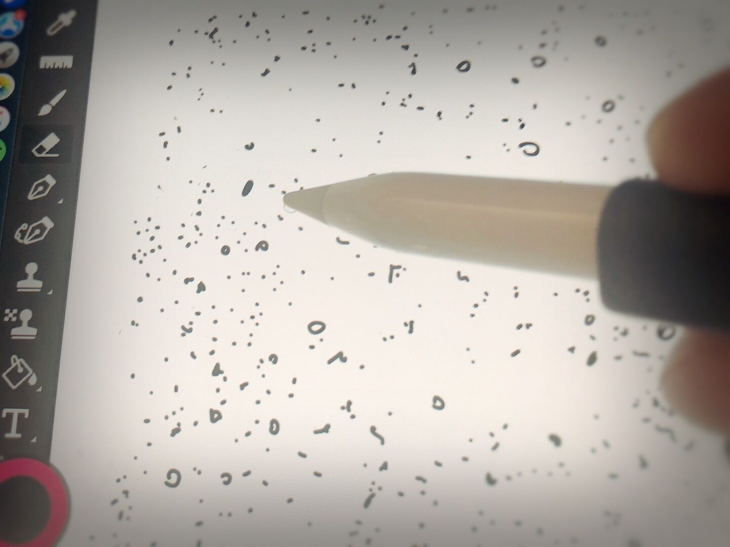
In this second tutorial discussing nuances that are specific to the digital iterations of the Chicago method, we’d like to debate over yet another peculiar surface treatment, the representation of areas obscured by plaster (you can find our previous tutorial about digital damage representation here.) Although including plaster surface on an inked drawing may seem like an even more questionable decision than indicating damage, the Epigraphic Survey enumerates many examples in their drawing conventions when registering such data might have research value for us. According to these guidelines, the Survey’s plaster convention is rendered as widely spaced dots and small open circles placed at random (reflecting the actual visual appearance of the material), using a trace weight pen (6x0/.13) in an outlined area where it obscures the carved decorative surface. In our standard 1200 dpi inking environment the digital equivalent of this Rapidograph line weight is the 6/7 pixels solid ink brush, of which the thinner is used for outlining the plastered area, while the thicker is applied for creating the plaster texture.
.jpg)
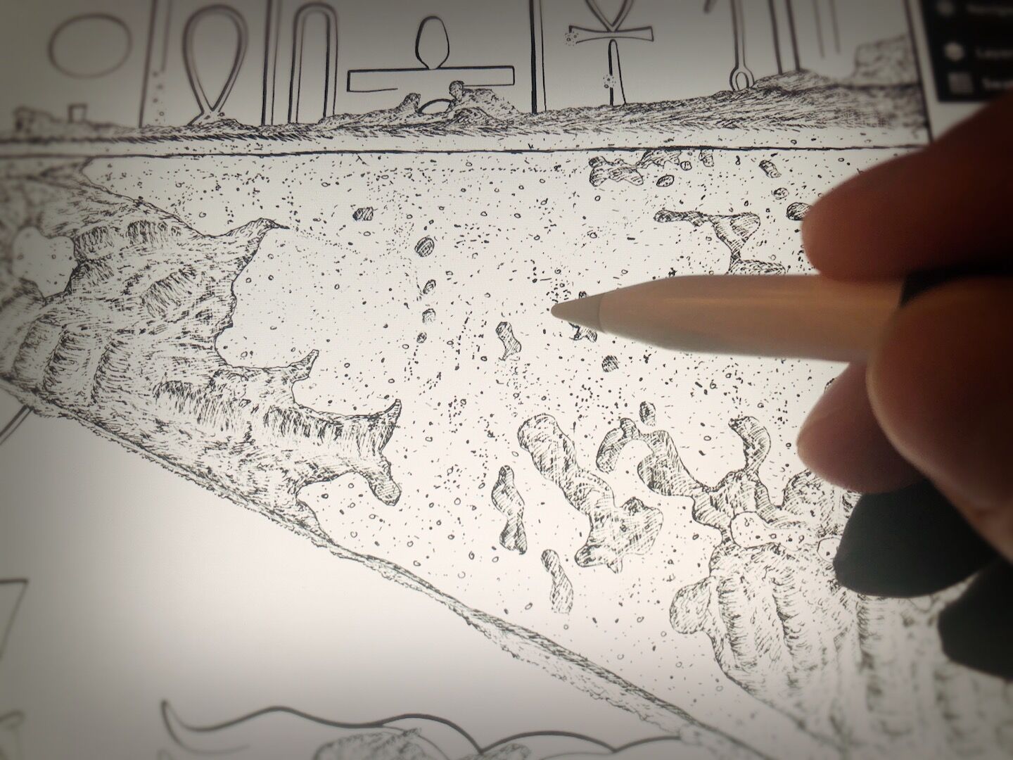
Plastered surface indicated by Rapidograph pen on photo enlargement in accordance with the Chicago method (Medinet Habu, Small Amun temple, detail, drawing by M. de Jong).
One would think that adding plaster texture (regardless its traditional or digital nature) over a photographic background is a more straightforward and somewhat more simplified affair than dealing with complex damage patterns. However, although indicating plaster used to be a less nuanced process in the past, over the last few decades its visual representation has become more and more reflective to the actual 3D surface. We quickly realized that we can’t apply the same procedure that we used to craft our digital damage when creating the digital equivalent of plaster texture. Applying a plaster pattern that is based on a direct copy of a traditional plaster section (with its circles and dots evenly distributed) results in a rather standardized surface, while repetitive use of this texture over the same area creates an overly busy and confusing pattern. At the end, our first digital patterns appeared much darker than their handmade equivalents, while the artists constantly struggled to have even minimal control over the details.
.jpg)
After a brief hiatus in having a true digital plaster pattern, in our second attempt we decided to design two separate textures to create a more flexible solution. The first texture was a relatively light version of the previous plaster texture. The second version was a derivative of the first, where all the circles were erased and more dots were added. The first served as a general plaster background for the rough layout of the plastered area, while the second added all the details relevant to the actual surface. The combination of these two patterns, with the occasional addition of some freehand drawings over sensitive areas, finally gave us the desired result while still saving a tremendous amount of time on large surfaces. Below, you’ll find the step-by-step tutorial regarding how the two patterns were created:
(1) Digital plaster pattern, just like any digital pattern we create, must be based on a hand-made counterpart (in our case a traditional Rapidograph pen-on-paper section drawn by M. de Jong).
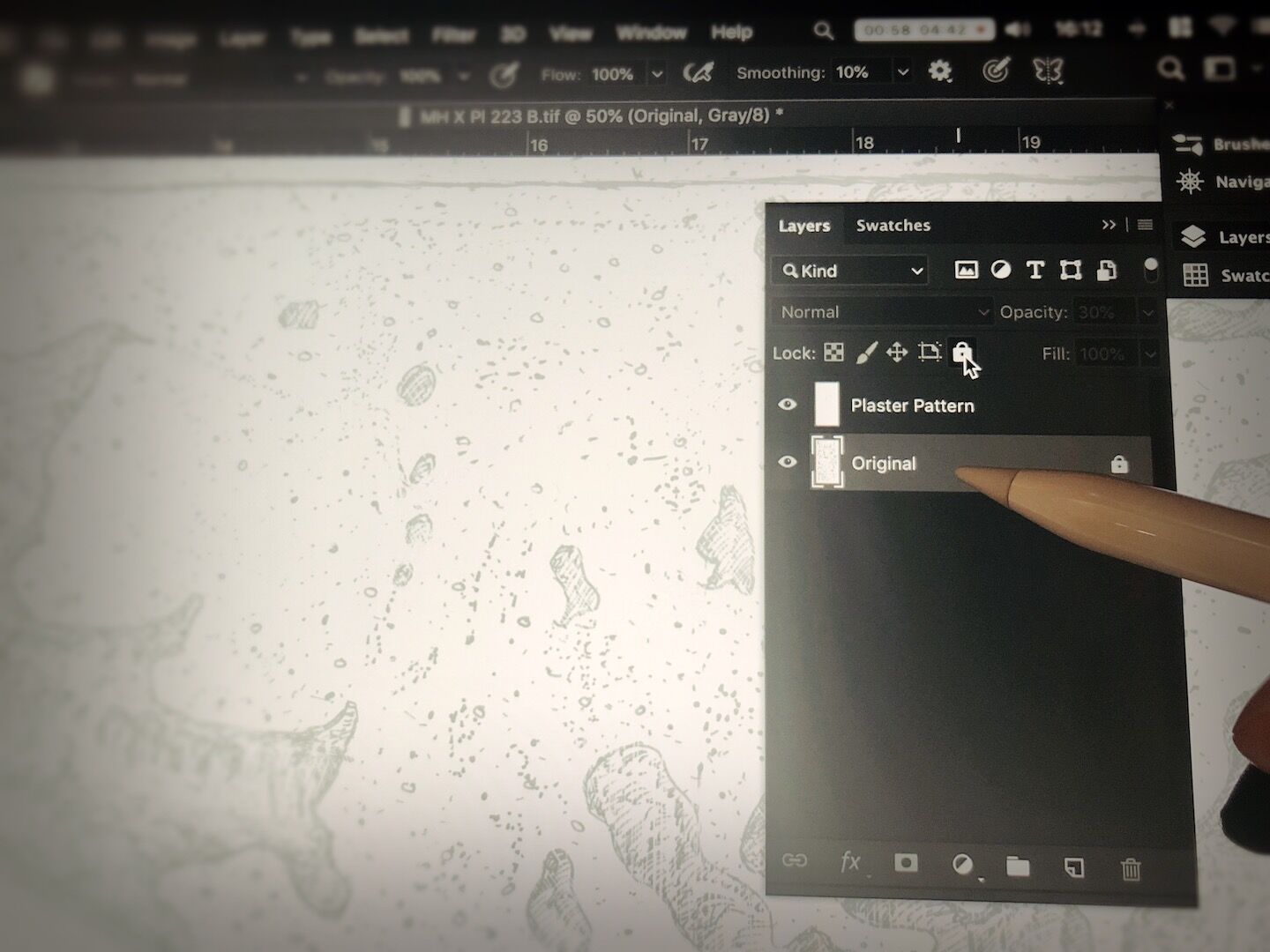
(2) Once our sample is scanned at 1200 dpi, its opacity needs to be lowered (to about 30%), while its digital complementary version is drawn on a separate layer.
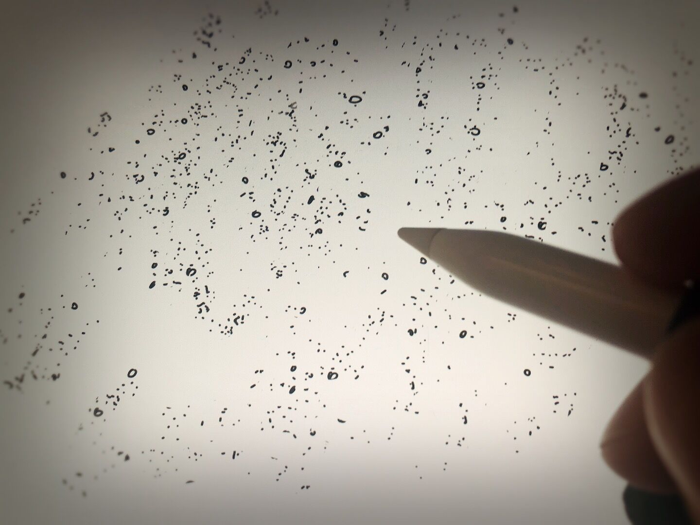
(3) A rectangular section needs to be created by faithfully copying the sample. Any gaps and blank areas of the original needs to be filled with dots and circles using the plaster brush (7px solid brush).
(4) Once we copied a large enough digital sample area in a satisfying manner, we must make sure that the original layer is hidden before creating the pattern.
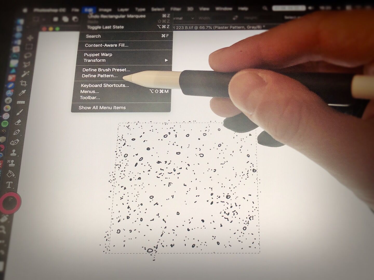
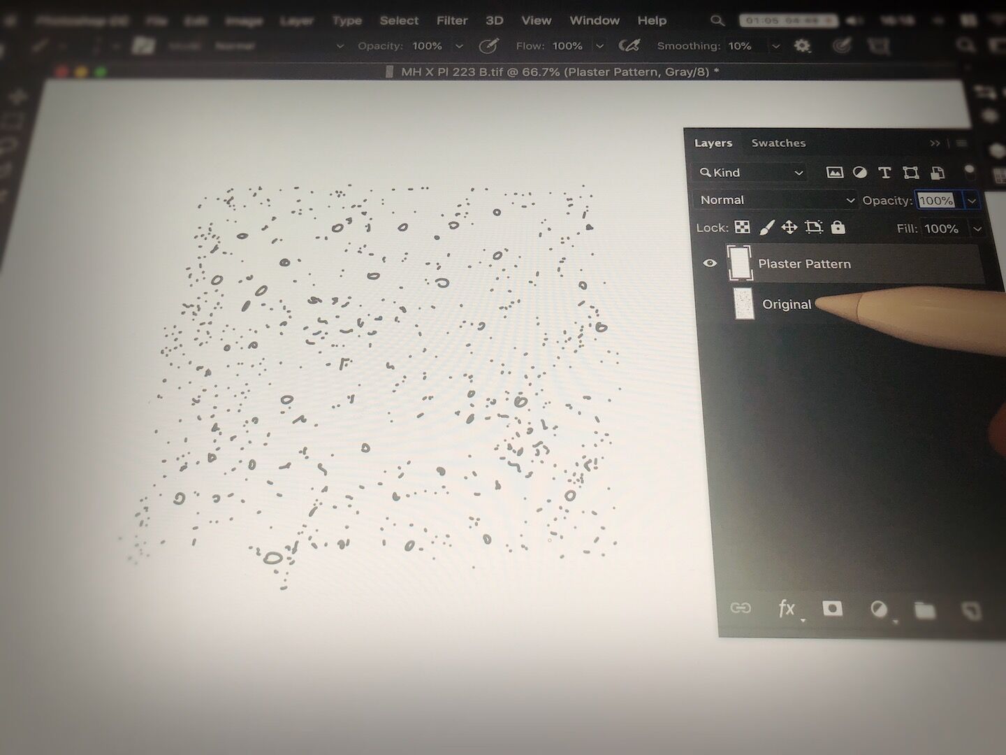
(5) A rectangular area of the digital plaster texture that will become the base of the pattern must be selected. The boundaries of the selection must be within the texture area to avoid blank areas when applied.
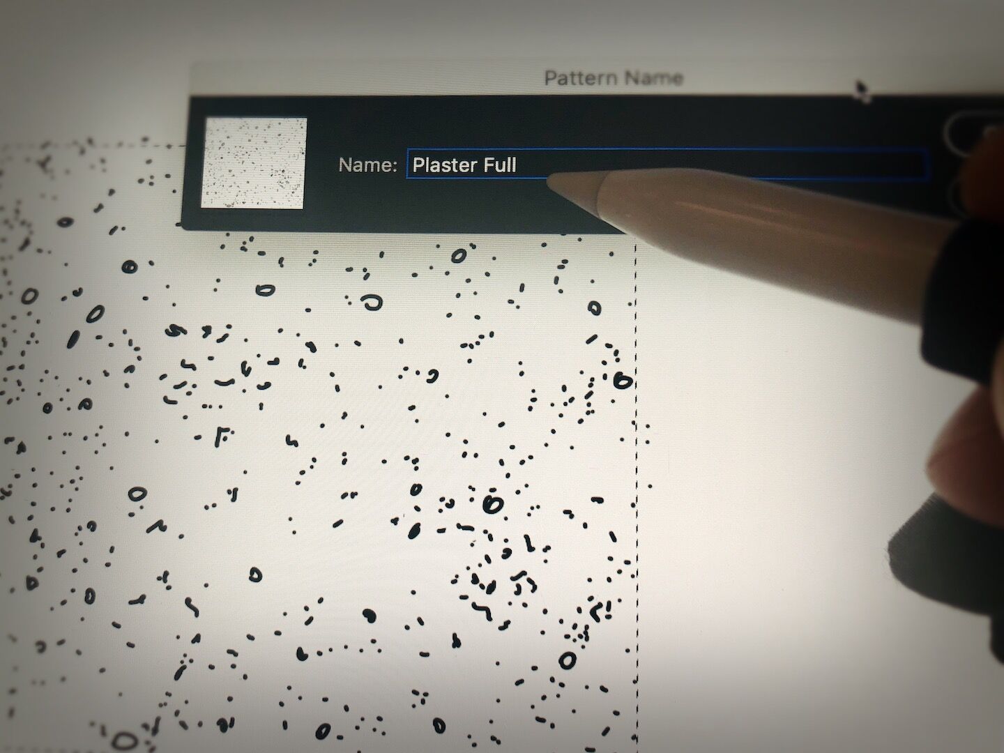
(6) Our new pattern is created by clicking on Edit/Define Pattern and named as Plaster Full. One must make sure that the layer and brush stroke the pattern is based on are both at 100% opacity.
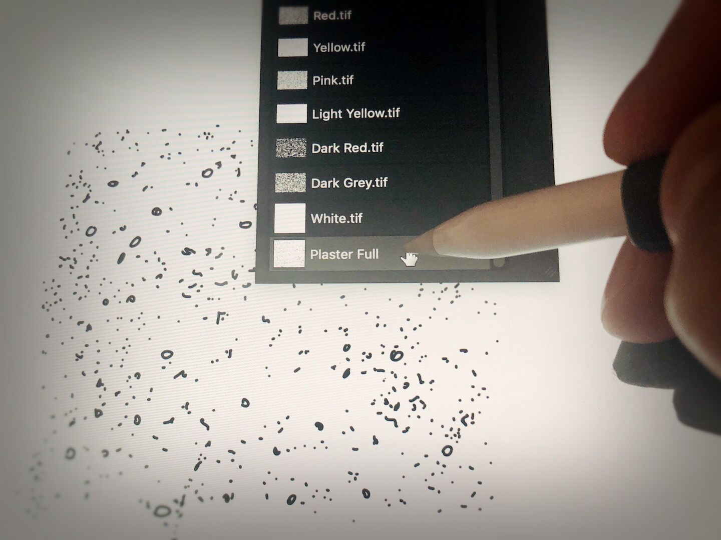
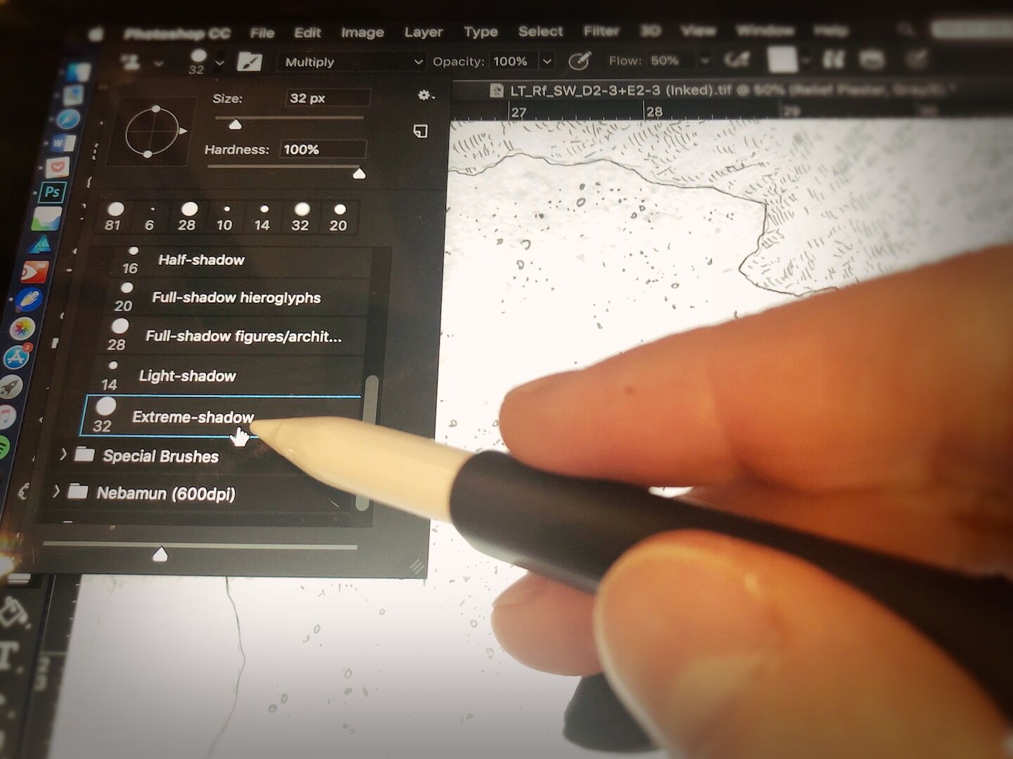
(7) The newly created pattern can be found at the bottom of our pattern list. If you’d like to move it to the top or edit your pattern order, you can do so in the Pattern Preset Manager.
(8) Next, we are ready to try out the new plaster pattern. One must disable “use same offset for each stroke” to be able to apply the pattern repeatedly over the same area.
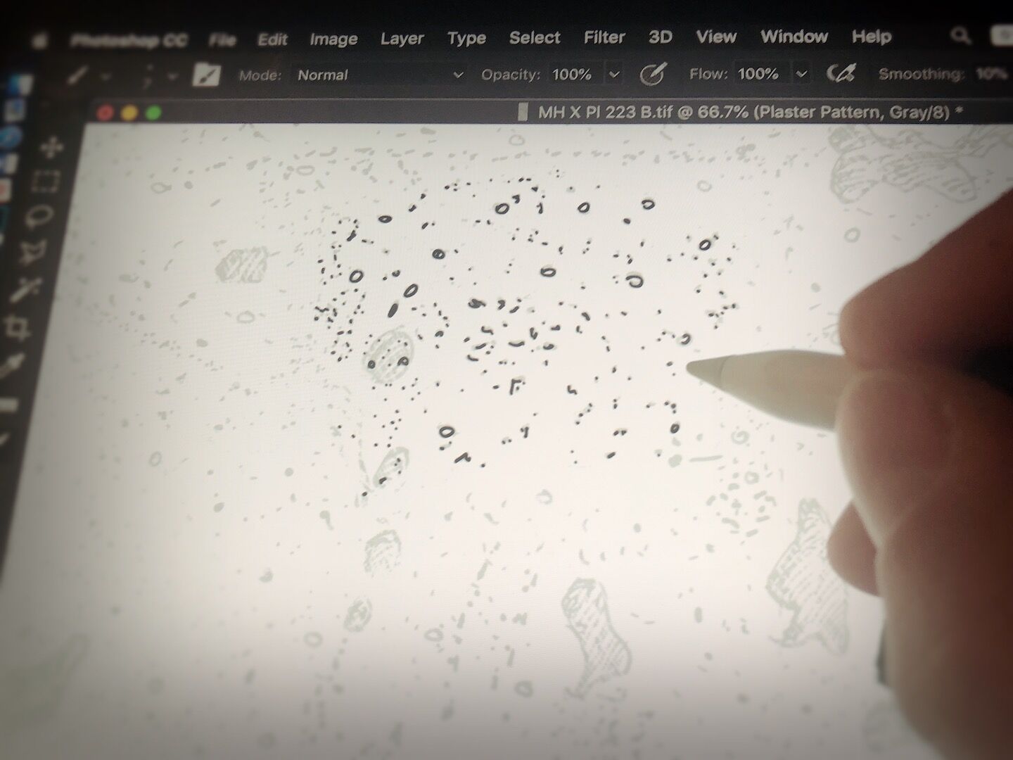
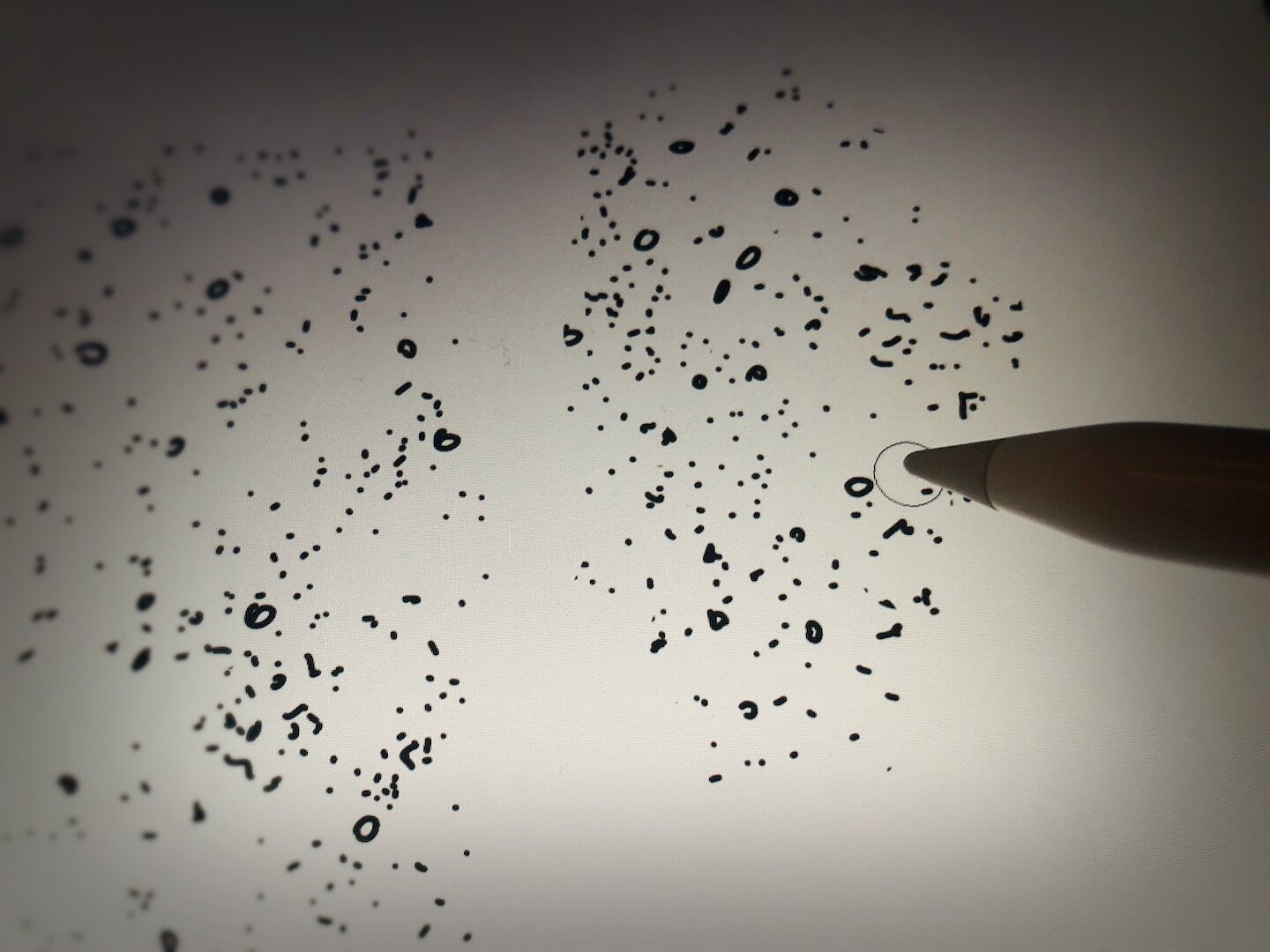
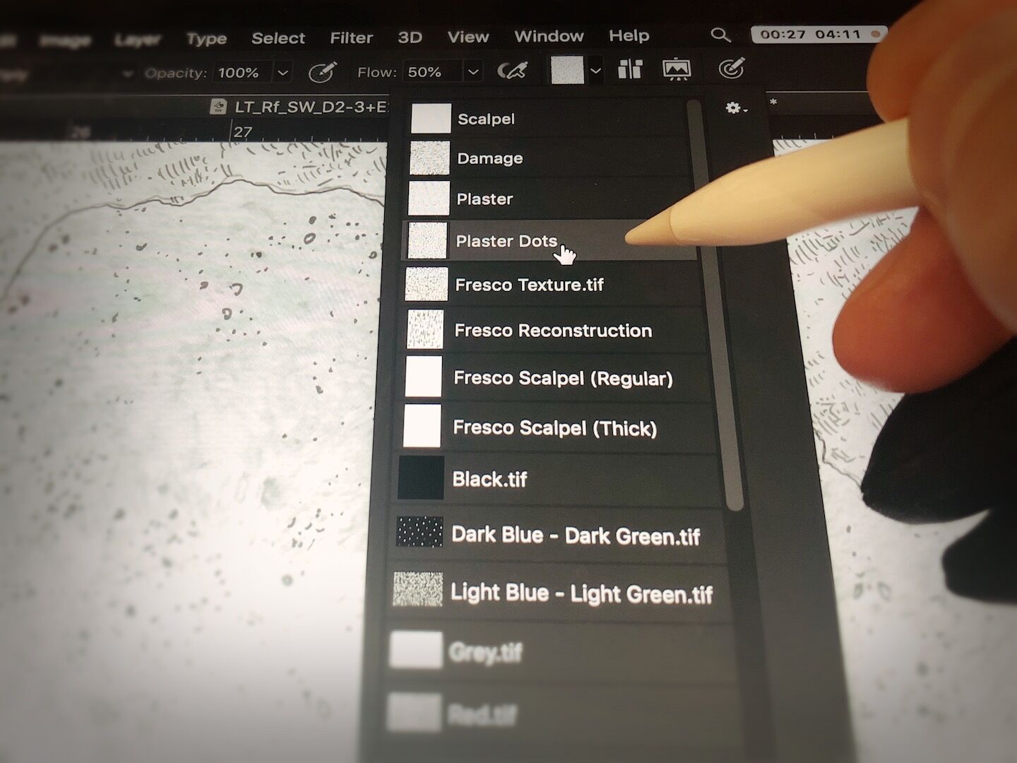
(9) In the next step we must create a new pattern that is based on our previous one but eliminates the circles. While erasing the “plaster blobs” one can add a few extra dots to create a denser pattern.
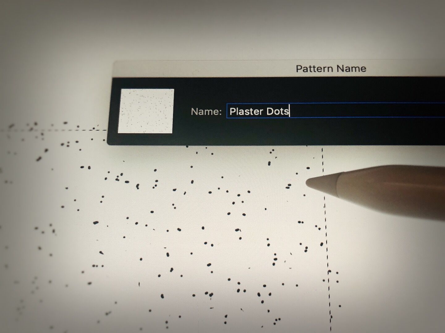
(10) When done, create this second pattern in the same manner as described in Step (6). Name your pattern Plaster Dots to be able to distinguish between the two.
(11) Plaster dots must be applied in tandem with the regular plaster pattern to provide a satisfactory result. Our final inked pattern is always a combination of these two presets, completed with a few freehand additions.
Just like our current digital damage pattern, the Epigraphic Survey’s plaster pattern brushes are available to download from here. And again, you must remember that these patterns were designed to be used in a 1200dpi environment, therefore they need to be resized accordingly when applied in a different context. Regarding the application of the two patterns, we’d like to present another short tutorial that demonstrates each step of the process. It can’t be overstated that one must be very careful when applying any of these patterns and, instead of “overusing” a plaster texture to capture every little detail, should leave sensitive areas (such as cracks) blank and add them by hand at the end of the process.
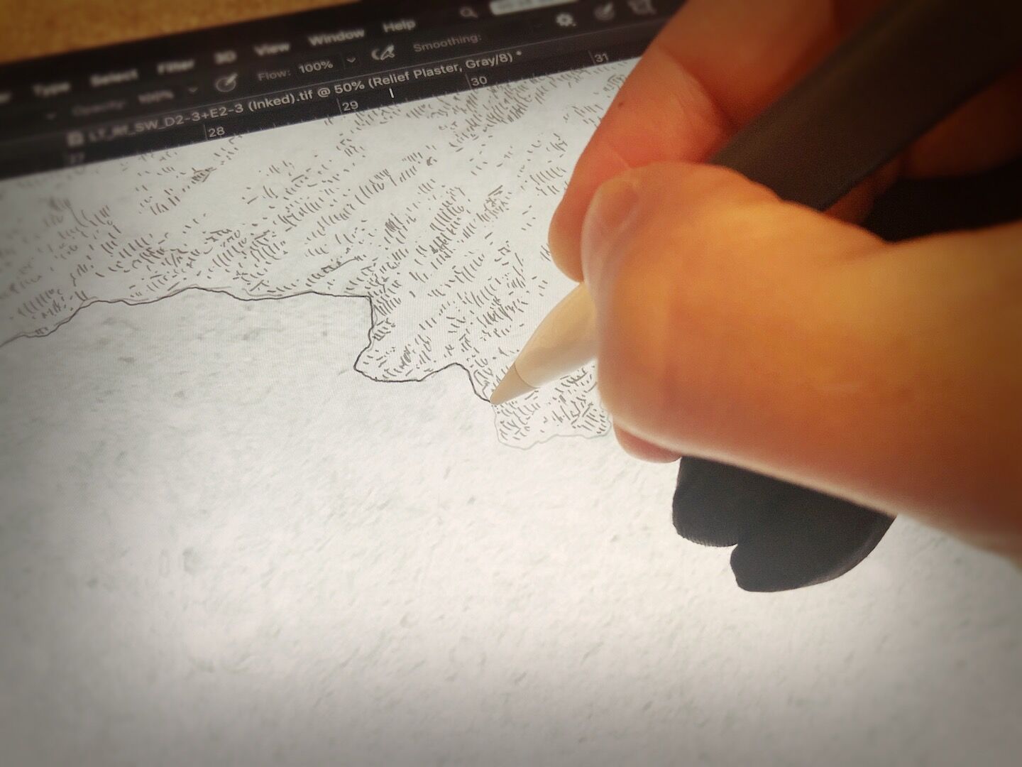
(1) The application of digital plaster pattern starts with drawing a continuous outline (6px solid brush) encircling the surface area that is covered in plaster.
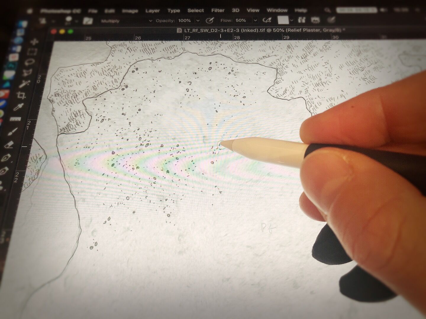
(2) When done, grab the Plaster pattern, pick a relatively large brush size (about 80px) and start adding large brush strokes over the darkest areas.
(3) Now we are ready to add some details by picking the other pattern we created (Plaster Dots), while we must not forget…
(4) …that we are refining our roughly distributed texture in this stage, therefore we need to pick a smaller brush size (around 30px).
(5) Our background image opacity should be lowered to appear lighter when adding details, preventing us from adding too much of the pattern.

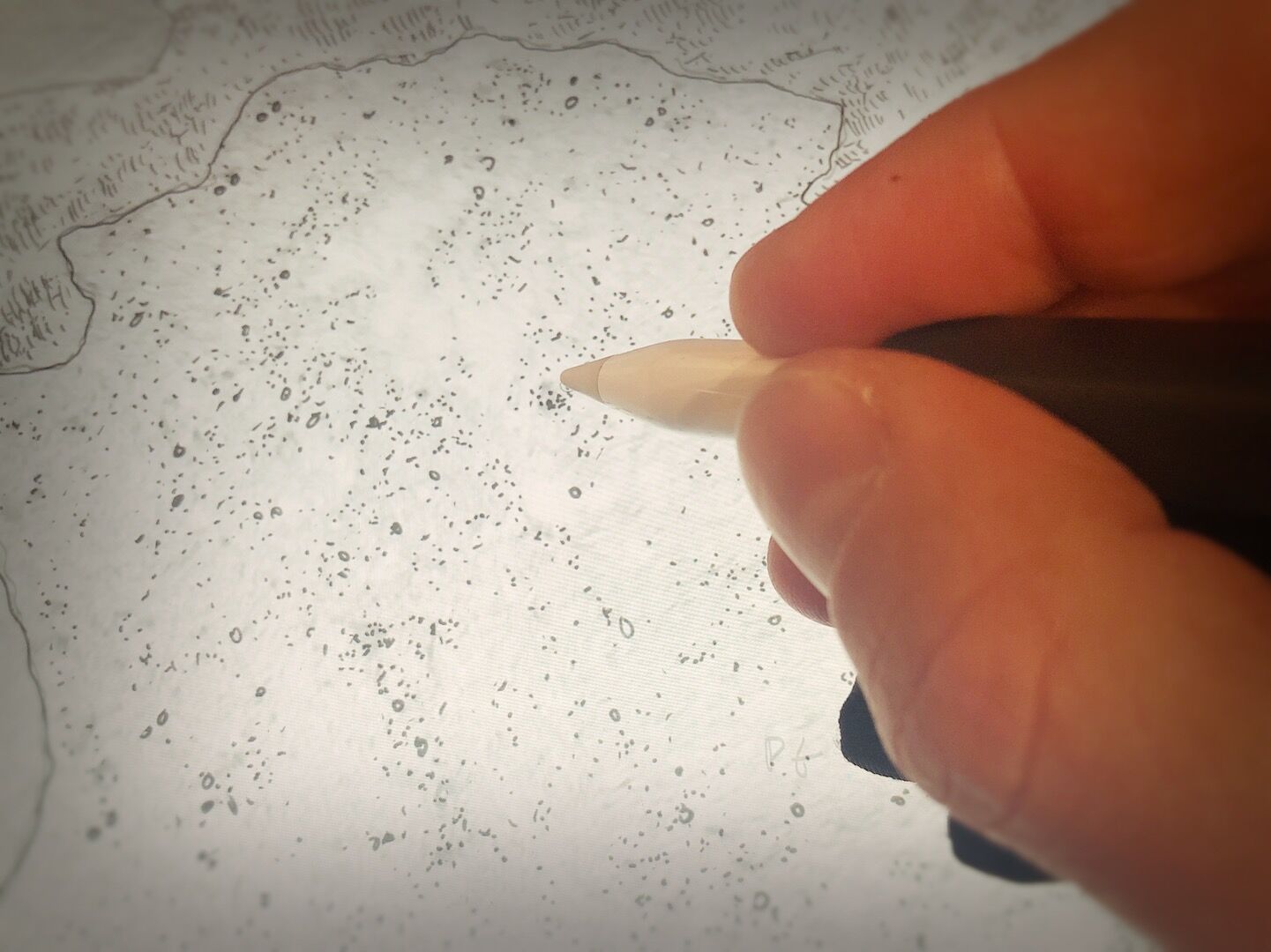
(6) Finally, we are ready to add the final touches by hand (7px solid brush), drawing or erasing a few dots and circles here and there.
(7) The result is the perfect blend of two patterns and a few hand-drawn brush strokes, with a close resemblance to the original surface.
Debating over patern for so long and spending this much time with developing the right one for representing non-decorative elements may sound unnecessary for some. However, you must keep in mind that epigraphic information could come from many different sources other than carved and/or painted art. With the above solution, the graphical indication of these elements can be made an organic part of our digital drawings while demanding only a small effort from the artist.
0 comment(s)
Leave a comment(We'll keep your email address private)