Developing a digital color code pattern based on traditional, hand drawn examples
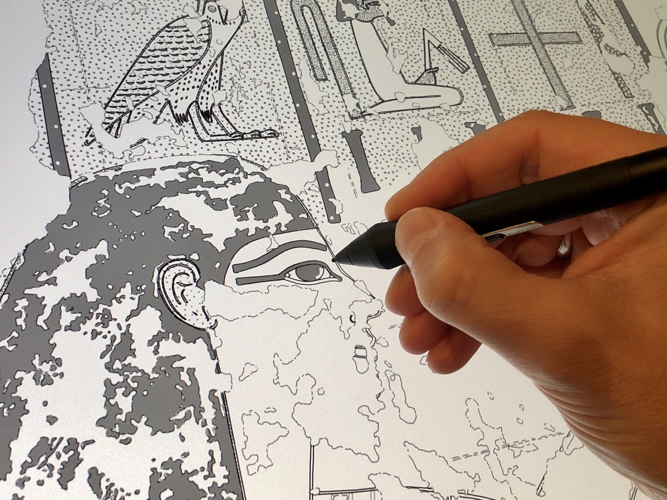
“Coloring” a line drawing with a digital pattern using Adobe Photoshop (TT 179, Axial Hall, West Wall)
When we look at ancient Egyptian monuments, color is to be found everywhere. Documenting either tombs, temples or the smallest painted graffito, we must provide a reasonable solution for recording the painted remains of the surface. Naturally, what immediately comes to mind for a satisfying resolution in this matter is the most objective, therefore most commonly used documenting technique: color photography. One would think that with today’s accelerating development in digital technology, cameras are able to cover every aspect of color documentation, therefore eliminating the need to implement color information in the drawings. In many regards the scientific perspective provided by digital photography, 2D, 3D and – more recently – virtual reality color reconstruction did replace artistic color representation. However, with the following tutorial, digitalEPIGRAPHY would like to present the modern incarnation of a traditional greyscale coloring method that is able to provide valuable data when applied as an extension of the more objective, scientific color recording approaches.
Needless to say, offering a comprehensive study of color representation in contemporary publications is a topic deserving its own space beyond this tutorial. Nonetheless, to fully understand our approach here, we would like to have a brief look at a few significant projects that considered documenting color in ways other than color photography. As indicated by the examples shown below, two main tendencies differing in approach and results can be distinguished regarding the treatment of their material.
Replicating color in traditional epigraphic recording
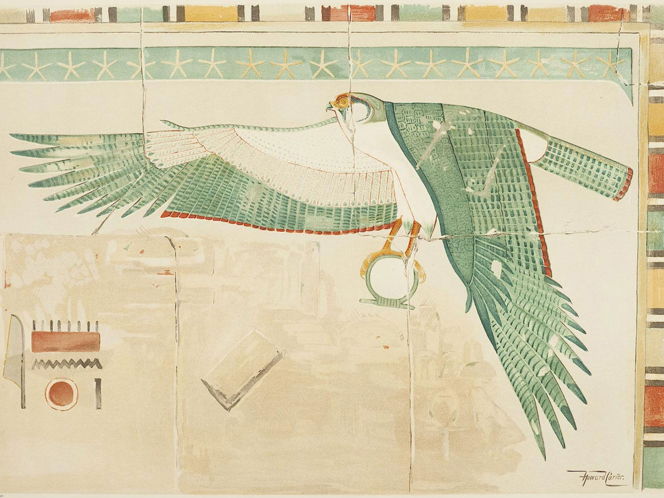
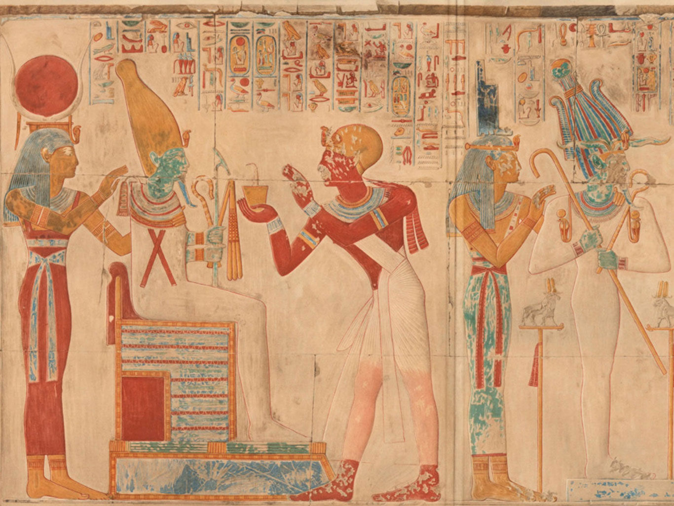
Mostly older publications are found in the first group, reproducing the painted material in a series of lavishly colored line drawings created by talented contemporary painters. One can look at the early works of Carter, Calverley or the Epigraphic Survey for fine examples. Taking the time to meticulously create a color painting and replicating the current state of a painted wall was born out of necessity: until the second half of the Twentieth century, photography wasn’t ready to produce acceptable copies of these master artworks.
In more recent publications, color information is usually provided to enhance the visual data (typically represented by a line drawing) in a less realistic manner. The attempt here is not to replicate the original color scheme but to reduce the complexity of the painted wall to a few basic hues. In stark contrast with the first group, these presentations typically apply a homogeneous texture, called color codes, that are either executed in color or in greyscale. One can find many examples belonging in this second group of publications in our reading section here, here, here and here.
How can color codes provide relevant data?
.jpg)
The color code system as part of the “Imiseba method”, was developed in 1998 to represent the wall paintings in Theban Tomb 65.
We have recently presented a special case study introducing a comprehensive documentation method that was developed more than 20 years ago for the epigraphic recording of the late-Ramesside wall paintings in Theban Tomb 65. In TT 65, the ancient artists applied bright colors with exquisite details, executed in the highest quality. Unfortunately, the present-day appearance of these murals is rather muted thanks to the various types of contamination on the surface. For this very matter, color photography – although a necessary component of epigraphic documentation – couldn’t provide a full data coverage of the walls on its own. Therefore, developing a sustainable method for color representation to distill the many layers and hues of painted information became an indispensable part of this project.
When designing the color code system for the tomb of Imiseba, the epigrapher wanted to deliberately avoid creating photorealistic color renderings of the walls as not to compete with color photography. Instead, emphasis was on forming a greyscale pattern scheme based on the basic color library of the painted walls. Since the method was thoroughly explained in our case study, we would only like to include a few additional arguments here to support our design choices:
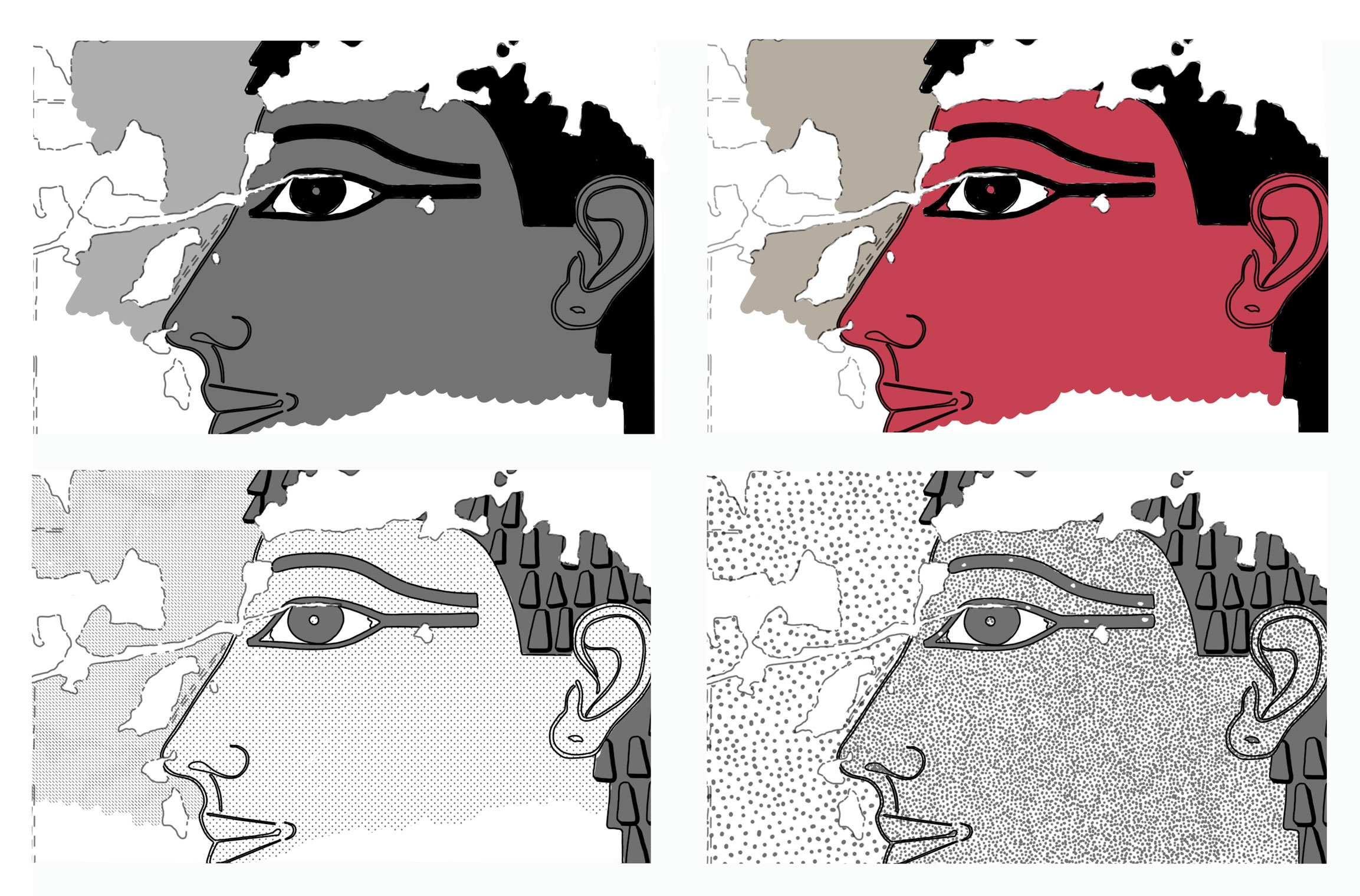
Various types of textures applied on the surface (from the top left clockwise: homogeneous greyscale, homogeneous color, artificial and custom-created patterns).
- The argument for drawing in greyscale: when reducing the many different shades of a pharaonic painting to a few basic hues, the use of a simplified color scheme can’t avoid being regarded as a falsified version of the original. However, greyscale fills are immediately regarded as artificial additions, therefore clearly differentiated from the original.
- The argument against using homogeneous patterns: the only distinguishing criteria between homogeneous greyscale hues is the strength of their shades (each hue’s content of black) on a limited palette. The more shades are used, the less of a difference can be made between each shade. When two similar hues are represented next to each other, it becomes hard to determine the color they represent.
- The argument for applying custom-created patterns: well-constructed greyscale patterns utilizing signage that is well differentiated and instantly recognizable, provide easy access to basic color information. Once the key to each pattern is memorized, it is easy to “see” these color-coded greyscale drawings in color.
- The argument against using artificial patterns: a computer-generated pattern will always remain a static filler that is not flexible enough to faithfully replicate the delicate nuances of the original.
- The argument against applying complex patterns: a pattern utilizing recognizable signage other than dots (for example crosses, triangles, rectangles, stars etc.) inevitably becomes too complicated, distracting the attention from the main elements of the composition. Furthermore, such shapes might be confused with elements of the pharaonic design.
- The argument for publishing in greyscale: even with color printing becoming cheaper and cheaper, publishing most of the drawings in black-and-white still eases the budgeting burden of most projects.
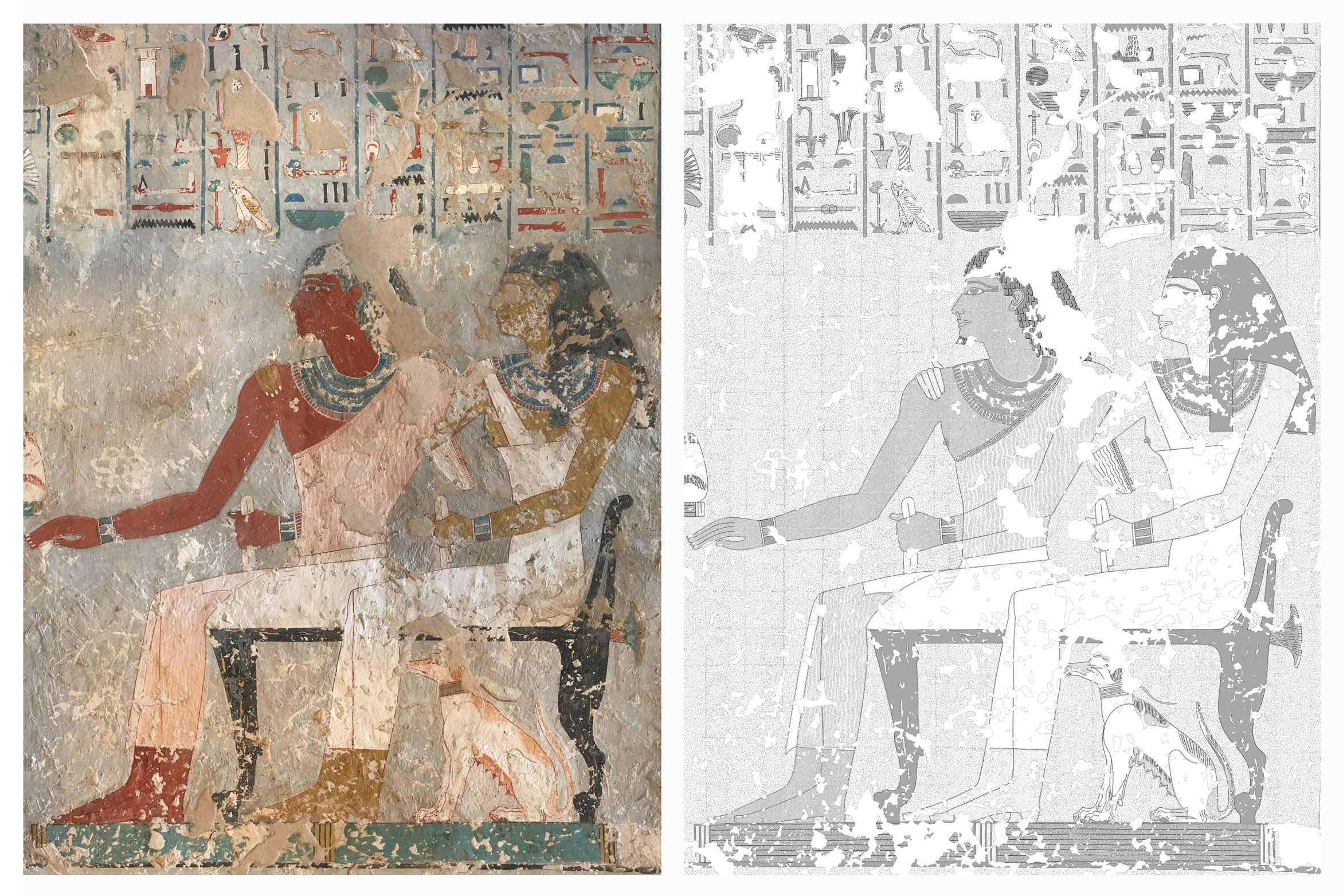
Color photograph compared with greyscale color-coded line drawing (TT 179, West Wall, detail).
Digitizing the TT 65 color code system
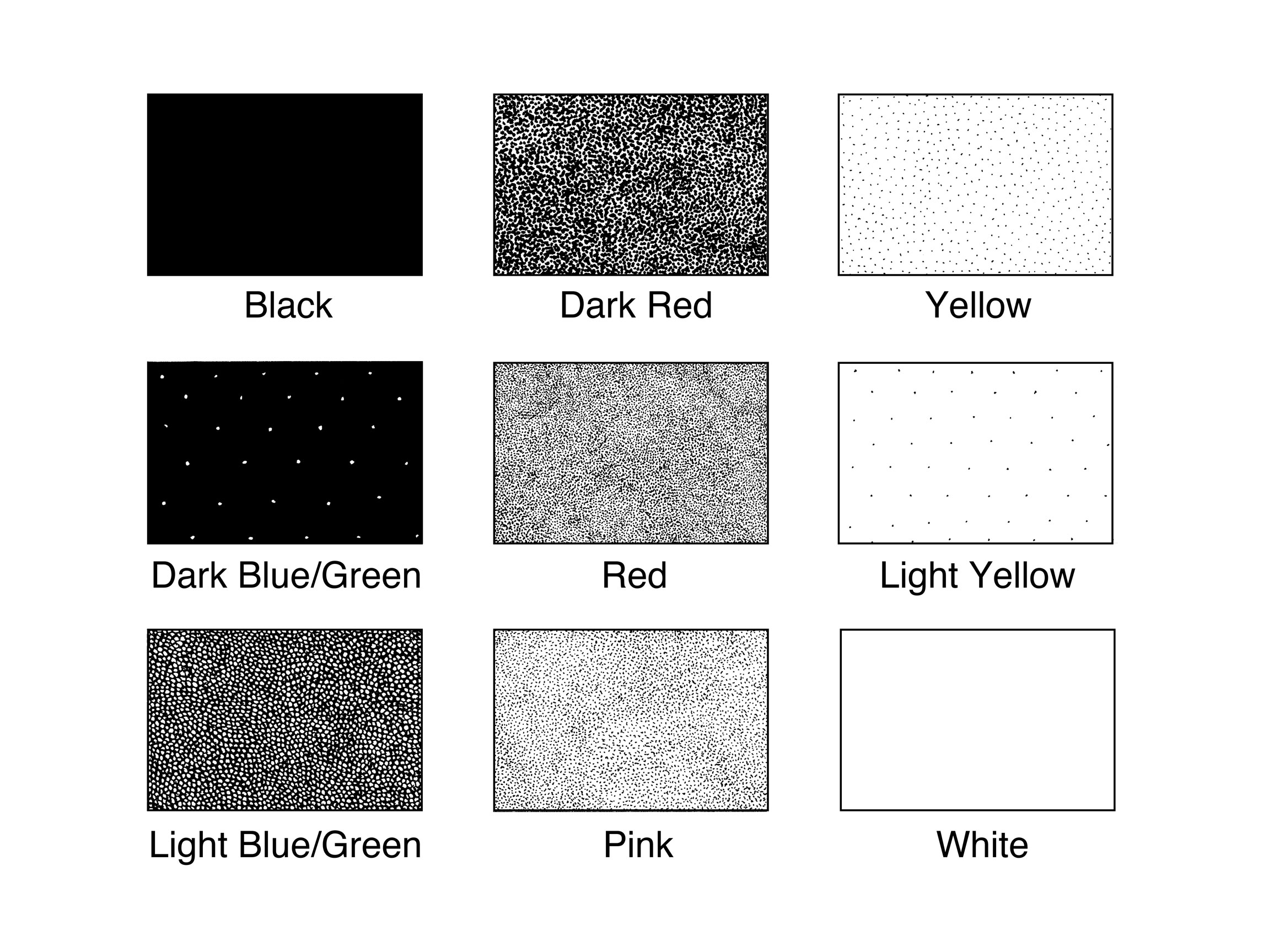
The original color codes developed for TT 65 utilized a greyscale pattern alternating between black and white dotted textures.
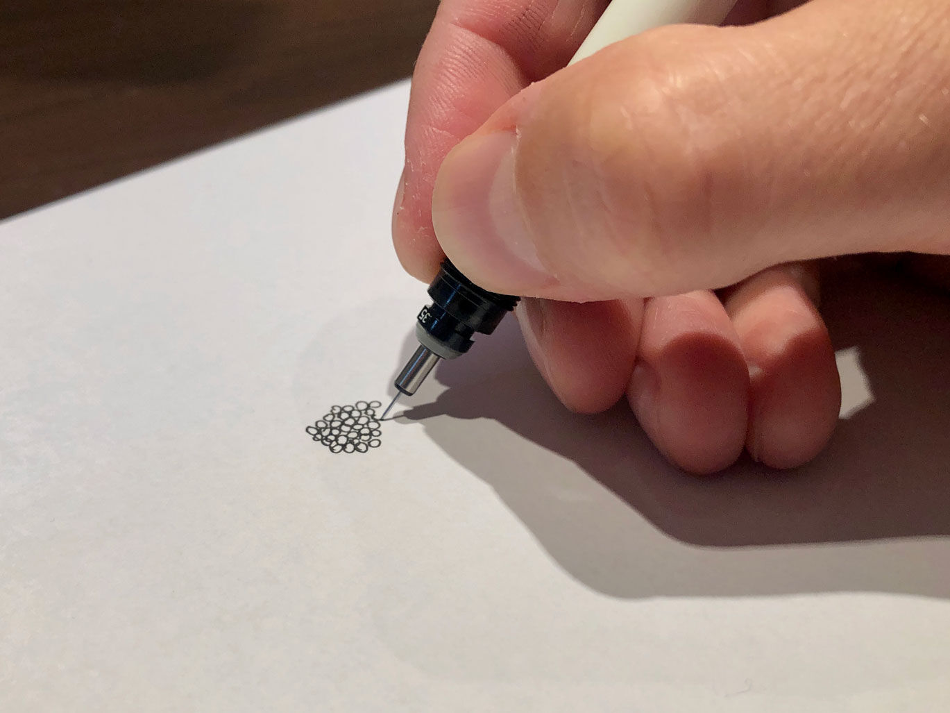
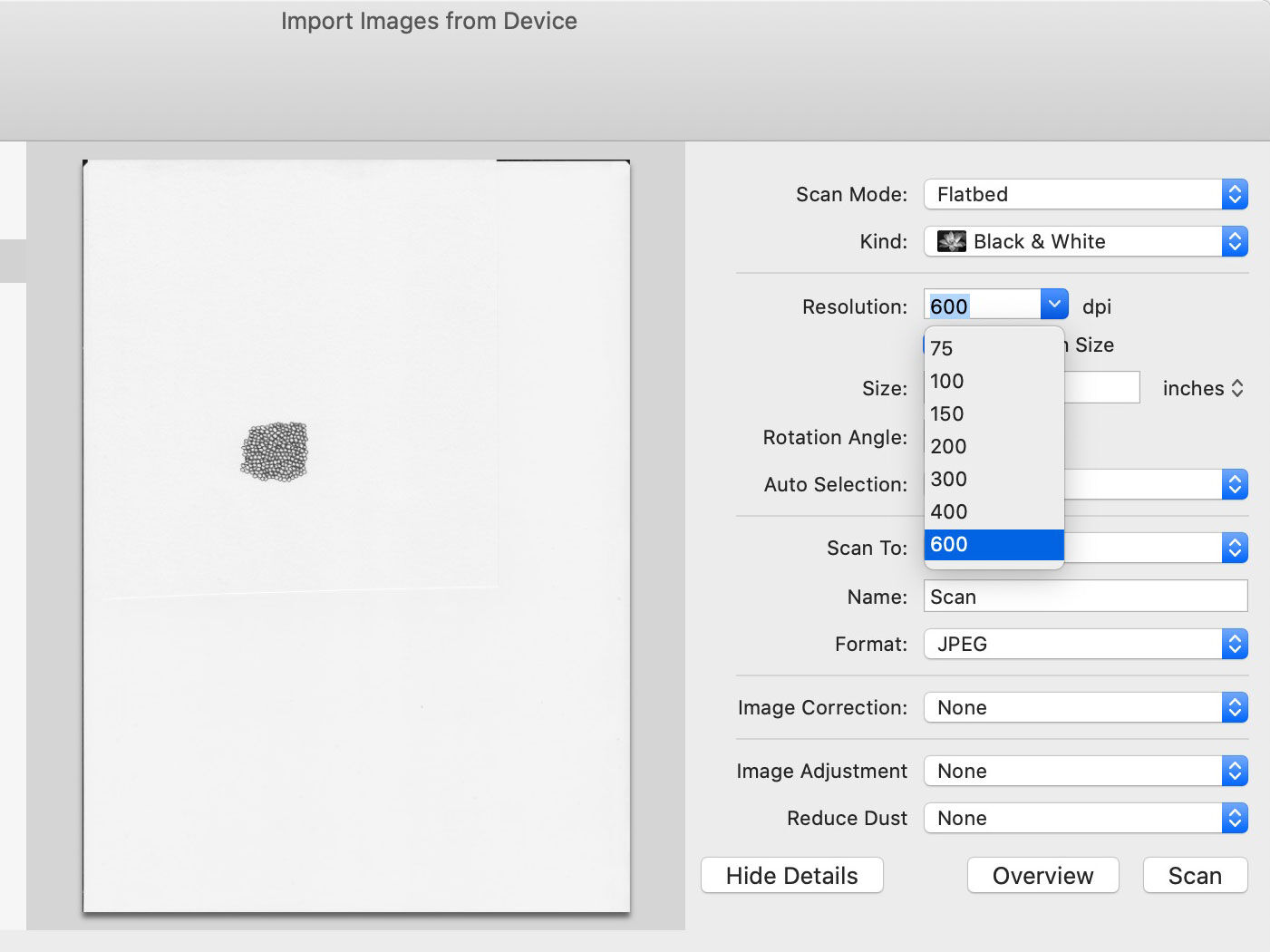
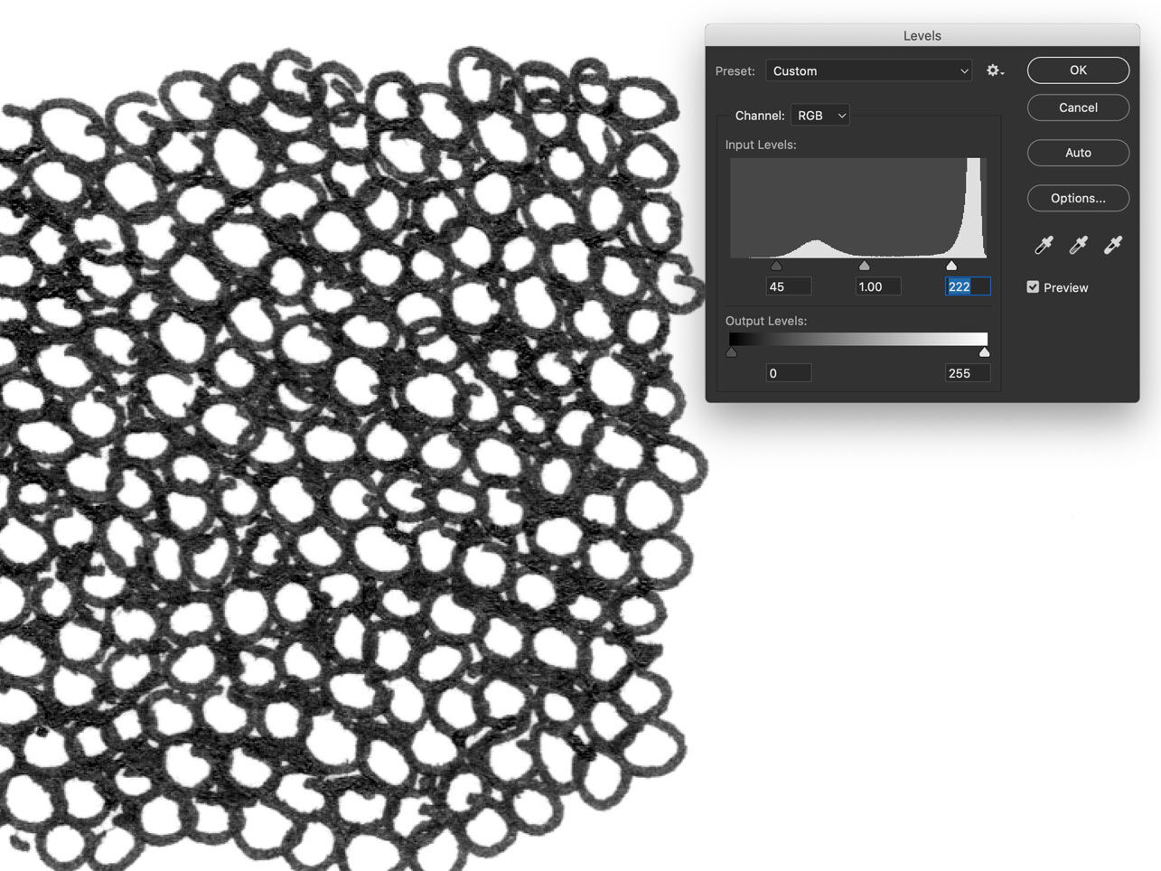
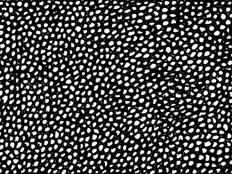
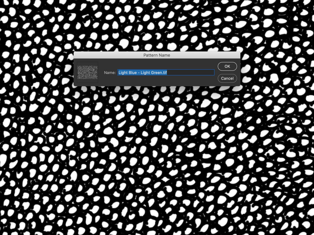
The original color code system was created with freehand drawing (executed by Rapidograph pens) in mind, because the lack of computing power didn’t allow us to present all the details in our desired resolution. However, as computer technology evolved, creating a maintainable digital equivalent of our efficient traditional coloring method became inevitable. While the digital inking process developed for facsimile drawings created in painted tombs was very similar to dealing with carved remains, designing a digital system based on existing color codes was more complicated. The desire to maintain the continuity between traditional and digital epigraphic recording didn’t allow a lot of wiggle room. As the digital iteration of the color code was intended to be created in Photoshop’s raster-based environment, the textures had to be suitable for the specific resolution required by the drawing. What it meant in practice was that designing digital color codes for a digital line drawing created at 600 dpi required the epigrapher to draw a large segment of each pattern texture by hand, scan them at 600dpi and create the digital equivalents afterwards. Naturally, if a drawing is created at 1200dpi, each pattern must be recreated in that environment, otherwise the texture would be half the size when applied.
Creating the digital color code
.jpg)
Traditional (left) and digital (right) color codes representing the color light blue are virtually indistinguishable, providing continuity and interchangeability between old and new.
Applying the digital color codes
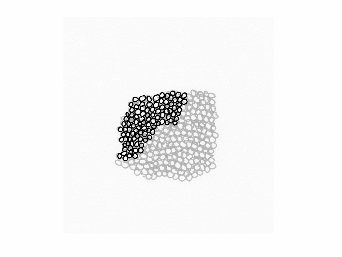
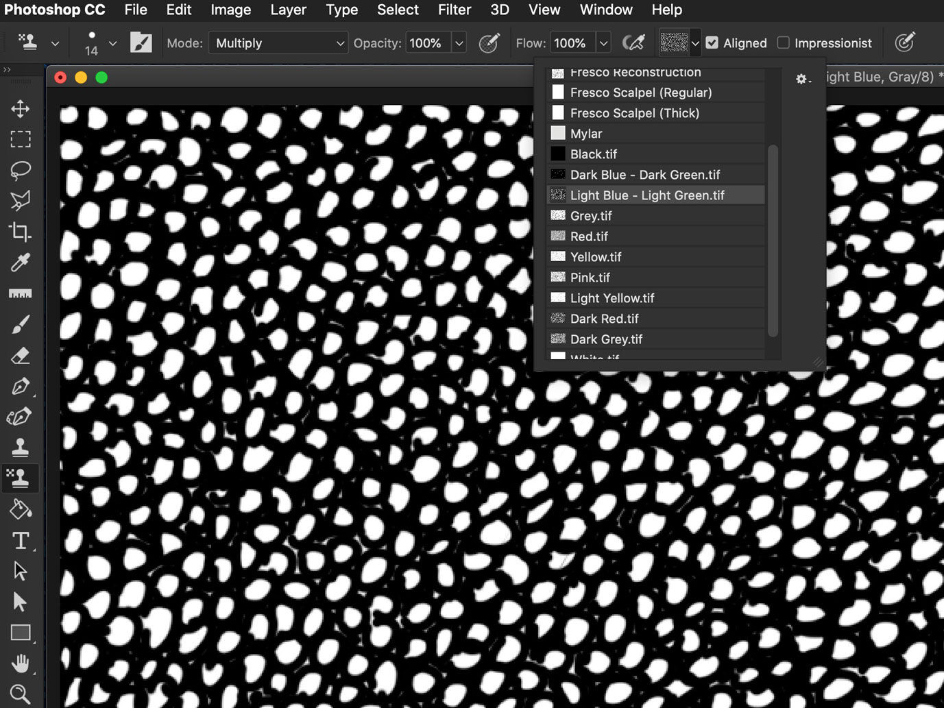
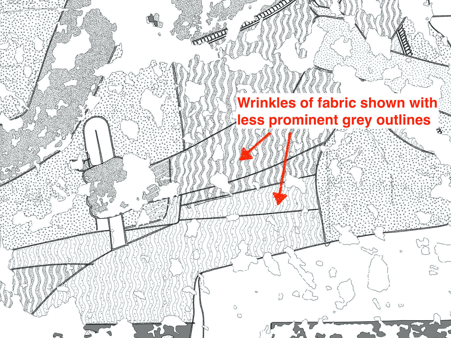
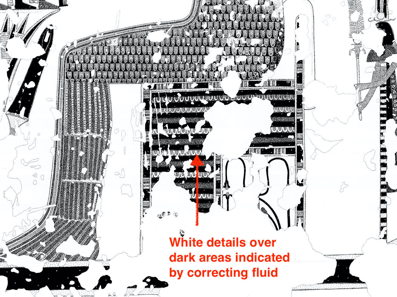
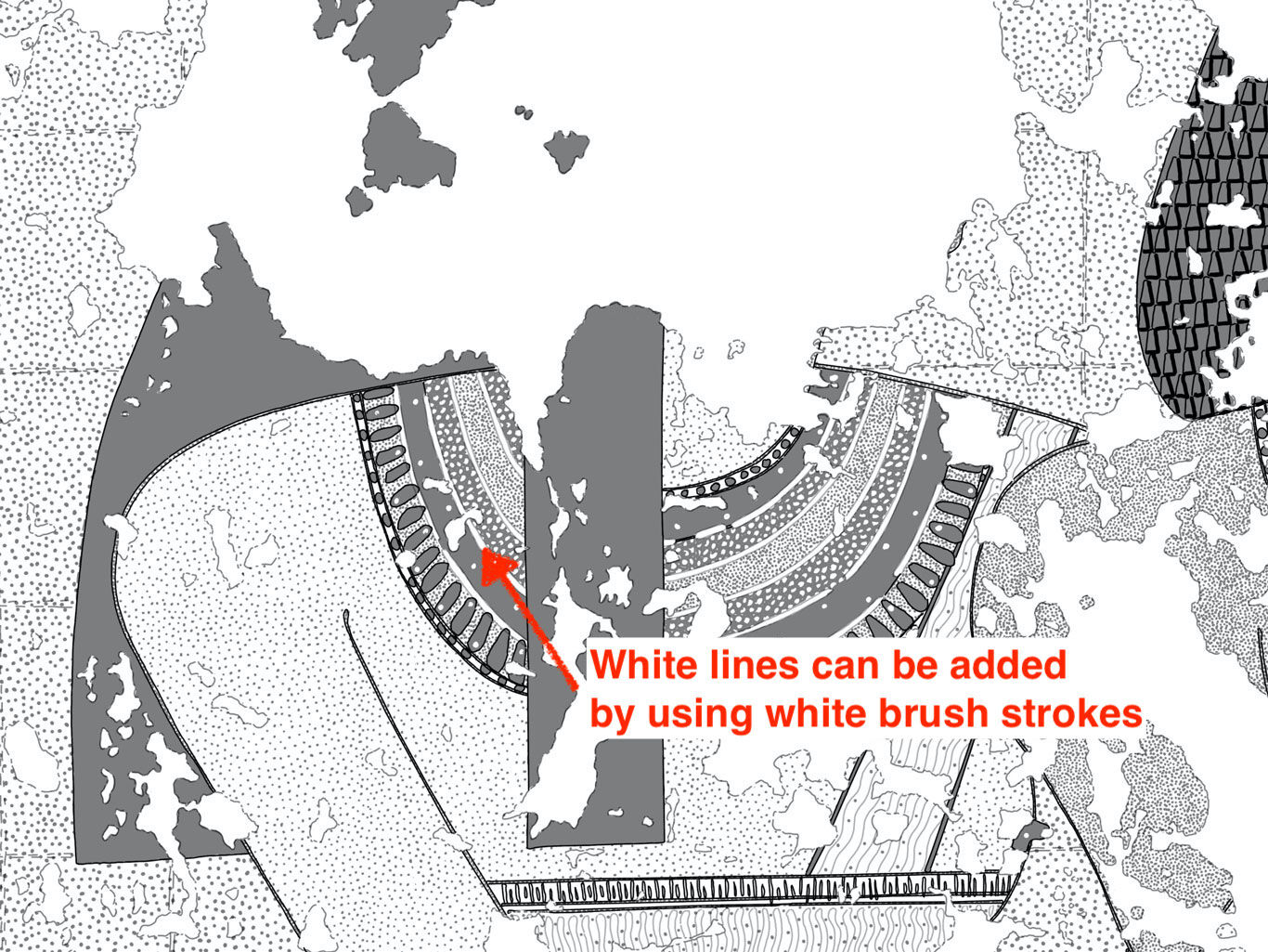
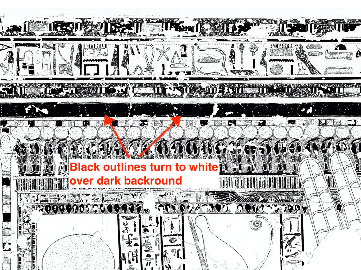
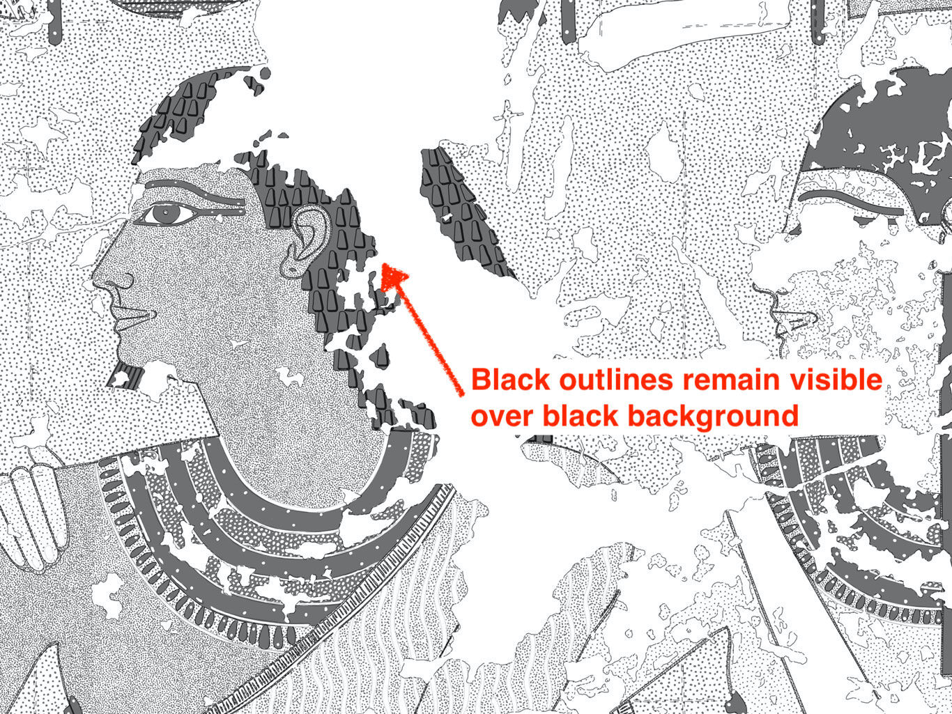
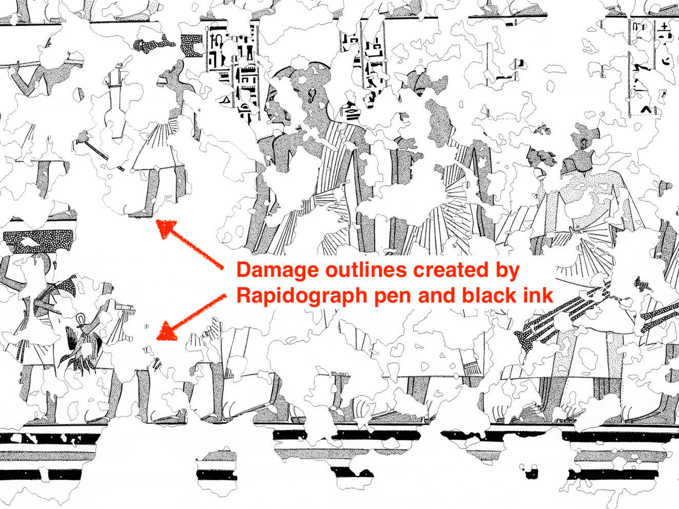
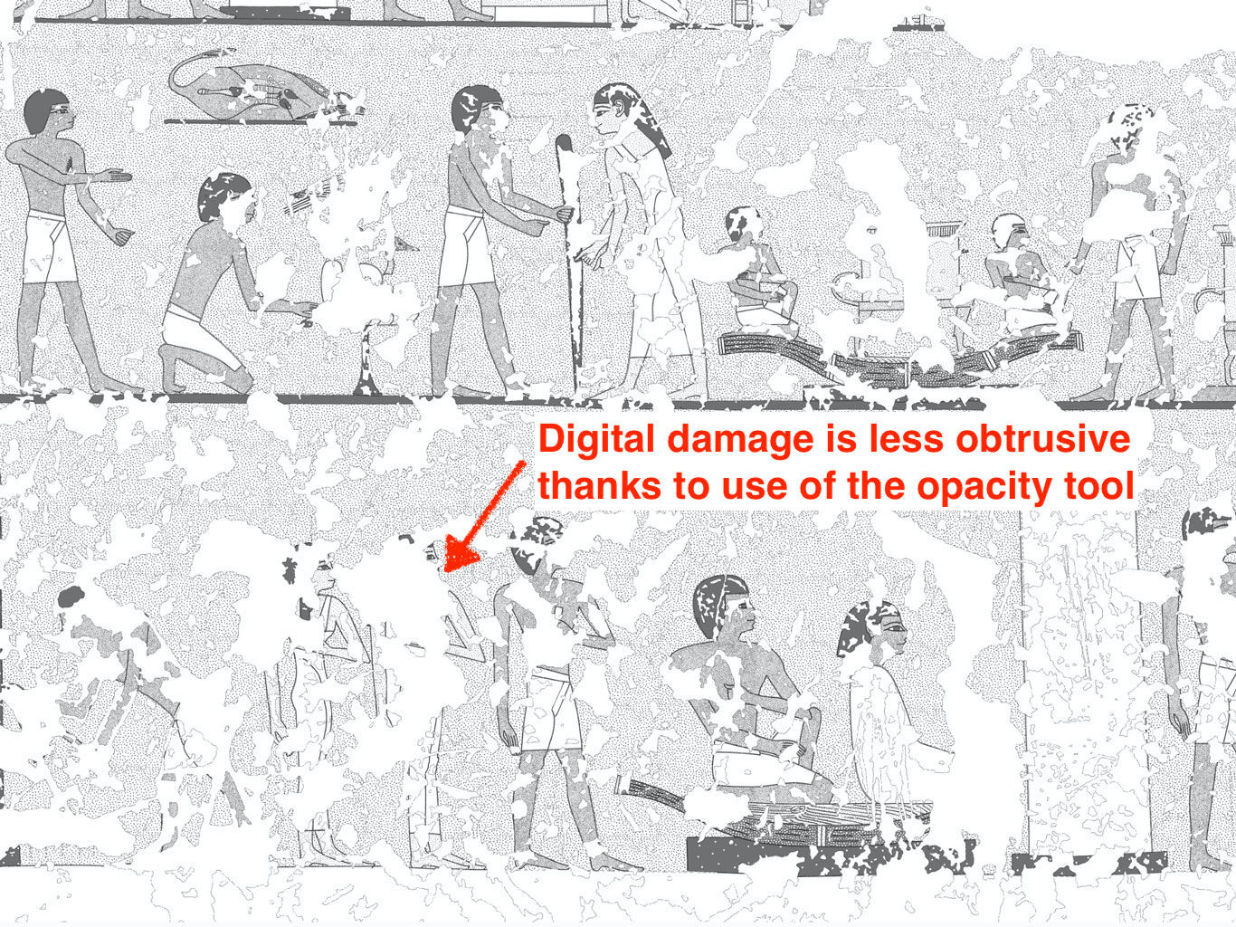
Naturally, when drawing in Photoshop, every important component of a drawing is drawn on a separate layer. When applying the digital color code, it must have its own space where it doesn’t interfere with the other essential elements of the painted wall, namely the grid, the preliminary sketches, the painted outlines, the carved outlines (if any), the later modifications (if any) or the damages/damage outlines (if indicated). Painting with the textures created above is still a time-consuming affair, especially if one pays attention to all the details. Covering an area with a digital texture usually starts with a larger texture brush (about 30 pixels at 600dpi), gently covering most of the area. If there are lots of obstacles spread out over the surface, it is probably faster to cover them all with the color texture and use the eraser to liberate them later, rather than maneuvering around each outline trying to create blank spaces. When the desired area is mostly covered, one should exchange the large texture brush to a regular brush (using the same pixel dimension as used for creating the texture) and add some texture freehand (dot-by-dot), filling in delicate and hard to reach areas. A tremendous advantage over any computer-generated texture fill is the flexibility freehand drawing provides when it comes to really small details, such as hair-thin brushstrokes, where the artist must alter the intensity of the pattern accordingly. When used properly, the mixture of custom-created color code patterns, complemented with small corrections/extensions using the brush tool, creates an organic texture fill that is adjusted to the flow of the original artwork. No computer-generated color fill can provide the same natural effect as a properly applied custom created color code. Furthermore, digital color coding, besides being much faster than adding color information one dot at a time, has many advantages over its traditional counterpart.
Advantages of the digital color code pattern
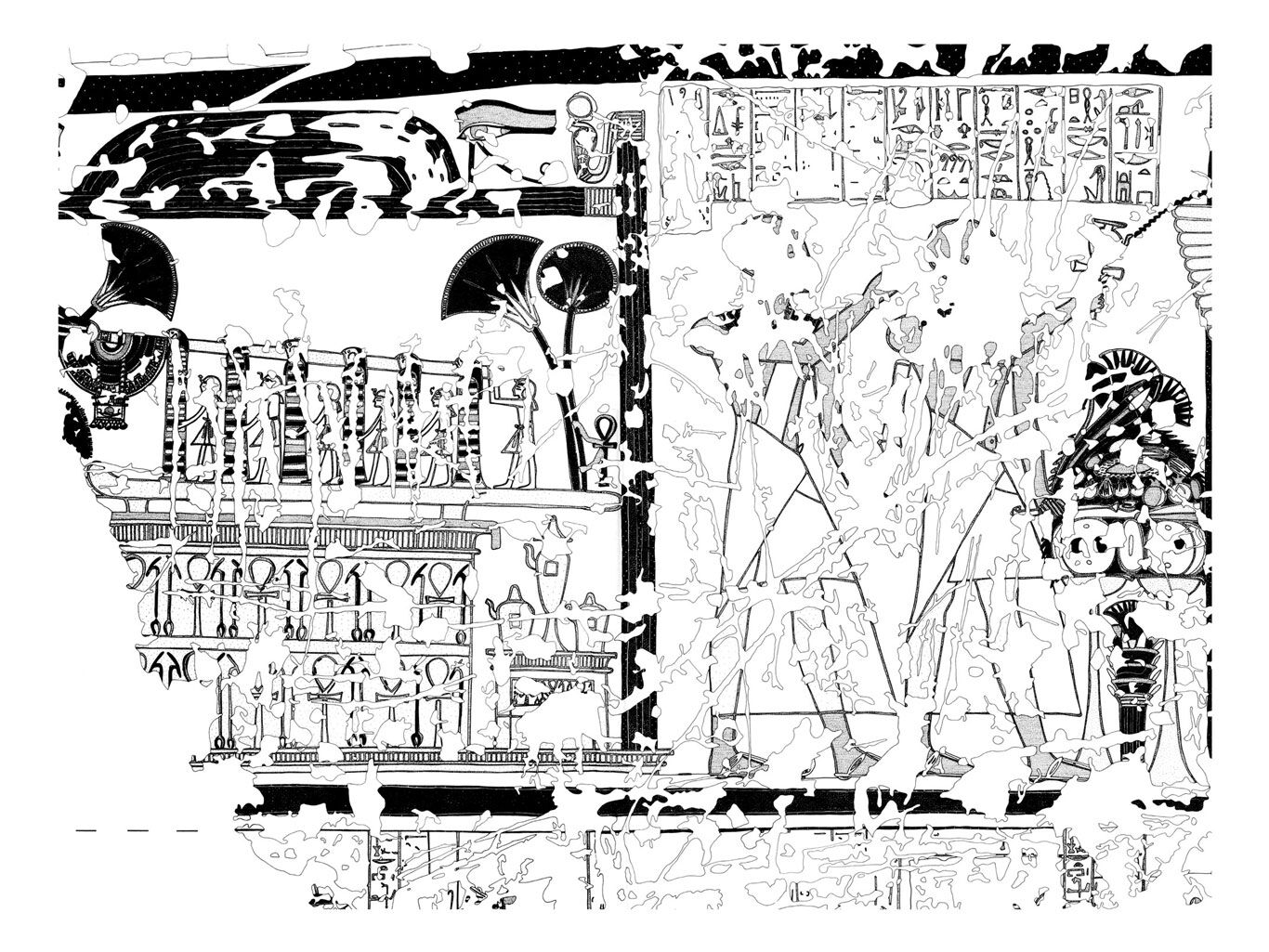
One additional but no less important advantage of digitizing the TT 65 color code system was the benefit of indicating the overall background of the walls. Adding the blueish-grey late-Ramesside background to the Imiseba drawings was impossible with the traditional method, therefore white surfaces, such as ceremonial costumes, shrouds etc. couldn’t be represented with the desired emphasis. In contrast, when the digital equivalent of the same color code system was applied on the drawings of the 18th Dynasty wall paintings in the tomb of Nebamun (TT 179), the typical dark-grey Thutmoside background received its own pattern, perfectly restoring the color balance on the walls. With the simplified, digitized color scheme applied over the line drawing, the result becomes quite striking:
.jpg)
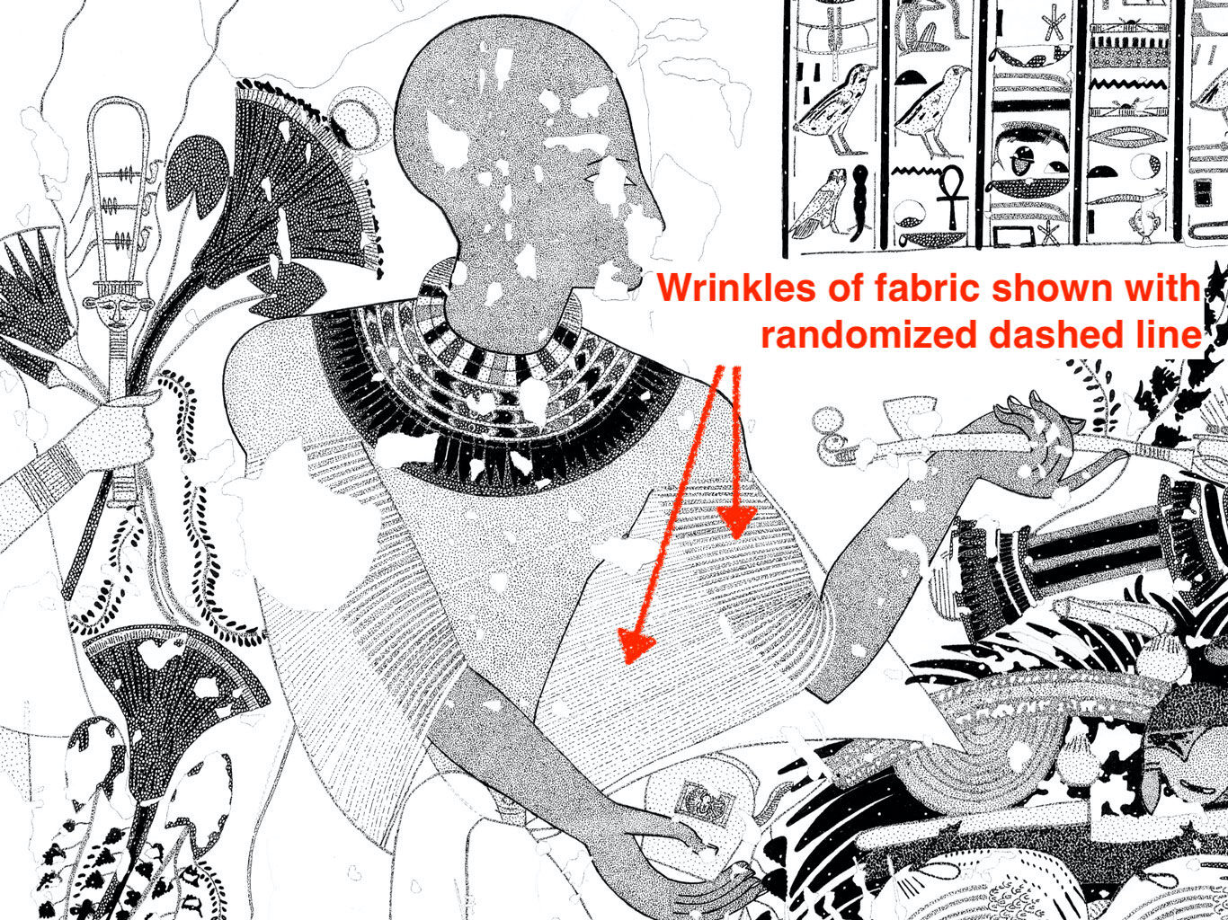
Outline drawing representing all the definite information regarding a single painted wall (TT 179, the tomb of Nebamun, East Wall, detail).
.jpg)
Enhancing the outline drawing with color codes providing basic color information in greyscale (TT 179, the tomb of Nebamun, East Wall, detail).
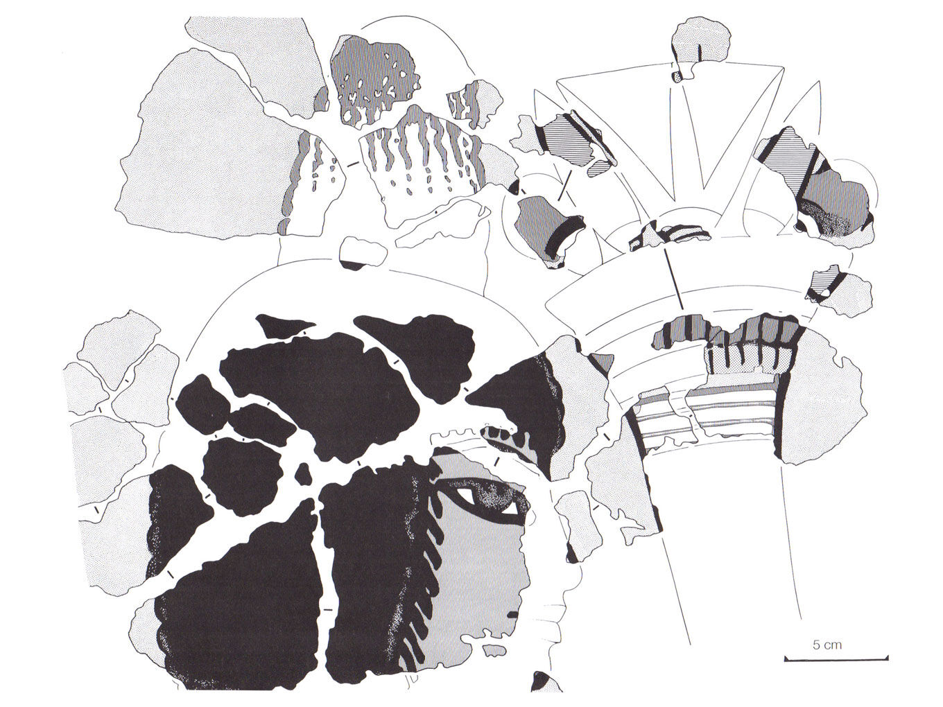
One could challenge our arguments for keeping around such an old-fashioned system in the digital age, however recycling and enhancing proven techniques in a digital environment to create better freehand drawings falls in line with the epigraphic approach digitalEPIGRAPHY stands for. Although the computer-generated fill and texture tools of Adobe Illustrator or Photoshop provide easy access to quicker solutions, the result will never be as satisfying as crafting it just like the ancient painters did many centuries ago. The color code system originally developed for TT 65 has been used in many publications since, enhancing not just wall paintings but wall fragments, painted objects, cartonnage etc. The digital version of the color code was first used on a grand scale in TT 179, with the results now being prepared for publication. Color coded details regarding wall fragments coming from the same tomb can be found in the following article. The digital equivalent of each code mentioned in this article can be downloaded from here, with the original, hand-drawn TIFF textures available here. If you’d like to try out the textures, just double click on the .pat file and it becomes part of your Photoshop pattern tool set. When applied, keep in mind that the digital color codes were designed to function properly only in a 600dpi greyscale canvas. Before starting to paint with the patterns, make sure that each pattern is set to multiply (to create transparent fills) and Aligned is checked in the Pattern Menu bar. Nonetheless, if you’re invested in applying a digital color fill to enhance your line drawings, we strongly encourage you to experiment with creating your own textures, tailored to your own needs.


0 comment(s)
Leave a comment(We'll keep your email address private)