
Creating the composite drawing of the Bark Sanctuary’s western outer wall in the Small Amun Temple at Medinet Habu (Part 2)
Documentation Process
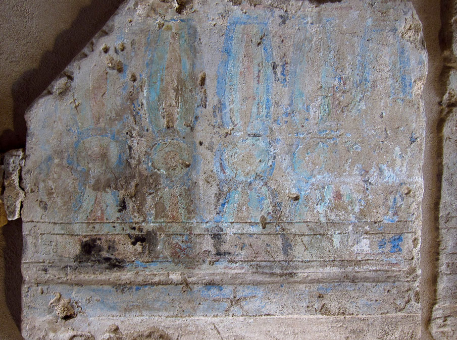
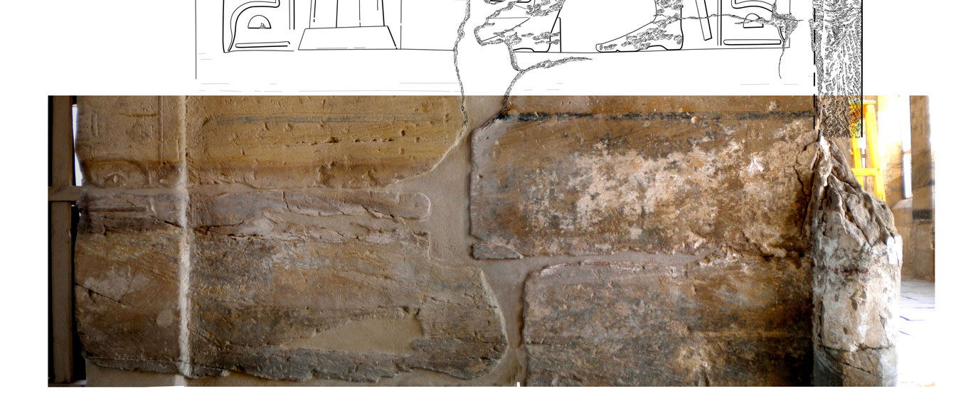
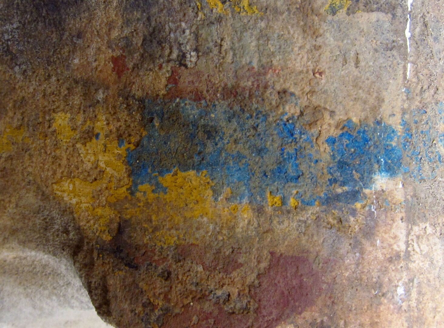
Well preserved painted Thutmoside kheker frieze above MHB 165
Working on the Doorway
Digital penciling on site at the doorway was mostly done using the Wacom Companion as the initial tool for capturing the carved lines. First, the shortcuts for Photoshop had to be modified slightly compared to the settings being used in the studio, so as to have quick access to the most frequently used tools. Due to drawing at a lower (400 dpi) resolution, the pencil brush and eraser both needed to be thinner (4 pixels) and more refined (50% hardness) for the better handling of finely carved details. The layer arrangement had to be extended as well, in order to make room for differentiating among the separate paint layers. The Pencil folder had two paint layers for indicating Thutmoside and Ptolemaic paint, with an effect applied over the dotted line of the latter changing its color to red (Right click on the layer/Blending Options/Stroke/Color - Red).
.jpg)
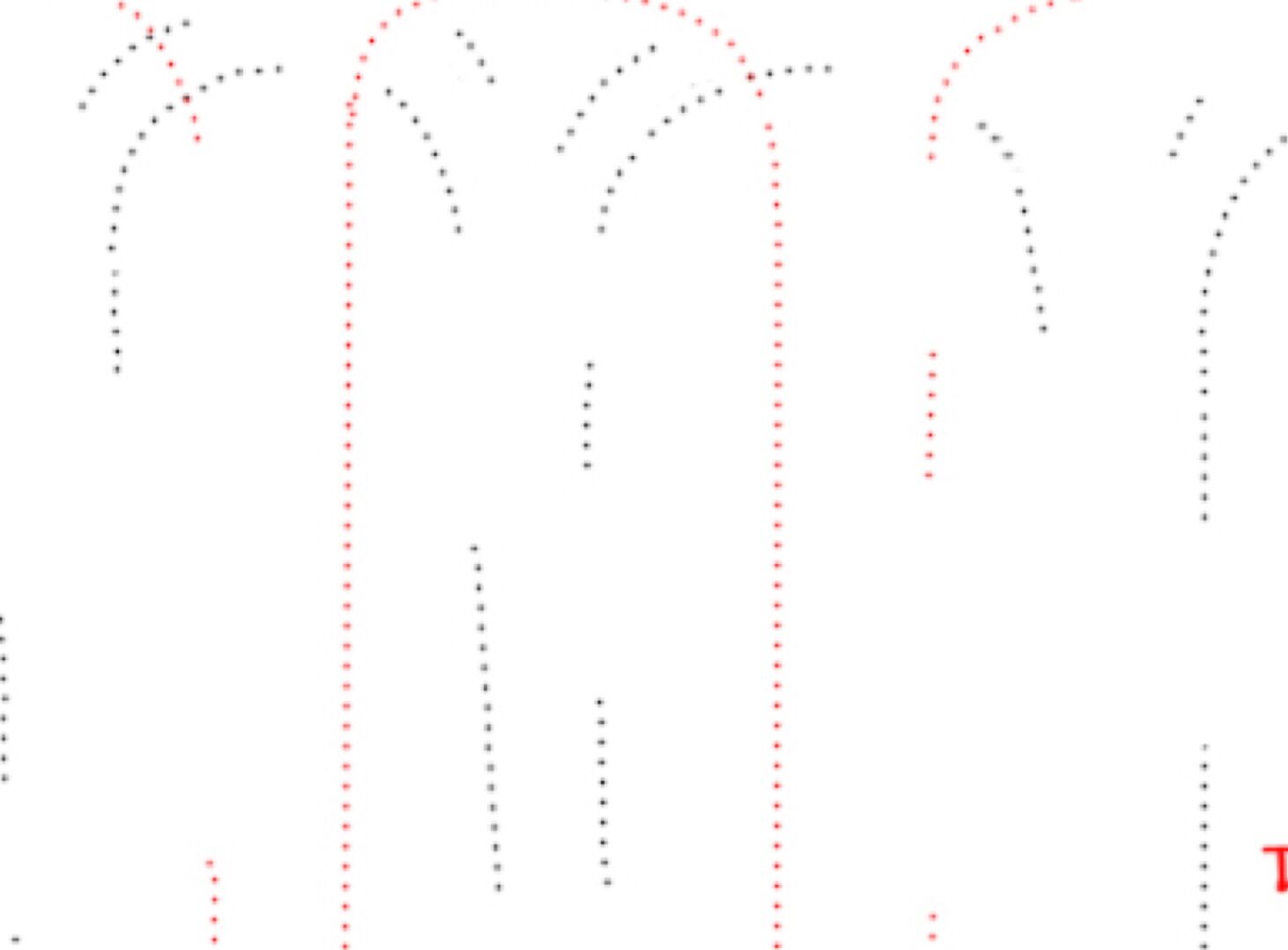
Hot key setup for field work on the Wacom Cintiq Companion (1st generation)
To be able to paint in color would certainly have been much easier, i.e. simply changing the brush color, but such a modification would have been irreversible. It is always important to keep the line attributes as intact as possible, even at the early penciling stage, so that the line can be further modified or changed back to the original at any time.
.jpg)
Differentiating in between painted layers during initial penciling.(Thutmoside paint shown in regular grey pencil shade while Ptolemaic paint is indicated in red)
.jpg)
Layer arrangement of the composite pencil drawing (MHB 163-165)
As penciling progressed, some new tools were applied to help with the initial epigraphic work. Certain surface areas on the original black and white photo were blurry or had too much shadow on them, covering specific elements and damaged areas. Therefore, additional quick in situ macro photographs were added for further clarification. Although the Companion's camera and the Windows photo capturing mechanism proved to be of poor quality and too complicated to use, it was easy enough to take a quick photo with a digital camera and transfer the files to the Companion even on site - via a USB cable. These temporary extra layers necessitated a separate folder to avoid getting them mixed up with the final layers. The content of this help folder constantly changed during penciling and, once these photos fulfilled their purpose, they were immediately deleted to keep the overall file size manageable.
Close-up detail showing blurry surface details and hard to see edges of the carved lines
While penciling, it was important to keep the pencil line quality as refined as possible, especially knowing that the brush strokes would be upscaled to 1200 dpi at the inking stage, leading to some degradation of the sharpness. For perfecting the line quality, the pen tool with its "digital French curves" was used extensively to provide a reliable basis for long, curved brush strokes. Unlike the inking process, here these vector-based paths were used only as guidelines, and they were never stroked over directly with the brush tool. The exclusive use of freehand brush strokes with the added artificial guidance led to a natural looking but very high line quality, even at this early stage.
Capturing complex surface elements, such as protruding doorjambs using archival photo data
The other frequently used aid for penciling was Photoshop's suite of transformation tools. These basic photo modification tools (Edit/Transform/Scale, Rotate, Distort, Perspective and Warp) provided easy and quick modifications of pencil lines or entire line segments after they were laid out. Whenever, based on later observations, the relation between certain hieroglyphs or other decorative elements had to be slightly modified, it was much easier to distort or to move the line than erase and redraw it entirely. This new kind of flexibility has had long term effects on the drawing process and opened up a whole new level of facility for the artist at the wall. Just to give one example: whenever there was a chance that a captured shape or form was not entirely correct, by performing a quick selection and duplication to make it a separate layer, the artist could apply the modifications and compare the two versions before settling on the final version (Select/Right Click/Layer via copy).
.jpg)
The pencil drawing of the doorjamb next to the existing digitally inked wall scene (MHB 165)
The archival photos of the doorway provided some data on the damaged areas before they were filled with modern cement, and therefore, whenever it was relevant, these were used to complete the pencil drawings. Some architectural elements, such as the once visible upper door socket, had to be included based solely on careful measurements, while others, such as the damage to the torus moulding, had to be eyeballed based on a perspectively corrected old photo. Once all of the disparate elements of the doorway and wall scenes were aligned and matched, and every previously inked line was integrated into to the newly penciled central area, it was time to add the upper and lower sections to the walls.
Old lintel damage visible on an archival photo
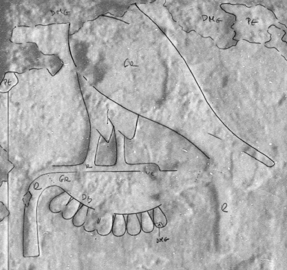
Capturing the Lower Dado
The lower dados were included with the composite drawing for three separate reasons:
- The vertical text on the doorjambs continues much further down than the scenes on the side walls, therefore it was necessary to provide the context surrounding them.
- There were some peculiar paint traces to be found below the Thutmoside lower border, likely from the Ptolemaic restoration phase. After making some careful observations under different light conditions, this area provided enough visual data to be represented on the drawing.
- Finally, there was a purely aesthetic reason as well: representing the lower portion in great detail gave more visual balance to the drawing, even without the damaged areas, etc. being penciled all the way down to the ground level.
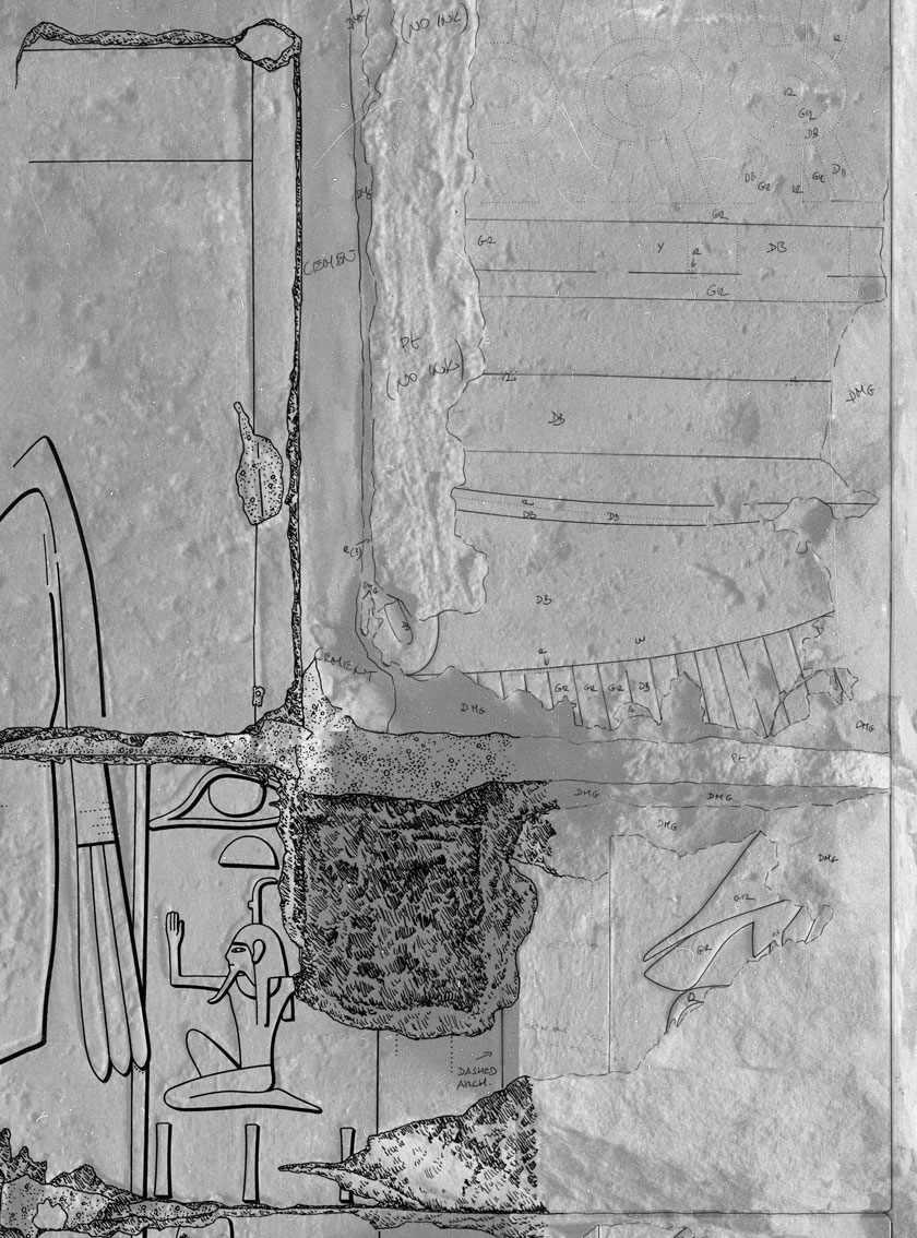
Penciling the dado over a color photo mosaic
(1) The color photo montage made of 12 separate detail photos was used to provide a detailed enough background for penciling. The existing upper scene and the new pencil additions on the doorway had to be matched with these photos for consistency.
(2) With the constant changing of transparency the color photo was an ideal background for capturing the different painted layers. Similarly, on the doorway area, temporary red color was used to indicate the later Ptolemaic paint.
(3) Changing the background to black/white (Image/Adjustments/Desaturate) added the necessary contrast for capturing the damage areas. Certainly it had to be temporary, therefore the color layer was duplicated, desaturated and deleted after penciling was finished.
(4) The final penciled lower section with the paint traces seamlessly blending in with the existing parts and ready for inking. All the damage details were added at a later stage during inking, while on the initial version they are represented only with outlines.
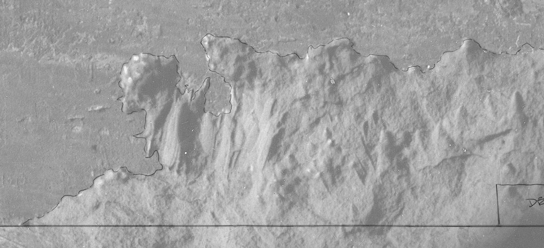
With the color photos of the lower sections included, the file size was still around 700 MB, which was manageable on the Companion without any lag. Since there were no carved lines on these surfaces, the main focus of the epigraphy was to represent the right amount of damage to indicate the natural breaks (caused by the earthquake and pressure from upper blocks) and intentionally hacked portions (including removal of the torus molding). For the areas of damage now covered by modern cement, sections of digitized archival photos where used whenever they indicated additional details. One of the biggest challenges on the lower section was finding the best way to represent the partly broken off and partly restored torus molding. A separate set of detail photographs of these elements was taken and meticulously fitted within the measured space for future inking. Some of the deeper cuts were indicated in pencil for reference.
-and-Ptolemaic-(red-stripes)-painted-borders-on-the-lower-left-portion.jpg)
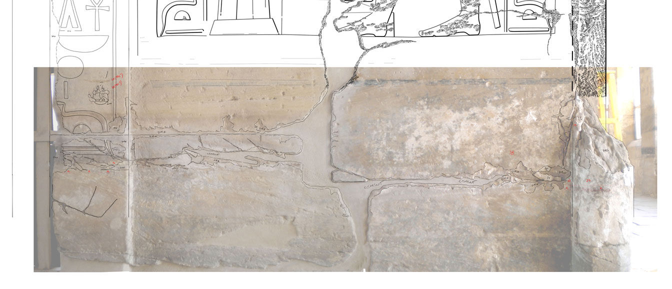
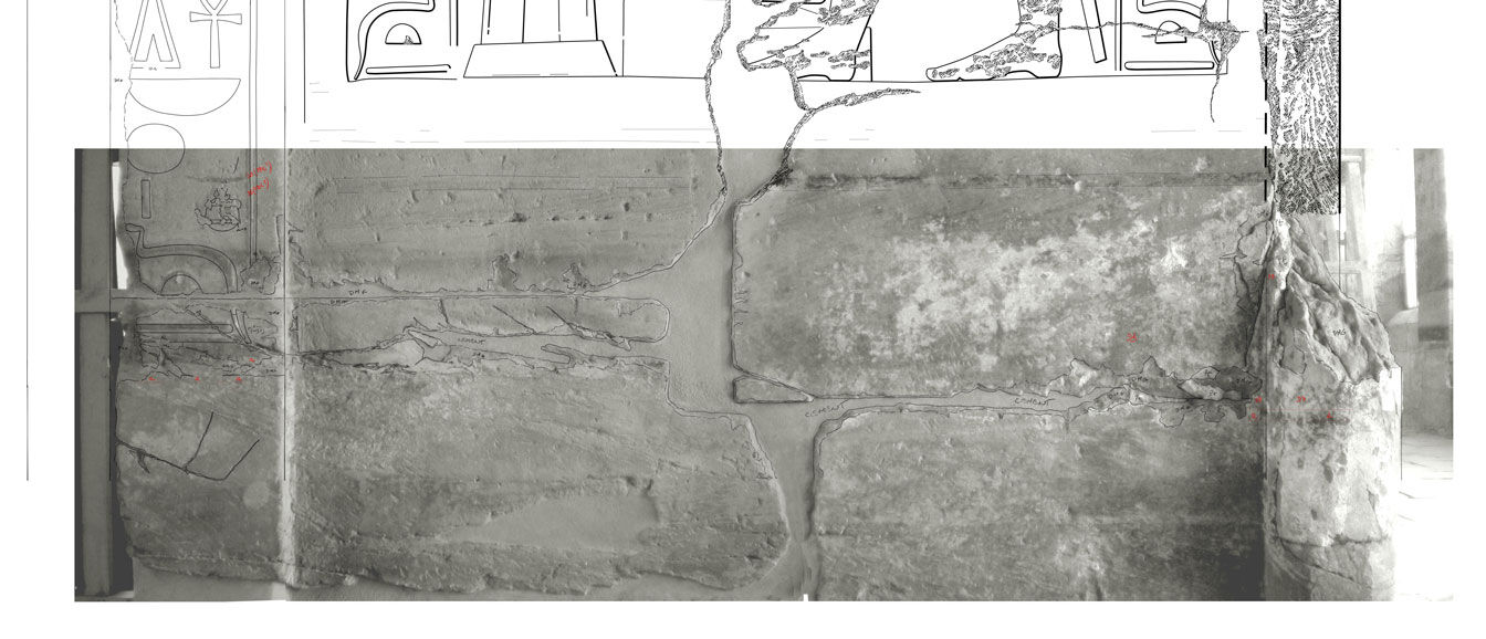
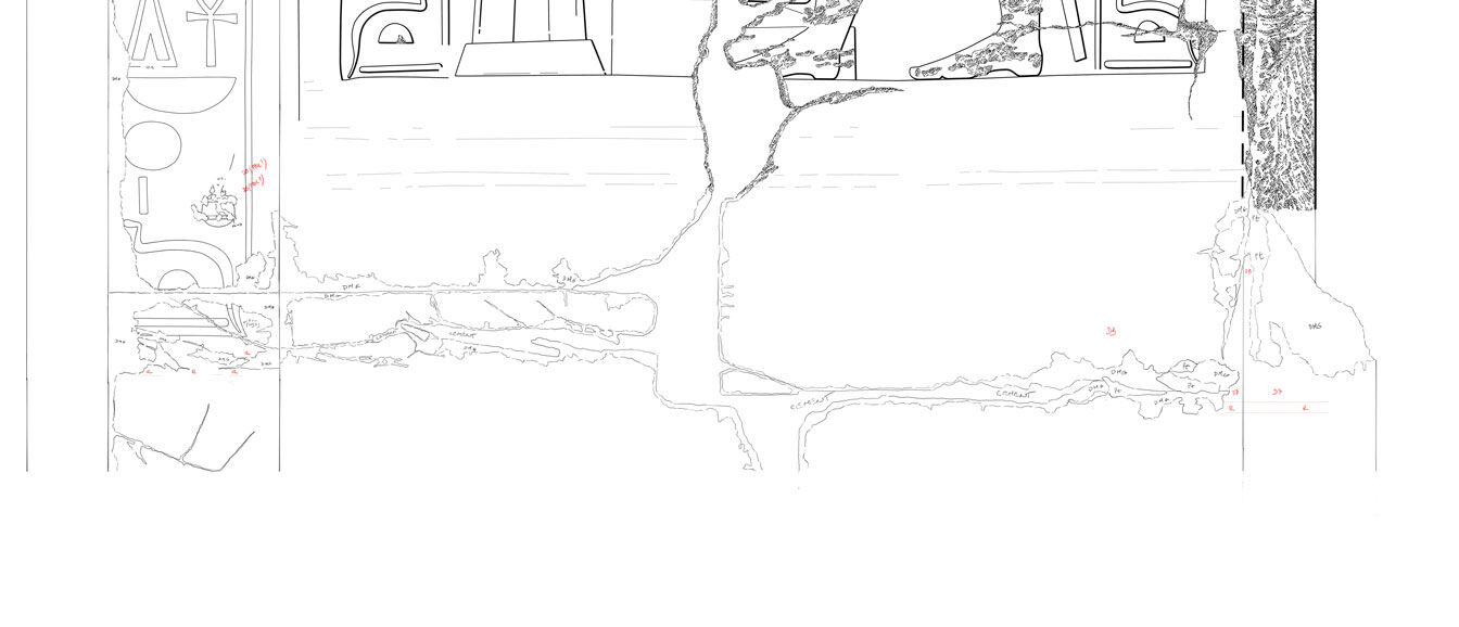
Relative position of Thutmoside (black frame with red and yellow panels) and Ptolemaic (red stripes) painted borders on the lower left portion
Fortunately, some painted details could be represented with the regular dotted line convention, since there were enough traces on the wall to draw a definite outline. Most of the preserved pigment, however, was only indicated by noting the particular color over the painted area. These annotations will not be included in the final drawing, but they still provide important visual data, and they have been grouped together with the drawing on a separate layer. In fact, a general rule with digital field drawings is that it is always a good idea to make a note in the drawing file of anything of peculiar interest. Sometimes a blue spot indicated right on a drawing tells more about the decorated surface than the same observation noted later on in the epigraphic commentary.
As penciling on the lower section proceeded further down, a decision had to be made about how far down the drawing should go. After some debate it was decided to stop right below the last visible traces of the Ptolemaic dado, but the contemporary floor level was nevertheless indicated on the drawing to give the decorative elements their proper balance and show the correct proportion of the doorway. This decision was based on the Epigraphic Survey's principal aim of documenting decorative surfaces within the context of architectural units.
Documenting the Upper Portion
The upper portion of the walls, including the torus moulding, kheker frieze, and cavetto cornice, proved to be the most challenging part of the in-situ documentation. The surface, which included traces of two separate (Thutmoside and Ptolemaic) paint episodes of similar decorative features was very much eroded and partially masked by soot and dirt, covered in bird droppings. One could clearly see the misaligned traces on certain areas, while they were almost invisible on other parts of the wall.
.jpg)
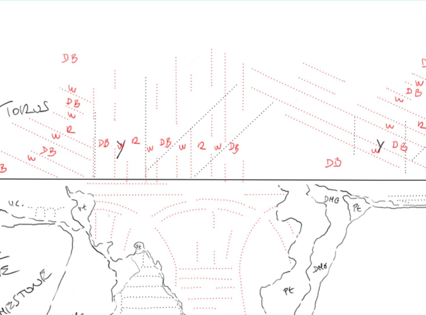
Thutmoside, Ptolemaic and composite kheker, torus and cavetto templates with their relative placement (detail)
The first decision that had to be made concerned the different styles of these two separate paint events. To be able to differentiate between the two layers, templates had to be created indicating the shape, spacing and alignment of these elements. A better preserved 18th Dynasty kheker sequence was traced over digitally on site, using single weight digital pencil brush strokes. This preliminary sketch was than recreated in high quality in the studio, then multiplied (select/right click/layer via copy) many times to get a horizontal sequence stretching along the entire wall surface. Once this hypothetical kheker frieze was placed over the composite drawing as a separate layer, the same process was done with the Ptolemaic kheker frieze pattern. As soon as the two kheker frieze patterns were integrated into the composite drawing, the same painstaking process had to be applied for the torus and cavetto cornice.
It was particularly hard to get an accurate representation of the torus decoration because the hemicylindrical feature, protruding from the surface, had lost most of its paint on its upper portion. This caused some uncertainty regarding the Ptolemaic torus pattern, but, thankfully, there were some relatively well-preserved parallel examples of this design to be found on the exterior of the temple. All of these template layers ended up forming a separate section in the help folder, and at first they were considered as temporary layers to be deleted later. Luckily, the original template drawings were created in 1200 dpi, and, although only a downgraded version thereof was used to help copying the upper wall segments on site, later on they could be reused when creating the reconstruction drawings. Having everything, even our temporary sketches, drawn in high resolution proved to be essential for the later stages of documentation.
Temporary layers of the help folder as they appeared during the drawing of the upper wall sections
As soon as the templates were ready, the drawing had to be taken back to the wall and all of the template features had to be aligned, spaced and sized correctly according to the corresponding features on the surface. To make this task easier and more focused, the features were dealt with one by one, with only one layer turned on at a time. For example, to have the exact layout of the Thutmoside kheker frieze represented on the drawing, each and every kheker needed to be selected and tweaked to fit perfectly (select/edit/transform and then Scale/Rotate/Distort or Warp). This method provided a tremendous amount of help on areas where only faint color patches indicated the original decorative elements, and it would have been incredibly hard to capture the exact features without the template layers. Furthermore, the templates proved to be indispensable for figuring out the relative alignment of the two painted layers on top of each other.
![]()
Color shining through the transparent photo layer and the two layers of paint represented by dotted lines
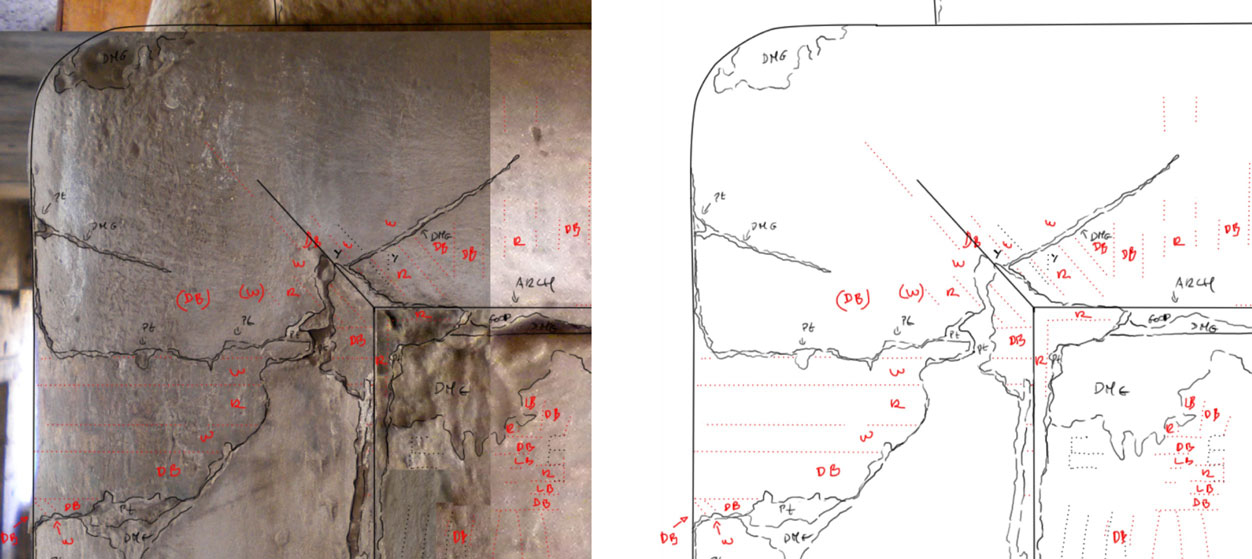
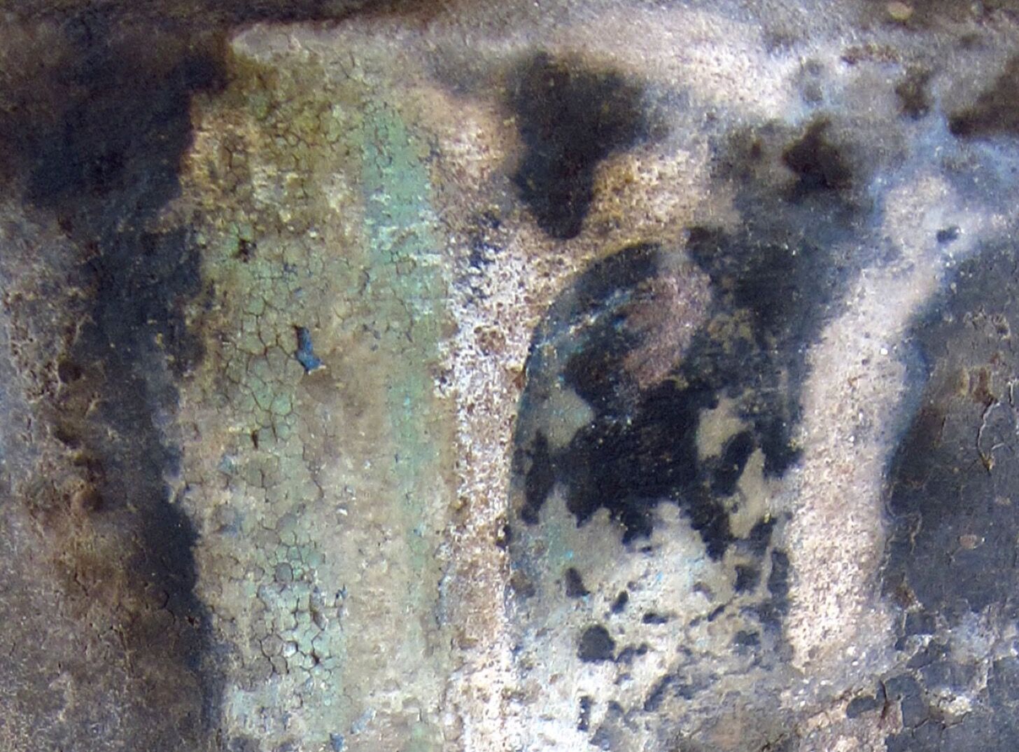
Torus corner with complex Ptolemaic paint scheme and labeled color stripes on the pencil drawing
Handling the complex relationship between the two separate paint events
(1) While the Thutmoside torus pattern keeps its original direction throughout the entire wall section, its Ptolemaic counterpart is symmetrical to the center.
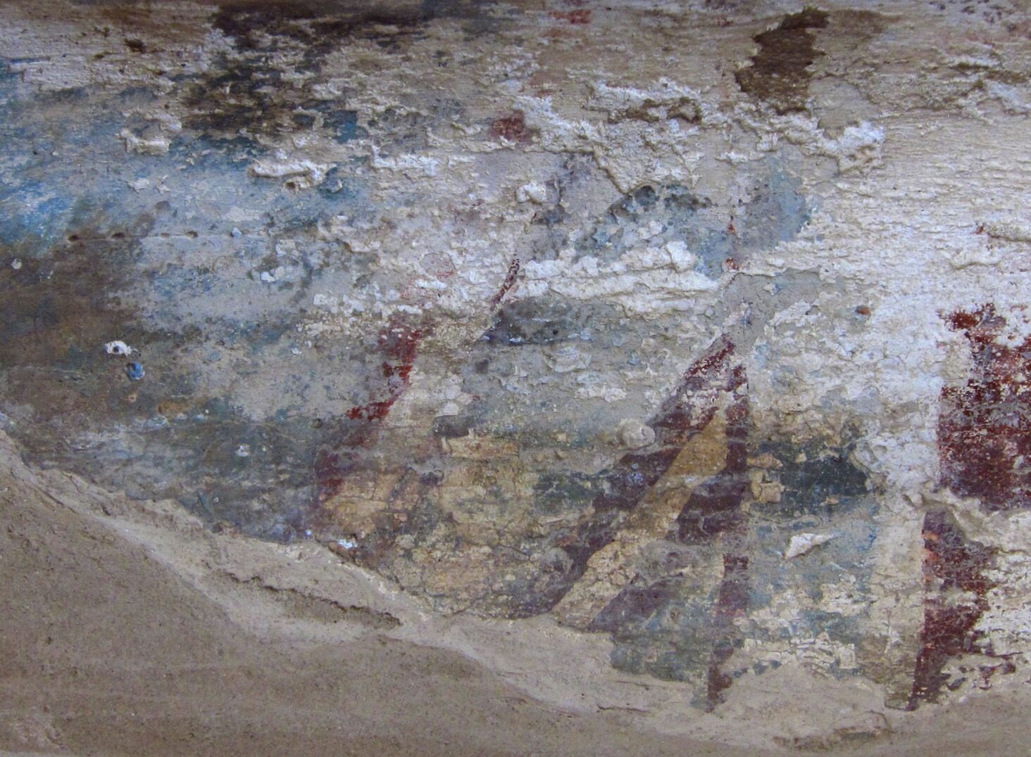
(2) Torus sample photo showing one of the few better-preserved areas of the Ptolemaic torus pattern with its blue and red stripes over white background (turned sideways for comparison).
(3) Torus sample photo indicating traces of the Thutmoside torus pattern underneath the Ptolemaic design with its plain yellow ribbons over white background.
(4) The placement of Ptolemaic cavetto elements (in red) clearly indicating the intentional ignorance of Thutmoside pattern alignment and size when replacing the original stripes.
(5) Cavetto cornice sample photo showing the Thutmoside torus pattern (on the right with black outlining) next to the Ptolemaic design (on the left with larger, simplified panels)
After recording and aligning the elements of the upper wall section, the drawing consisted of a fully reconstructed paint schematic that had to be modified to reflect the level of actual preservation. From this point on, drawing continued on the actual pencil layers using the usual two tone - black and red - dotted lines (with the pre-created dotted line stroke) for copying the preserved painted outlines of the wall. In practice, this required changing the template layers' opacity to a less prominent 30% and using them as a guide over the color photo.
Along with the main architectural features, damaged areas had to be indicated as well, and the new pencil drawings had to be seamlessly blended in with the existing earlier documentation. On extremely difficult areas, such as the only preserved section of the corner torus molding, as many labels and comments were included as needed to clarify the full picture. When all the layers were turned on at the end, the drawing appeared to be a very complex but carefully represented maze of pencil lines, which would then be dealt with in the studio.
.jpg)
Detail of the misaligned kheker friezes blending in with the existing drawing (MHB 165)
At this point the file size was about 1.5 GB; it was still in 8-bit RGB and had 28 separate layers, containing all the initial information preserved in the photographs and recorded at the wall. It was now time to upscale the drawing to 1200 dpi and start with digital inking.
The final penciled drawing ready for studio work (Click photo to discover in higher resolution)
The final penciled drawing ready for studio work - detail (Click photo to discover in higher resolution)
0 comment(s)
Leave a comment(We'll keep your email address private)